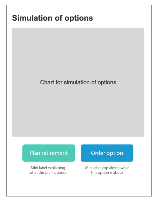
I think the situation is not only about buttons and their position, but about a selection of plan types (similar to pricing plans), consequently prioritizing one over another is conditioning the user's freedom to choose.
Hence, the plans are usually always at the same level, with a color difference, almost always with a label or explanatory text of the characteristics, and sometimes with a highlight on the recommended plan. Rate plans or prices are not just buttons, they require more information to facilitate the user's decision.
About the question: –what to do about those journeys which change the primary and secondary intention– my answer is to give as much information as possible, or a synopsis if it has been explained before, or the main features summary, and allow the user to decidedecides what to do. If there is a preferred plan, the Recommended label

