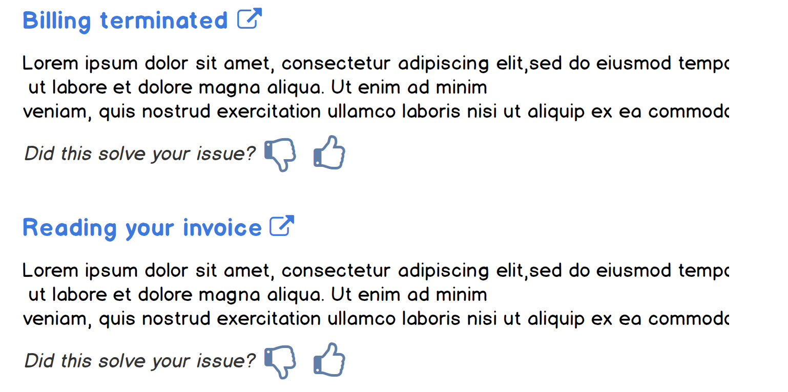
Try using actions that represent a clear choice between two outcomes. Phrase in the form of a question or a command to address them directly.
Your question is about graphic emphasis, but I'm suggesting rethinking the checkbox and the writing you have.
A checkbox is associated with a setting or configuration. Here, you're asking the viewer to leave an assessment about the quality of your support, not to configure, add, or other interactions we associate with a checkbox.
Try using opposing controls
Using thumbs up / thumbs down (Twitter uses smile / frown emojis), you're leveraging a fairly common interaction. Once selected, you can make the icon selected solid, indicating a change of state. This allows them to unselect if they would like to revoke their answer.
You can trying various type treatments, such as italics, which distinguishes it from the rest of the text.
You'll see this in doc sites; here's from Google Cloud, in which they call 'Rate and review':


