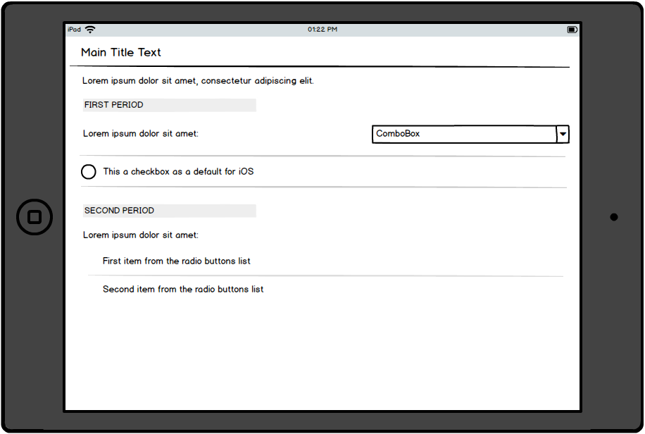
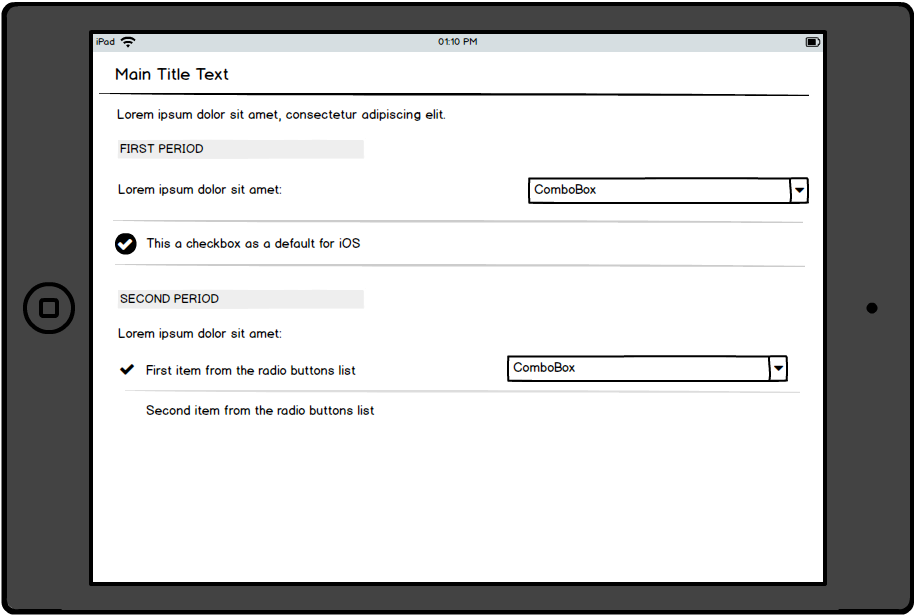
I have a question regarding the default component for checkboxes and radio buttons in iOS.
[Context]
In this flow, the user will have to create a two period charging recurrence (for a service), where he has to select the day (day of month) for the first period and then, for the second period, either a specific day (day of month) or a number of days before the end of the month, for the charge to take place.
The user also has the possibility to define optional service period settings (here is where the checkbox comes in), like the type of the charge (if it's an in arrears or in advance payment) or custom start / end date for periods.
I want to create a screen, on iPad, having both checkboxes and radio buttons, but using the default components from the iOS doesn't really help, because the UI used by Apple, it's the opposite of the "common UI" (checkboxes have the UI of radio buttons and radio buttons are a check icon with no box around it). I've attached this wireframe in order to better understand the context in which these components are displayed.
The issue here is that the users can't really understand which is a radio button and which is a checkbox, which makes it harder for the user to have a first read of the screen and understand what's happening.
Only after they randomly tap on the screen they can figure out the behavior of the listOnly after they randomly tap on the screen they can figure out the behavior of the list:
Do you have any suggestions on how to apply an alternative of using these components but in a more intuitive way?
LE: this app is used by Android users also (on a company device), this is why the UX should accommodate both OS' in an Apple environment.
Disclaimer: This may seem like a design question but it also has major UX implications, this is the reason I posted it here.


