Commonmark migration
Source Link

##What is the user trying to do with this content?

What is the user trying to do with this content?

Start with the users priorities, which often trumps aesthetics

One thing you might explore is the use of Flexbox (in context with bootstrap 4 here) for dynamic widths. Talk to your devs on this.

Here's MDN docs. Anything further than that is more suitable to Stack Overflow.

If the order of the tiles is important, personally speaking as a user, I don't mind dead space if the sequence is maintained for me. The same goes for if comparison across tiles is important as well.

###Another approach (with caveats)

Another approach (with caveats)

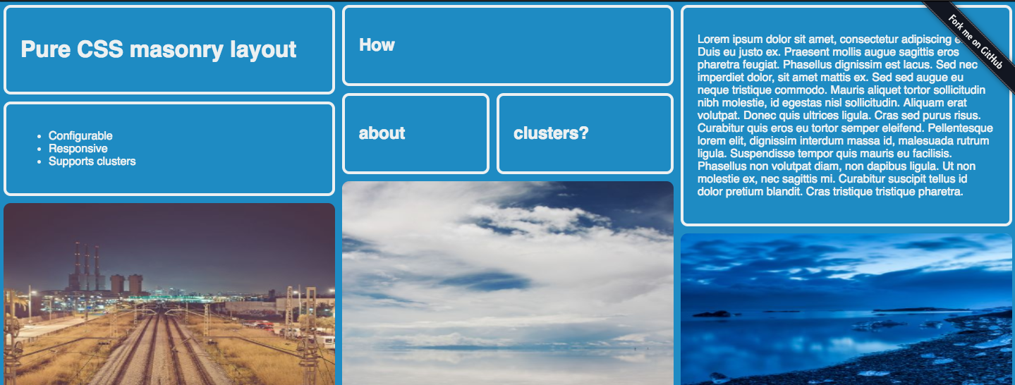
If it's a browsing/exploratory interface, in which the data itself is not ordered in any particular importance (the order doesn't matter), you can try a masonry UI.

enter image description here

enter image description here

Here's a demo:

Here's a more in-depth description:

There are some drawbacks to this, to name just one:

If you need your content to go from left to right in a date ordered style, pure CSS masonry might not be the right solution for you.

Pro

  • fills the space, and provides an immersive experience
  • encourages exploration, browsing, scrolling
  • works well for primarily visual content

Con

  • hard to search for relevant content if reading is a priority across tiles
  • is biased towards aesthetics and can reorder info.
  • comparison between tiles will be difficult due to alignment and shape change

##What is the user trying to do with this content?

Start with the users priorities, which often trumps aesthetics

One thing you might explore is the use of Flexbox (in context with bootstrap 4 here) for dynamic widths. Talk to your devs on this.

Here's MDN docs. Anything further than that is more suitable to Stack Overflow.

If the order of the tiles is important, personally speaking as a user, I don't mind dead space if the sequence is maintained for me. The same goes for if comparison across tiles is important as well.

###Another approach (with caveats)

If it's a browsing/exploratory interface, in which the data itself is not ordered in any particular importance (the order doesn't matter), you can try a masonry UI.

enter image description here

enter image description here

Here's a demo:

Here's a more in-depth description:

There are some drawbacks to this, to name just one:

If you need your content to go from left to right in a date ordered style, pure CSS masonry might not be the right solution for you.

Pro

  • fills the space, and provides an immersive experience
  • encourages exploration, browsing, scrolling
  • works well for primarily visual content

Con

  • hard to search for relevant content if reading is a priority across tiles
  • is biased towards aesthetics and can reorder info.
  • comparison between tiles will be difficult due to alignment and shape change

What is the user trying to do with this content?

Start with the users priorities, which often trumps aesthetics

One thing you might explore is the use of Flexbox (in context with bootstrap 4 here) for dynamic widths. Talk to your devs on this.

Here's MDN docs. Anything further than that is more suitable to Stack Overflow.

If the order of the tiles is important, personally speaking as a user, I don't mind dead space if the sequence is maintained for me. The same goes for if comparison across tiles is important as well.

Another approach (with caveats)

If it's a browsing/exploratory interface, in which the data itself is not ordered in any particular importance (the order doesn't matter), you can try a masonry UI.

enter image description here

enter image description here

Here's a demo:

Here's a more in-depth description:

There are some drawbacks to this, to name just one:

If you need your content to go from left to right in a date ordered style, pure CSS masonry might not be the right solution for you.

Pro

  • fills the space, and provides an immersive experience
  • encourages exploration, browsing, scrolling
  • works well for primarily visual content

Con

  • hard to search for relevant content if reading is a priority across tiles
  • is biased towards aesthetics and can reorder info.
  • comparison between tiles will be difficult due to alignment and shape change
added 35 characters in body
Source Link
Mike M
  • 25k
  • 1
  • 58
  • 66

##What is the user trying to do with this content?

Start with the users priorities, which often trumps aesthetics

One thing you might explore is the use of Flexbox (in context with bootstrap 4 here) for dynamic widths. Talk to your devs on this.

Here's MDN docs. Anything further than that is more suitable to Stack Overflow.

If the order of the tiles is important, personally speaking as a user, I don't mind dead space if the sequence is maintained for me. The same goes for if comparison across tiles is important as well.

###Another approach (with caveats)

If it's a browsing/exploratory interface, in which the data itself is not ordered in any particular importance (the order doesn't matter), you can try a masonry UI.

enter image description here

enter image description here

Here's a demo:

Here's a more in-depth description:

There are some drawbacks to this, to name just one:

If you need your content to go from left to right in a date ordered style, pure CSS masonry might not be the right solution for you.

Pro

  • fills the space, and provides an immersive experience
  • encourages exploration, browsing, scrolling
  • works well for primarily visual content

Con

  • hard to search for relevant content if reading is a priority across tiles
  • is biased towards aesthetics and can reorder info.
  • comparison between tiles will be difficult due to alignment and shape change

##What is the user trying to do with this content?

Start with the users priorities, which often trumps aesthetics

One thing you might explore is the use of Flexbox for dynamic widths. Talk to your devs on this.

Here's MDN docs. Anything further than that is more suitable to Stack Overflow.

If the order of the tiles is important, personally speaking as a user, I don't mind dead space if the sequence is maintained for me. The same goes for if comparison across tiles is important as well.

###Another approach (with caveats)

If it's a browsing/exploratory interface, in which the data itself is not ordered in any particular importance (the order doesn't matter), you can try a masonry UI.

enter image description here

enter image description here

Here's a demo:

Here's a more in-depth description:

There are some drawbacks to this, to name just one:

If you need your content to go from left to right in a date ordered style, pure CSS masonry might not be the right solution for you.

Pro

  • fills the space, and provides an immersive experience
  • encourages exploration, browsing, scrolling
  • works well for primarily visual content

Con

  • hard to search for relevant content if reading is a priority across tiles
  • is biased towards aesthetics and can reorder info.
  • comparison between tiles will be difficult due to alignment and shape change

##What is the user trying to do with this content?

Start with the users priorities, which often trumps aesthetics

One thing you might explore is the use of Flexbox (in context with bootstrap 4 here) for dynamic widths. Talk to your devs on this.

Here's MDN docs. Anything further than that is more suitable to Stack Overflow.

If the order of the tiles is important, personally speaking as a user, I don't mind dead space if the sequence is maintained for me. The same goes for if comparison across tiles is important as well.

###Another approach (with caveats)

If it's a browsing/exploratory interface, in which the data itself is not ordered in any particular importance (the order doesn't matter), you can try a masonry UI.

enter image description here

enter image description here

Here's a demo:

Here's a more in-depth description:

There are some drawbacks to this, to name just one:

If you need your content to go from left to right in a date ordered style, pure CSS masonry might not be the right solution for you.

Pro

  • fills the space, and provides an immersive experience
  • encourages exploration, browsing, scrolling
  • works well for primarily visual content

Con

  • hard to search for relevant content if reading is a priority across tiles
  • is biased towards aesthetics and can reorder info.
  • comparison between tiles will be difficult due to alignment and shape change
added 35 characters in body
Source Link
Mike M
  • 25k
  • 1
  • 58
  • 66

###What##What is the user trying to do with this content?

Start with the users priorities, which often trumps aesthetics

One thing you might explore is the use of Flexbox for dynamic widths. Talk to your devs on this.

Here's MDN docs. Anything further than that is more suitable to Stack Overflow.

If the order of the tiles is important, personally speaking as a user, I don't mind dead space if the sequence is maintained for me. The same goes for if comparison across tiles is important as well.

###Another approach (with caveats)

If it's a browsing/exploratory interface, in which the data itself is not ordered in any particular importance  (the order doesn't matter), you can try a masonry UI.

enter image description here

enter image description here

Here's a demo:

Here's a more in-depth description:

There are some drawbacks to this, to name just one:

If you need your content to go from left to right in a date ordered style, pure CSS masonry might not be the right solution for you.

Pro

  • fills the space, and provides an immersive experience
  • encourages exploration, browsing, scrolling
  • works well for primarily visual content

Con

  • hard to search for relevant content if reading is a priority across tiles
  • is biased towards aesthetics and can reorder info.
  • comparison between tiles will be difficult due to alignment and shape change

###What is the user trying to do with this content?

Start with the users priorities, which often trumps aesthetics

One thing you might explore is the use of Flexbox for dynamic widths. Talk to your devs on this.

Here's MDN docs. Anything further than that is more suitable to Stack Overflow.

If the order of the tiles is important, personally speaking as a user, I don't mind dead space if the sequence is maintained for me. The same goes for if comparison across tiles is important as well.

If it's a browsing/exploratory interface, in which the data itself is not ordered in any particular importance(the order doesn't matter), you can try a masonry UI.

enter image description here

enter image description here

Here's a demo:

Here's a more in-depth description:

There are some drawbacks to this, to name just one:

If you need your content to go from left to right in a date ordered style, pure CSS masonry might not be the right solution for you.

Pro

  • fills the space, and provides an immersive experience
  • encourages exploration, browsing, scrolling
  • works well for primarily visual content

Con

  • hard to search for relevant content if reading is a priority across tiles
  • is biased towards aesthetics and can reorder info.
  • comparison between tiles will be difficult due to alignment and shape change

##What is the user trying to do with this content?

Start with the users priorities, which often trumps aesthetics

One thing you might explore is the use of Flexbox for dynamic widths. Talk to your devs on this.

Here's MDN docs. Anything further than that is more suitable to Stack Overflow.

If the order of the tiles is important, personally speaking as a user, I don't mind dead space if the sequence is maintained for me. The same goes for if comparison across tiles is important as well.

###Another approach (with caveats)

If it's a browsing/exploratory interface, in which the data itself is not ordered in any particular importance  (the order doesn't matter), you can try a masonry UI.

enter image description here

enter image description here

Here's a demo:

Here's a more in-depth description:

There are some drawbacks to this, to name just one:

If you need your content to go from left to right in a date ordered style, pure CSS masonry might not be the right solution for you.

Pro

  • fills the space, and provides an immersive experience
  • encourages exploration, browsing, scrolling
  • works well for primarily visual content

Con

  • hard to search for relevant content if reading is a priority across tiles
  • is biased towards aesthetics and can reorder info.
  • comparison between tiles will be difficult due to alignment and shape change
added 367 characters in body
Source Link
Mike M
  • 25k
  • 1
  • 58
  • 66
Loading
Source Link
Mike M
  • 25k
  • 1
  • 58
  • 66
Loading