replaced http://ux.stackexchange.com/ with https://ux.stackexchange.com/
Source Link

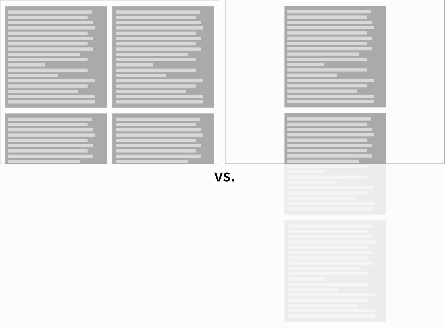
There is a reasonable limit in the amount of information the user should see at once.

If the view is filled with more information than the user can assimilate/understand it becomes overwhelming. This will depend on the kind of contentThis will depend on the kind of content and the way the information is displayed.

It is not a matter of leaving empty space, but of using the amount of space needed, not more.

To illustrate the point with your example:

enter image description here

As websites can make use of scroll, there is no need to put as much information as possible in a single screen.
Now, how to distribute the content?

enter image description here

enter image description here enter image description here

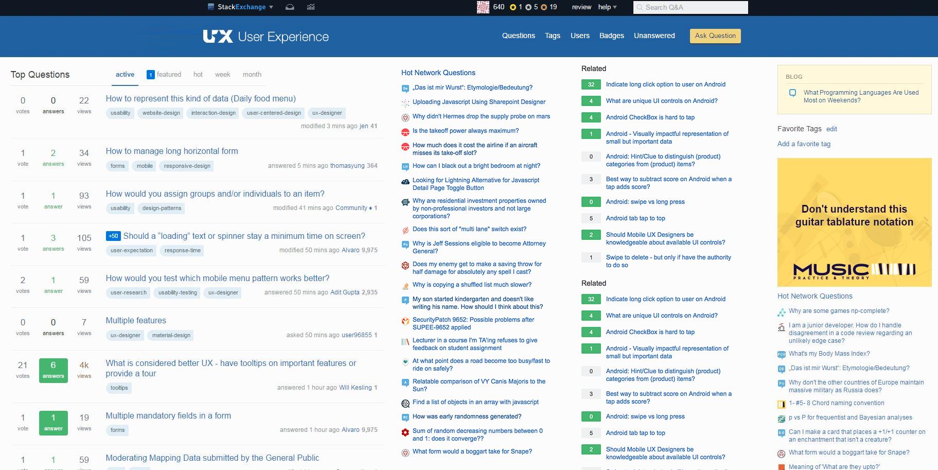
Depending on the site the content might be centered or left aligned (this last one probably due to reading Left to Right). There is another alternative which is not to distribute the space in the boundaries of the containers, but instead inside the elements. This kind of layout might be useful if there are several columns inside the containers and there is a sidebar in each side. In other words, it is worth if there are enough columns, and at some point the consistency of each element (each row) will start to break due to the information being too far apart. And when we reach that point we are back to continue adding that empty space in any of the previous ways.

enter image description here

There is a reasonable limit in the amount of information the user should see at once.

If the view is filled with more information than the user can assimilate/understand it becomes overwhelming. This will depend on the kind of content and the way the information is displayed.

It is not a matter of leaving empty space, but of using the amount of space needed, not more.

To illustrate the point with your example:

enter image description here

As websites can make use of scroll, there is no need to put as much information as possible in a single screen.

Now, how to distribute the content?

enter image description here

enter image description here enter image description here

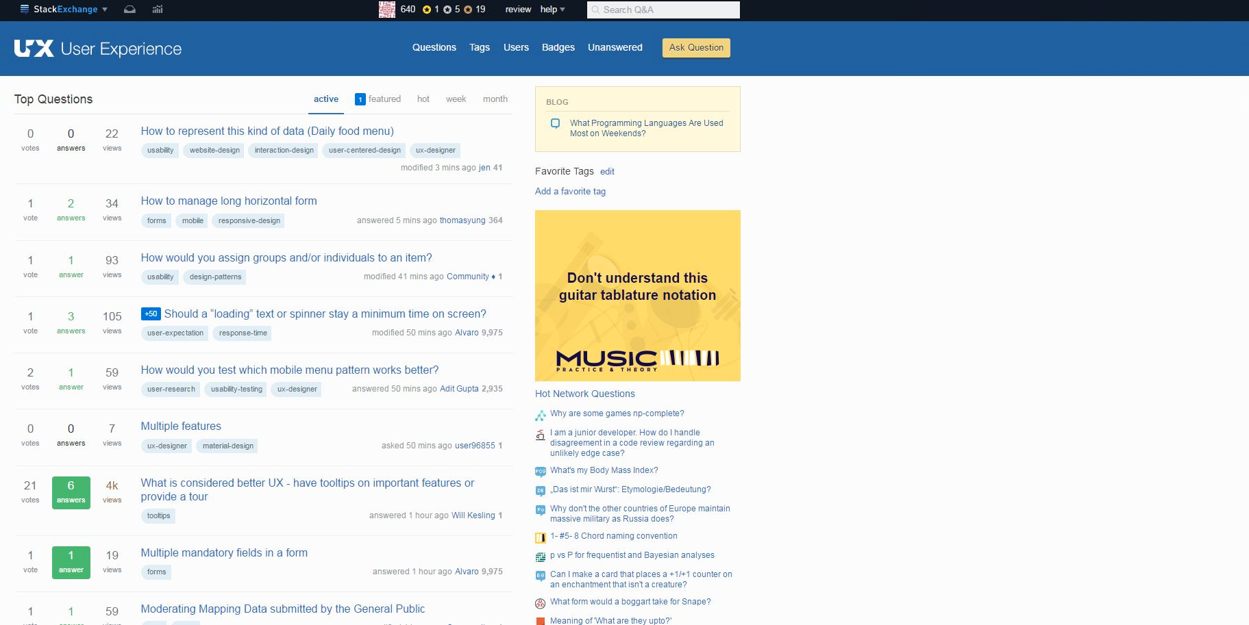
Depending on the site the content might be centered or left aligned (this last one probably due to reading Left to Right). There is another alternative which is not to distribute the space in the boundaries of the containers, but instead inside the elements. This kind of layout might be useful if there are several columns inside the containers and there is a sidebar in each side. In other words, it is worth if there are enough columns, and at some point the consistency of each element (each row) will start to break due to the information being too far apart. And when we reach that point we are back to continue adding that empty space in any of the previous ways.
enter image description here

There is a reasonable limit in the amount of information the user should see at once.

If the view is filled with more information than the user can assimilate/understand it becomes overwhelming. This will depend on the kind of content and the way the information is displayed.

It is not a matter of leaving empty space, but of using the amount of space needed, not more.

To illustrate the point with your example:

enter image description here

As websites can make use of scroll, there is no need to put as much information as possible in a single screen.

Now, how to distribute the content?

enter image description here

enter image description here enter image description here

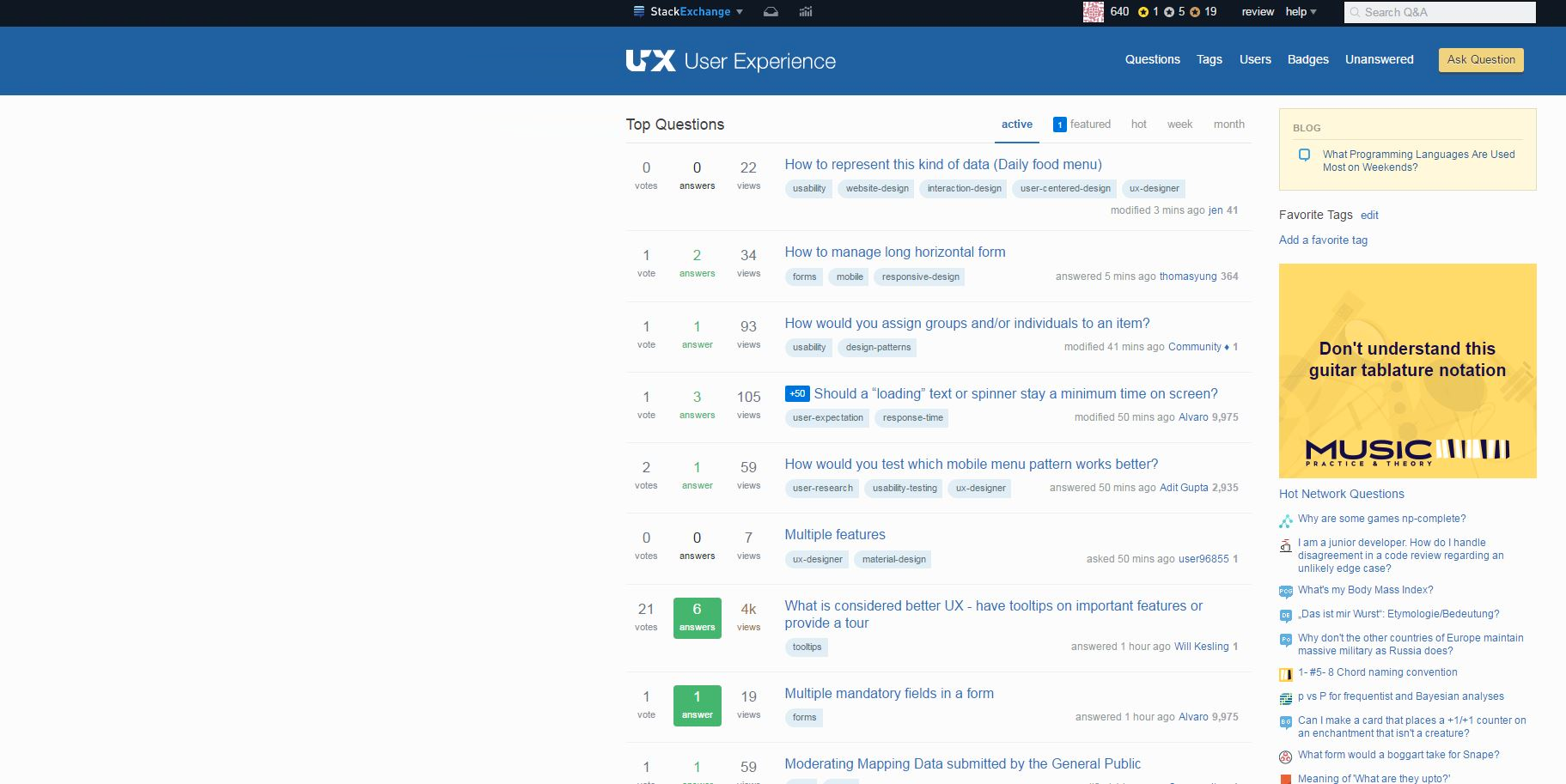
Depending on the site the content might be centered or left aligned (this last one probably due to reading Left to Right). There is another alternative which is not to distribute the space in the boundaries of the containers, but instead inside the elements. This kind of layout might be useful if there are several columns inside the containers and there is a sidebar in each side. In other words, it is worth if there are enough columns, and at some point the consistency of each element (each row) will start to break due to the information being too far apart. And when we reach that point we are back to continue adding that empty space in any of the previous ways.
enter image description here

deleted 44 characters in body
Source Link
Alvaro
  • 16.9k
  • 7
  • 45
  • 68

There is a reasonable limit in the amount of information the user should see at once.

If the view is filled with more information than the user can assimilate/understand it becomes overwhelming. This will depend on the kind of content and the way the information is displayed.

It is not a matter of leaving empty space, but of using the amount of space needed, not more.

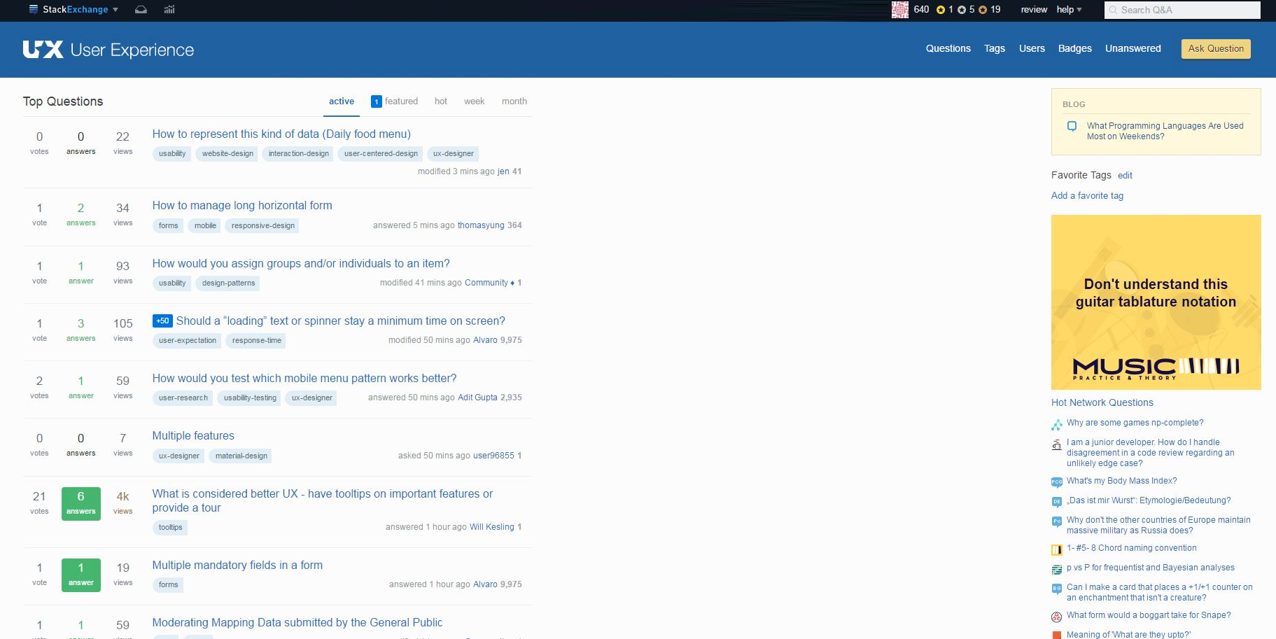
To illustrate the point with your example:

enter image description here

As websites can make use of scroll, there is no need to put as much information as possible in a single screen.

enter image description here

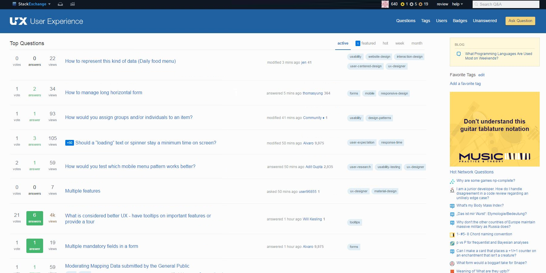
Now, how to distribute the content?

enter image description here

enter image description here enter image description here

Depending on the site the content might be centered or left aligned (this last one probably due to reading Left to Right). There is another alternative which is not to distribute the space in the boundaries of the containers, but instead inside the elements. This kind of layout might be useful if there are several columns inside the containers and there is a sidebar in each side. In other words, it is worth if there are enough columns, and at some point the consistency of each element (each row) will start to break due to the information being too far apart. And when we reach that point we are back to continue adding that empty space in any of the previous ways.
enter image description hereenter image description here

There is a reasonable limit in the amount of information the user should see at once.

If the view is filled with more information than the user can assimilate/understand it becomes overwhelming. This will depend on the kind of content and the way the information is displayed.

It is not a matter of leaving empty space, but of using the amount of space needed, not more.

To illustrate the point with your example:

enter image description here

As websites can make use of scroll, there is no need to put as much information as possible in a single screen.

enter image description here

Now, how to distribute the content?

enter image description here

enter image description here enter image description here

Depending on the site the content might be centered or left aligned (this last one probably due to reading Left to Right). There is another alternative which is not to distribute the space in the boundaries of the containers, but instead inside the elements. This kind of layout might be useful if there are several columns inside the containers and there is a sidebar in each side. In other words, it is worth if there are enough columns, and at some point the consistency of each element (each row) will start to break due to the information being too far apart. And when we reach that point we are back to continue adding that empty space in any of the previous ways.
enter image description here

There is a reasonable limit in the amount of information the user should see at once.

If the view is filled with more information than the user can assimilate/understand it becomes overwhelming. This will depend on the kind of content and the way the information is displayed.

It is not a matter of leaving empty space, but of using the amount of space needed, not more.

To illustrate the point with your example:

enter image description here

As websites can make use of scroll, there is no need to put as much information as possible in a single screen.

Now, how to distribute the content?

enter image description here

enter image description here enter image description here

Depending on the site the content might be centered or left aligned (this last one probably due to reading Left to Right). There is another alternative which is not to distribute the space in the boundaries of the containers, but instead inside the elements. This kind of layout might be useful if there are several columns inside the containers and there is a sidebar in each side. In other words, it is worth if there are enough columns, and at some point the consistency of each element (each row) will start to break due to the information being too far apart. And when we reach that point we are back to continue adding that empty space in any of the previous ways.

enter image description here

added 766 characters in body
Source Link
Alvaro
  • 16.9k
  • 7
  • 45
  • 68

There is a reasonable limit in the amount of information the user should see at once.

If the view is filled with more information than the user can assimilate/understand it becomes overwhelming. This will depend on the kind of content and the way the information is showndisplayed.

It is not a matter of leaving empty space, but of using the amount of space needed, not more.

To illustrate the point with your example:

enter image description here

As websites can make use of scroll, there is no need to put as much information as possible in a single screen.

enter image description here

vs.Now, how to distribute the content?

enter image description here

In smaller screens thereenter image description here enter image description here

Depending on the site the content might be centered or left aligned (this last one probably due to reading Left to Right). There is usually no problem with too much information, butanother alternative which is not to distribute the oppositespace in the boundaries of the containers, sobut instead inside the content can occupyelements. This kind of layout might be useful if there are several columns inside the full widthcontainers and there is a sidebar in each side. In other words, it is worth if there are enough columns, and at some point the consistency of each element (each row) will start to break due to the information being too far apart. And when we reach that point we are back to continue adding that empty space in any of the screen:previous ways.

enter image description here

There is a reasonable limit in the amount of information the user should see at once.

If the view is filled with more information than the user can assimilate/understand it becomes overwhelming. This will depend on the kind of content and the way the information is shown.

It is not a matter of leaving empty space, but of using the amount of space needed, not more.

To illustrate the point with your example:

enter image description here

As websites can make use of scroll, there is no need to put as much information as possible in a single screen.

vs.

In smaller screens there is usually no problem with too much information, but the opposite, so the content can occupy the full width of the screen:

There is a reasonable limit in the amount of information the user should see at once.

If the view is filled with more information than the user can assimilate/understand it becomes overwhelming. This will depend on the kind of content and the way the information is displayed.

It is not a matter of leaving empty space, but of using the amount of space needed, not more.

To illustrate the point with your example:

enter image description here

As websites can make use of scroll, there is no need to put as much information as possible in a single screen.

enter image description here

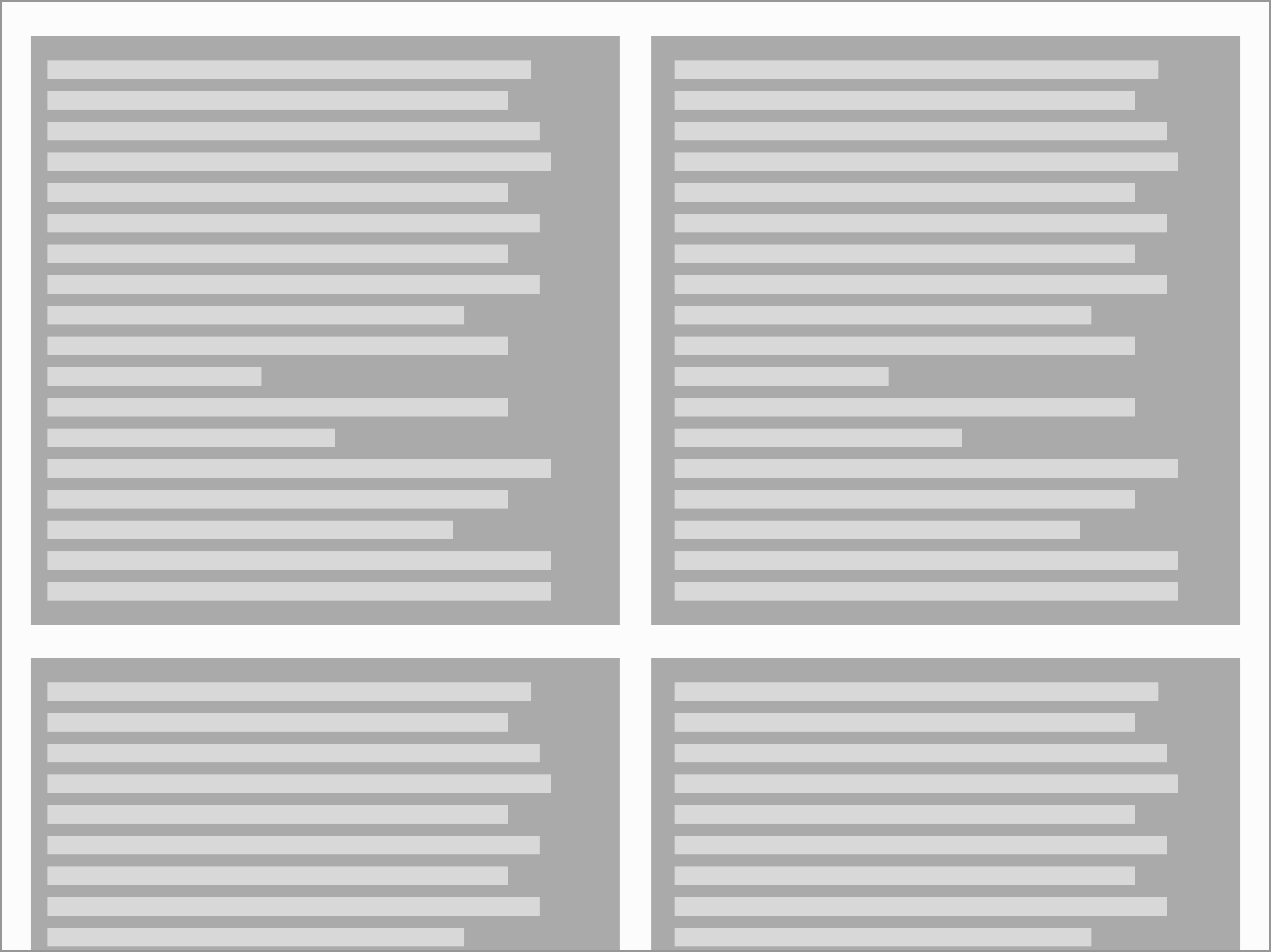
Now, how to distribute the content?

enter image description here

enter image description here enter image description here

Depending on the site the content might be centered or left aligned (this last one probably due to reading Left to Right). There is another alternative which is not to distribute the space in the boundaries of the containers, but instead inside the elements. This kind of layout might be useful if there are several columns inside the containers and there is a sidebar in each side. In other words, it is worth if there are enough columns, and at some point the consistency of each element (each row) will start to break due to the information being too far apart. And when we reach that point we are back to continue adding that empty space in any of the previous ways.
enter image description here

added 110 characters in body
Source Link
Alvaro
  • 16.9k
  • 7
  • 45
  • 68
Loading
added 216 characters in body
Source Link
Alvaro
  • 16.9k
  • 7
  • 45
  • 68
Loading
added 90 characters in body
Source Link
Alvaro
  • 16.9k
  • 7
  • 45
  • 68
Loading
added 95 characters in body
Source Link
Alvaro
  • 16.9k
  • 7
  • 45
  • 68
Loading
added 172 characters in body
Source Link
Alvaro
  • 16.9k
  • 7
  • 45
  • 68
Loading
Source Link
Alvaro
  • 16.9k
  • 7
  • 45
  • 68
Loading