added 4 characters in body
Source Link
Alvaro
  • 16.9k
  • 7
  • 45
  • 68

First thing first: If this is for desktop, then you should NOT use a hamburger menu. However, if you're decided to do it, just test it and see how it goes.

If this is for mobile, then proceed to the second part :)

And what you think is correct. There should be 2 different menus. To avoid confusions, it's common to name one of the menus NAVIGATION, while any other menu will be called a menu. This is important, because here's what you're correctly perceiving: there's one menu (the navigation one) which acts as a way to access the different parts of the site.

On the other hand, you have a member's area with its own set of actions and behaviorsbehaviours, so it needs to go in a different menu.

Let's take Material Design as an example

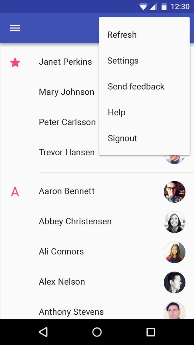
A menu is a temporary piece of material that appears upon interaction with a button, action, pointer, or other control. It contains at least two menu items.

Each menu item consists of a discrete option or action that can affect the app, the view, or selected elements within a view.

Menus should not be used as a primary method for navigation within an app.

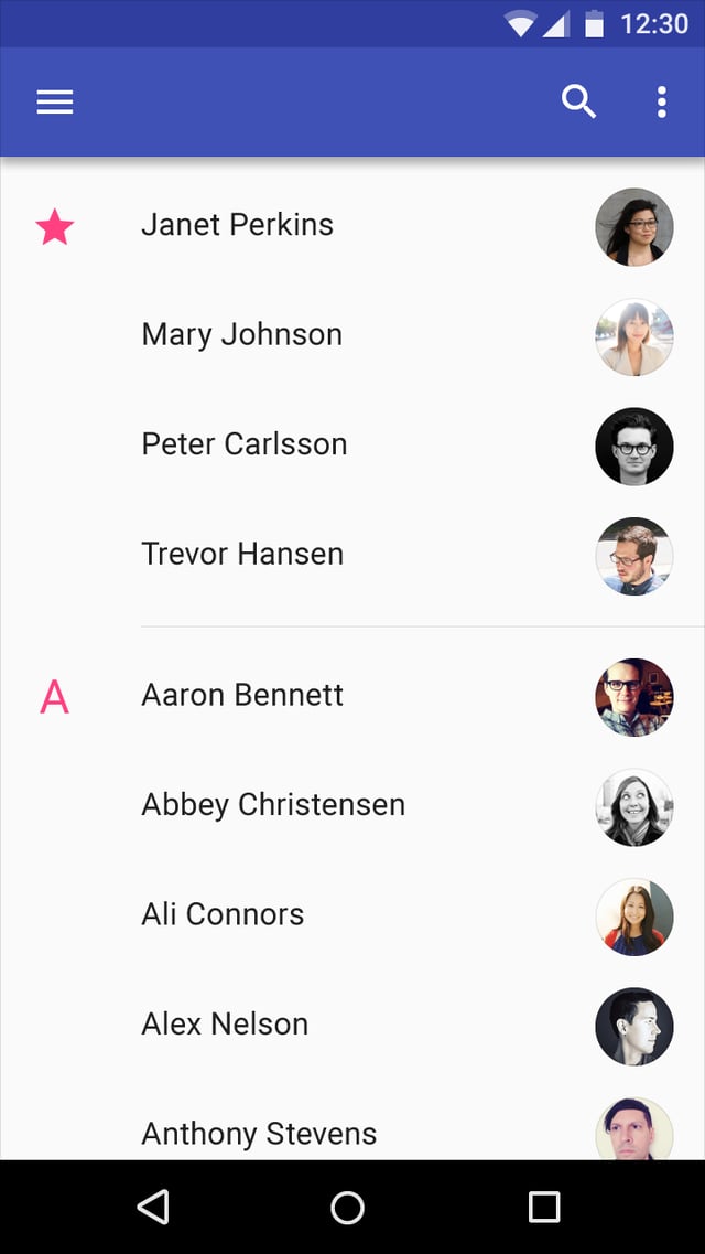
And see the hamburger menu (left) used for navigation and the kebab menu (right) used for settings and app related behaviorsbehaviours, such as yours

enter image description hereenter image description here enter image description hereenter image description here

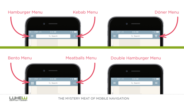
BONUS: Just for reference, the funny names after the menus (hamburger, kebab and such):

enter image description here

First thing first: If this is for desktop, then you should NOT use a hamburger menu. However, if you're decided to do it, just test it and see how it goes.

If this is for mobile, then proceed to the second part :)

And what you think is correct. There should be 2 different menus. To avoid confusions, it's common to name one of the menus NAVIGATION, while any other menu will be called a menu. This is important, because here's what you're correctly perceiving: there's one menu (the navigation one) which acts as a way to access the different parts of the site.

On the other hand, you have a member's area with its own set of actions and behaviors, so it needs to go in a different menu.

Let's take Material Design as an example

A menu is a temporary piece of material that appears upon interaction with a button, action, pointer, or other control. It contains at least two menu items.

Each menu item consists of a discrete option or action that can affect the app, the view, or selected elements within a view.

Menus should not be used as a primary method for navigation within an app.

And see the hamburger menu (left) used for navigation and the kebab menu (right) used for settings and app related behaviors, such as yours

enter image description here enter image description here

BONUS: Just for reference, the funny names after the menus (hamburger, kebab and such):

enter image description here

First thing first: If this is for desktop, then you should NOT use a hamburger menu. However, if you're decided to do it, just test it and see how it goes.

If this is for mobile, then proceed to the second part :)

And what you think is correct. There should be 2 different menus. To avoid confusions, it's common to name one of the menus NAVIGATION, while any other menu will be called a menu. This is important, because here's what you're correctly perceiving: there's one menu (the navigation one) which acts as a way to access the different parts of the site.

On the other hand, you have a member's area with its own set of actions and behaviours, so it needs to go in a different menu.

Let's take Material Design as an example

A menu is a temporary piece of material that appears upon interaction with a button, action, pointer, or other control. It contains at least two menu items.

Each menu item consists of a discrete option or action that can affect the app, the view, or selected elements within a view.

Menus should not be used as a primary method for navigation within an app.

And see the hamburger menu (left) used for navigation and the kebab menu (right) used for settings and app related behaviours, such as yours

enter image description here enter image description here

BONUS: Just for reference, the funny names after the menus (hamburger, kebab and such):
enter image description here

Source Link
Devin
  • 38.3k
  • 15
  • 81
  • 143

First thing first: If this is for desktop, then you should NOT use a hamburger menu. However, if you're decided to do it, just test it and see how it goes.

If this is for mobile, then proceed to the second part :)

And what you think is correct. There should be 2 different menus. To avoid confusions, it's common to name one of the menus NAVIGATION, while any other menu will be called a menu. This is important, because here's what you're correctly perceiving: there's one menu (the navigation one) which acts as a way to access the different parts of the site.

On the other hand, you have a member's area with its own set of actions and behaviors, so it needs to go in a different menu.

Let's take Material Design as an example

A menu is a temporary piece of material that appears upon interaction with a button, action, pointer, or other control. It contains at least two menu items.

Each menu item consists of a discrete option or action that can affect the app, the view, or selected elements within a view.

Menus should not be used as a primary method for navigation within an app.

And see the hamburger menu (left) used for navigation and the kebab menu (right) used for settings and app related behaviors, such as yours

enter image description here enter image description here

BONUS: Just for reference, the funny names after the menus (hamburger, kebab and such):

enter image description here