Should CRUD actions such as Add a new item, Update an existing item and View item details be on the same form? what's the preferred approach to let the user know "where is he \ what is he currently doing"?
EDIT:
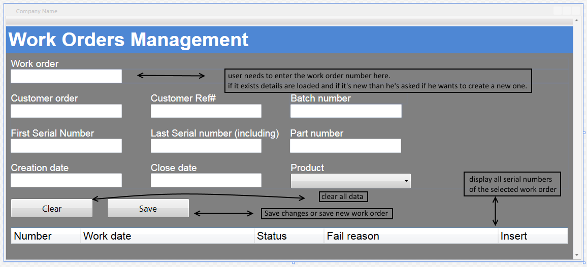
this is how my form looks like now:
-
My answer is "usually". If you add an example though, people might be able to give you some more detailed answers.– KemanoThiefCommented Mar 22, 2015 at 11:34
3 Answers
User experience is different from data design
Developers who move into UX often forget this important perspective change.
Users don't think in terms of CRUD. They usually think in terms of what they want to get done.
Some examples:
- For a micro blog, an author might want to create, update, and delete posts from the same convenient interface.
- For a large news site, journalists may be able to create and edit, but only editors can delete. So the actions may be on totally different screens or even different applications.
- For a missile launch system, only a General might be able to create a launch, but field officers can edit or delete the launch.
In each case, the create, update, and delete UX flow depend entirely on who the users are and what they want to get done.
-
3Hear, hear. Put another way: CRUD actions operate on the data model, which is rarely the same as the user's mental model of the task they're performing. Commented Mar 22, 2015 at 22:49
-
1@kitgrose in most cases your answers are a lot more eloquent than mine... Well said– tohsterCommented Mar 22, 2015 at 22:53
It can be on the same page. But all depends on requirements.
Actually I've worked on form pages where the options are on same page as well as in different page (i.e) from the list page it will be redirected to an add/edit/view page. Delete will happen in list page.
In case of same page, I would keep the form (add/edit/view) as hidden HTML div and will show them when the respective option/button is clicked.
So if you can post some screenshot or explain the requirement can help you further!!
Based on your screenshot, the form page could do with a header below "Work Orders Management" which lets the user know whether they are currently editing of adding, wording along the lines of "Editing Work Order" or "Adding new work order".
The Clear and Save buttons at the bottom, could do with being separated, physically or visually using different colours. To prevent clicking the wrong button and wiping your hard work. Or ideally removing the Clear button altogether, as it is very rare that a user will ever want to clear the form and start again.
The delete function is normally kept on the list view before the form view, however if included on the editing form view, I would keep the delete button very far from the save button and ensure that there is an "Are you sure?" confirmation after the first click.
