5

The holiday accommodations my company rents out have varying prices, depending on the day of arrival and the duration of the stay. Currently, these prices are charted in a scrollable table, with on the horizontal axis all dates, and on the vertical axis the duration, in number of night ranging from 3-21. Intersections that are booked don't show a price. This has the advantage of the customer being able to see what he/she would spend to depart one day later, or stay for two more days, or start their vacation a week earlier, etc. However, this also causes a pretty large grid of prices, displaying up to 7 dates * 12 durations = 84 different prices at a time. I fear this way of displaying might scare off customers, and I'd like to a/b test a new way of displaying these prices.

How could I simplify the price display, while keeping in mind the following things?

  • Prices differ with every departure-date, and every duration.
  • Being able to see the prices of nearby durations and departures is something that has worked very well in the past, and having no fixed arrival dates is a rare thing in the holiday business.

Thanks for your input!

3
  • 7*12 is it 7 days and 12 hours or is it 7 days and 12 weeks? Not quite sure what the calculations are about...
    – Igor-G
    Commented Jan 23, 2013 at 9:49
  • Updated that in the question.
    – Lg102
    Commented Jan 23, 2013 at 18:07
  • We have a similar issue too: ux.stackexchange.com/questions/34361/…
    – firedev
    Commented Feb 8, 2013 at 15:55

1 Answer 1

5

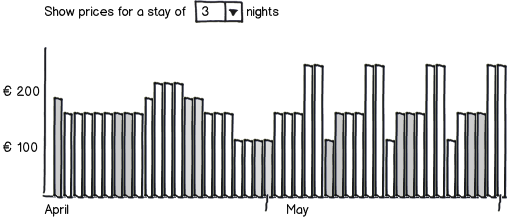
Perhaps you could consider a design where you have a bar-chart of prices over your period. I have seen a design like that on airline sites, and I liked it a lot. Horizontally, you'd set your arrival dates, and vertically the price. You'd start with a standard-length stay, that the user might customize. I am not sure if showing a single night would make most sense, or showing a lengthier period like a week.

mockup

download bmml source – Wireframes created with Balsamiq Mockups

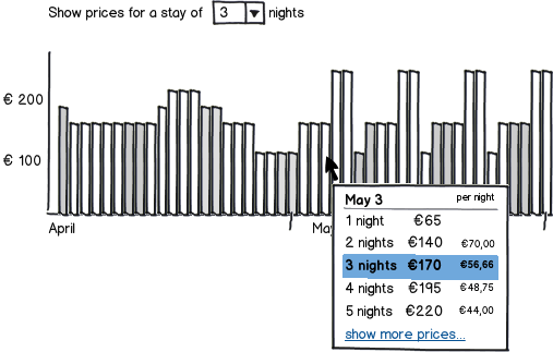
Then, on hovering the bar representing a day, you could show an overlay or an area below the graph that shows prices for the different lengths of stay starting at that date, perhaps with both a total and a price-per-night for each of the stay lengths.

mockup

download bmml source

That way, you avoid drowning your price page in numbers.

7
  • 1
    As a minor enhancement to this suggestion, I recommend highlighting Sat/Sun in a slightly different color.
    – Brian
    Commented Jan 23, 2013 at 14:23
  • I like the basic idea here, but what would you say this does to complexity? Whereas there are no options now, in this solution the user has to select his desired stay-duration, and loses the ability to see what one night longer would cost him. How would you solve that, if I may ask?
    – Lg102
    Commented Jan 23, 2013 at 18:15
  • @Brian: good idea, added a bit of shading for 2 out of every 7 bars to indicate weekends (though the bar lenghts would in reality probably peak at those days)...
    – André
    Commented Jan 23, 2013 at 18:37
  • @Lg102: The indicated stay length would only be used for the graph. The idea was that if you hover or select a day, you'd get an overview of the prices for the different lengths of stay so the user can easily spot the price difference for an extra night (or a night less). I'll try to add a mockup of that as soon as I figure out how to create a new mockup based off the existing one...
    – André
    Commented Jan 23, 2013 at 18:40
  • 2
    This looks a lot like the Google Flights UI: google.com/flights/… Commented Jan 23, 2013 at 21:35

Your Answer

By clicking “Post Your Answer”, you agree to our terms of service and acknowledge you have read our privacy policy.

Not the answer you're looking for? Browse other questions tagged or ask your own question.