8

Suppose the user -- from a CMS backend WYSIWYG editor -- opens an Insert link-dialog. When having a list of possible link destination pages,

  • where would be an appropriate place to put filter controls if the UI should cater for inexperienced as well as experienced users?

Suppose the controls are placed above the list, like (1): enter image description here
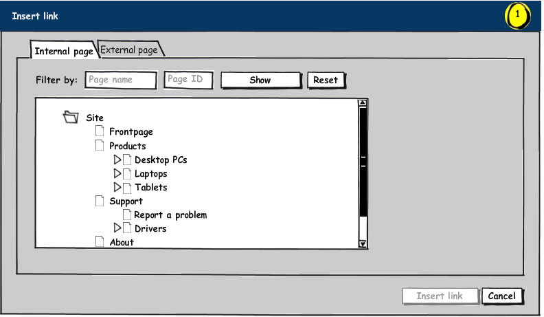
This might be an advantage to more experienced users, since they have fast access to the filtering tools. However, for more novice users, the filtering tools might appear to be required -- due to the implied flow --- rather than optional, assistive tools (as intended from a design perspective).

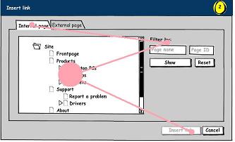
Another approach would be to place the filtering tools next to the list, like (2):enter image description here
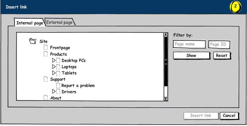
This way the filtering tools are less in-your-face.

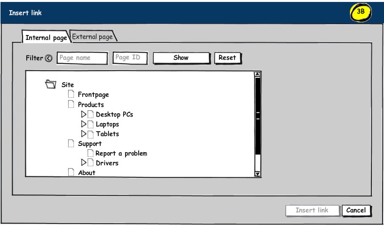
A third approach would be to initially hide the filtering controls, like (3A & 3B):enter image description here enter image description here
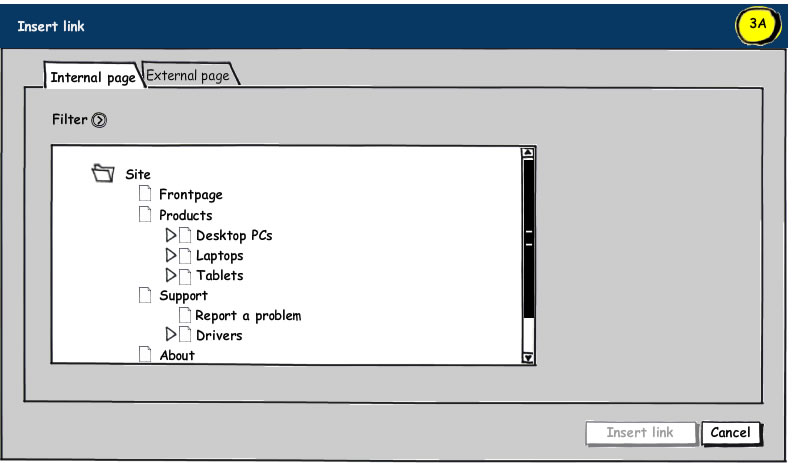
The advantage here is the reduction of the number of UI elements on the first encounter. The downside is the extra click to open the filter options. However, a cookie might be used to store hidden/visible state of the filter controls.

Perhaps a more toolbar-like styling of the filter options is the way to go, but then again, this would be yet another UI element.

Any thoughts on this?

2
  • which program did you used to create the mock?
    – ALoR
    Commented May 2, 2011 at 20:10
  • Balsamiq Mockups is the program used. Very powerful for quick mockups, and very intuitive :)
    – Lode
    Commented May 3, 2011 at 8:01

5 Answers 5

1

IMHO, you should not toggle the visibility of the filter buttons. Keep it simple and show the user which interactions the UI supports.

When it comes to the choice of top/right position, the answer will probably be obvious during a test. You already have some mockups, so it's not a big job to ask a few people to "complete some tasks".

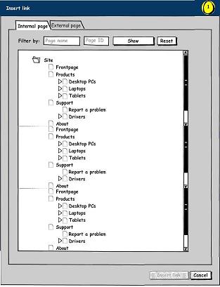
I really don't think it matters whether the buttons are on top or on the right, but the position will be "more fixed" at the top. If you put the buttons on the right, you can end up with a bit of a distance between the list and the buttons. Eg. if the user resizes the screen or the width of the list.

I would consider the buttons on the top as related to the grid, whereas the buttons on the right are more general buttons (like a action panel).

Update

Placement of the buttons when resizing the window:
enter image description here

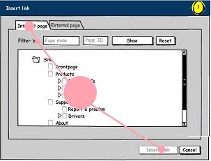
Visual work-flow:
enter image description here

6
  • The main "interaction space" of this dialog is the page tree, so the main focus should be on this. My personal favorite is (2), since the filter controls are always visible, while not getting in the of this main space. The downside though, is that it occupies horizontal space that could have been used by a deep page tree. Also, it still might interpreted as required. It it should be placed at the top, I believe the best thing would be to put in a sort of top panel visually clearly pertaining to the tree view. Regarding the "action panel" I have seen sites where such panels are used for filters
    – agib
    Commented May 3, 2011 at 7:09
  • Regarding a little test with my mockups, you are probably right - it might provide useful insigts. It's just the usual problem of recruiting test participants. Everybody's so busy... :)
    – agib
    Commented May 3, 2011 at 7:13
  • @agib, I belive that the tree will be the main focus on this page either way. Commented May 3, 2011 at 11:13
  • @anonymous downvoter: care to tell me whats incorrect with this answer? Commented May 3, 2011 at 11:16
  • @Jørn, I downvoted (and thought I added a comment, apparently not, sorry) because the answer stayed vague and didn't provide a real answer on it self. Your update adds that so I removed my downvote :-)
    – Lode
    Commented May 3, 2011 at 12:59
2

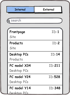
To respond to my own question, inspired by Luke Wroblewski's idea to focus on mobile first (e.g. http://www.lukew.com/ff/entry.asp?933) and Apple's eagerness to flatten information hierarchies, the UI might look something like this:

enter image description here

Here the search field would respond to both page names, ancestor names (written in gray below the page names) and page ID's.

Unfortunately, a UI like this is beyond the scope our redesign project.

2
  • This is exactly the right direction I think (and what I was gearing towards with my answer as well. Just have a good eye and iterate a few designs to merge this idea into the current product. I think you can get quite far.
    – Lode
    Commented May 3, 2011 at 12:55
  • @Lode, we can agree that an approach along the lines of this is more clean than both my initial designs and your suggestions. However, our users are used to having a separate search field for page ID's, and the flattened hierarchy isn't so supportive of the spatial memory of users accustomed to traversing the page tree. Further, the search would rely on live filtering (with potential performance issues), and actually we have constructs that subdivide even subpages, which also complicates things. The mobile first thinking is a sound exercise, though.
    – agib
    Commented May 3, 2011 at 14:59
1

I like 3a/3b. Most users won't need the filter, and a user can easily select a page without using it (if they don't notice it or if they don't know what it means).

This seems like a rather complicated UI just for inserting a link. How does the user manipulate the hyperlink text? The internal site browser you have may be helpful for users who are not web savvy, but it may be more of a hassle for users who are. Who is your target audience? Is this a general purpose CMS or is it geared toward a specific industry?

You might consider a more traditional dialog with two fields: [URL] and [link text]

5
  • I'm not sure I quite follow you, since the emphasis is on the page linking, not the page files per se?
    – agib
    Commented May 2, 2011 at 14:47
  • Ok. I thought you were linking to files in the internal site (rather than pages). The folder icon next to "site" in the directory structure just made me think files for some reason. I'll update my post accordingly.
    – Baa
    Commented May 2, 2011 at 15:04
  • The folder icon is a convention of our software, so I suppose most users are familiar with this. However, I agree it might confuse some.
    – agib
    Commented May 3, 2011 at 7:15
  • To some extent I agree, it's a bit of a complicated UI for a simple task such as inserting a link. What I didn't show in the mockups, though, is that there a two more options, corresponding to two more tabs: Linking to a file, e.g. a .pdf or .doc (as you initially thought) and linking to a mail adress (mailto:). The link text is defined in the WYSIWYG editor, from with this dialog is launched. If internal pages are the link targets, users probably don't know the actual URL, so selecting the target in a tree view appears to be a reasonable solution.
    – agib
    Commented May 3, 2011 at 7:23
  • On the External page-tab the UI is as simple as it can get: Just one text input field for writing/pasting the URL.
    – agib
    Commented May 3, 2011 at 7:24
1

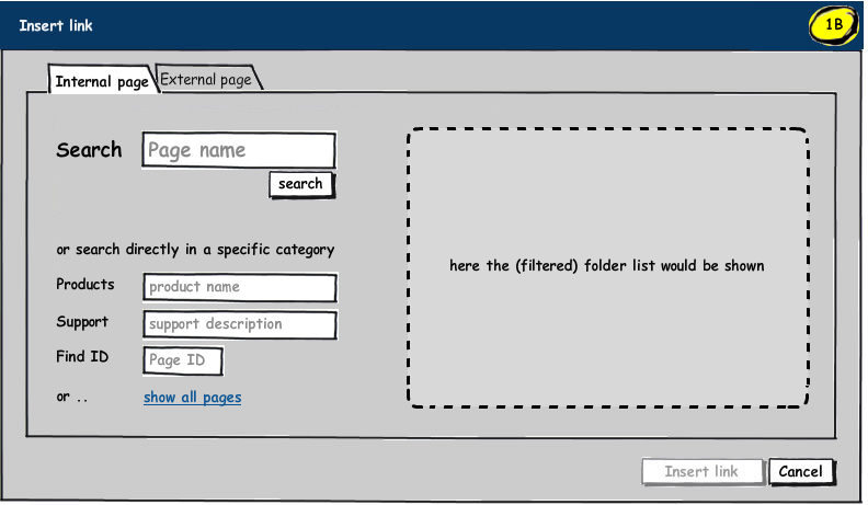
I would say the 'filters' can be more powerful and intuitive to first time users then the hierarchical folder list.

What if you would use the filters as a powerful search and let the hierarchical folder list be optional?

search or filter as main

Search results would show up on the right and change as the search/filters change. The "show all pages" would open up the hierarchical folder list, also on the right (which can be filtered in the same way from then on).

(I do make the assumption that there are quite a lot of pages. Otherwise just displaying a folder list is quicker and filters are not needed at all.)

Maybe this is more than what you can change about the application. In that case, make the filters more apparent and let them get more attention (visually and/or in wordings) than the folder list.

In the future you can even think about merging the internal and external tabs in one input/search. As most users don't know the difference between the two, this can help a lot. The interface reacts differently if what you type in might be an external url (starting with http, www, etc) and/or if the text is found as an internal page.

Update

I've changed the mockup a bit. Putting more emphasis on the first search field and changing the dropdowns into search fields as well. You can also view the previous mockup if wanted.

Of the first mockups you gave, I especially don't prefer the 3A/B one. It adds one more click and only triggers more questions and distraction for first time users. If you would want to show less of the filters I think it is best to use faded/grayed fields, icons and buttons.

2
  • +1 for the idea & mockup :) I'm not very fond of tree views myself, because they tend to be confusing (when large) and the interaction tends to be fiddly. An even stronger emphasis on search might be an appropriate approach, since users are so accustomed to web search. However, the many dropdowns in your mockup might be interpreted as being all mandatory. Also, with a lot of top-level pages a lot of dropdowns would be listed, which may appear daunting to users. Further, what would happen if the user needs to select a page not a direct child of the top-level page? Would another dropdown appear?
    – agib
    Commented May 3, 2011 at 8:59
  • You're right there. I've added a mockup which places the emphasis more clearly. The dropdowns were just a first idea and you can easily play with this emphasis and layout more. I think the main point is to look in the direction of using filters as the main flow. As, indeed, that is actually what a lot of novice users are used to.
    – Lode
    Commented May 3, 2011 at 12:50
0

Considering that you'd like to cater for both inexperienced and experienced users, my first guess would be to go for your option 3: hide those filter controls. Maybe you could also make the visibility state persistent - if the user leaves the page with the control expanded, it will still be expanded on their next visit.

If you build in a reasonable focusing behavior, one click or key press will open the filter control and instantly give keyboard focus to the field that is most likely being used, so the user can just start typing away.

2
  • Although my personal favorite is (2), hiding the controls leaves for a cleaner UI. However, the extra click might frustrate experienced users. But then again, if the last usage is stored (as we both suggest), it might work
    – agib
    Commented May 3, 2011 at 8:11
  • Oops, I must have overlooked that sentence of yours about the cookie ;-) Sorry for the duplication...
    – Jan
    Commented May 3, 2011 at 8:24

Your Answer

By clicking “Post Your Answer”, you agree to our terms of service and acknowledge you have read our privacy policy.

Not the answer you're looking for? Browse other questions tagged or ask your own question.