I have a client who wants to use Comic Sans MS for lots of things on a website I'm doing for him.
How can I explain that comic sans ms is so bad? He's fairly easily persuaded, I think I just need the right arguments.
I have a client who wants to use Comic Sans MS for lots of things on a website I'm doing for him.
How can I explain that comic sans ms is so bad? He's fairly easily persuaded, I think I just need the right arguments.
This question probably belongs on Graphic Design.
That said:
Good visual design is about a lot of things, one of them being that it should be appropriate for the particular message one is trying to communicate.
Comic Sans was designed for MS Bob, a failed UI concept of MS's back in the day. It was created to be informal, but legible at low-resolution. MS Bob is dead, and most of us have nice computer screens now.
I'd ask the client what the use of Comic Sans seems to 'say' to them in terms of brand image. Are they hoping for an informal, friendly feel? If so, maybe steer them in the direction of any number of much better designed script faces that are truly designed as hand written. Are they looking for a comic book feel? If so, point out that while Comic Sans is named that, it wasn't designed for comic books, and then steer them in the direction of all the great faces designed specifically for comic book lettering.
If they are hoping for anything other than that, then it's your job to show them why it's an inappropriate choice. Just as you wouldn't choose stock photos of people in sweat pants eating fast food to sell luxury jewelry, you wouldn't use Comic Sans, either.
Given the uniqueness of the face and how much it's used inappropriately, it gives off a very cheap, generic feel to nearly everything its applied to. That's likely not the message your client is hoping to communicate--even if it is a subconscious thing.
In summary, and perhaps a more practical approach: Ask them what they want to communicate to their customers via the use of Comic Sans. You can then find typefaces that better communicate that message and are much less generic that will help the client stand out.
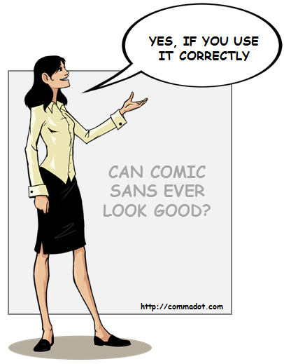
Comic sans is a good font, if used correctly. It's for comic book situations like below. (usually all CAPS) It's not meant for emails or web page text. My suggestion is to show them the proper use of the font and ask them if they want comic book characters commissioned for the site. Then it will look correct.
Sometimes, trebuchet MS or Tahoma will make them feel better than Arial.

This page discusses some of the reasons why Comic Sans is so hated, as well as examples and decent alternatives. One of the points discussed is:
Technical and Aesthetic Drawbacks
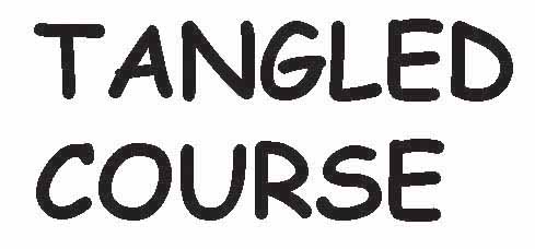
While many who hate Comic Sans do so just because of its omnipresence, others hate it because of aesthetic and technical drawbacks. Both the kerning and weighting of the font are inconsistent, leading to a haphazard appearance in large swathes of text (or even small ones).
A perfect example of the poor kerning can be seen here, between the "T" and "A":

This example is taken from Todd Klein's Blog, where he also goes into great detail on why Comic Sans should not be used.
Comic Sans is sits in a typographic uncanny valley. It is clearly trying to imitate real handwriting, but the uniformity of line weight, repetitive features, and lack of variable glyphs make a a repulsive half-human of a font, a typographic abomination, a vaguely familiar but frightening beast.
Try Offhand Round for a nice alternate with all the features that Comic Sans lacks.
Some dyslexics actually find comic sans easier to read.
Though while I am dyslexic it doesnt work for me - Liberation Sans Narrow does. Uk Dyslexia association link to fonts
Explain to your client that it's all about "perception". Comic Sans has history of being perceived as a "joke" font and any message written in such a font will be taken as a joke. Readers will most likely perceive the message to be playful and lighthearted, which may contradict the actual message.
Every font conveys a message beyond what the sum of each letter and word. Some fonts evoke fear and scariness. Other fonts make documents look official. Others are silly and playful. Make sure your client knows that Comic Sans is too playful and might cause the reader to misinterpret the meaning of message.
http://blogs.wsj.com/dailyfix/2010/07/09/lebron-james-and-the-revenge-of-comic-sans/
Ignore the client and use a better type face. Say something like, "We think this font looks much better than comic sans." If they need more explanation -- "Comic sans looks really dated and is over-used. There are lots of other comic book fonts and handwriting fonts that will look cleaner and more modern." If that doesn't do it, they aren't interested in your opinion.
It has to be decided on a client by client basis, and definitely in the right context.
For internal discussions or sketches, Comic Sans can be appropriate to convey that something is not final, meant to be taken lightly, and is not an attempt at design.
For client-facing deliverables, it usually is seen as unprofessional, and should be avoided.
Comic Sans is used pretty commonly in Primary Education.
If the client operates in the Primary Education field - then the client is probably right.
BTW - All the comments so far are subjective comments from the design community. What is lacking is some actual research on how people respond to it...