The W3C Techniques For Accessibility Evaluation And Repair Tools says:
Two colors provide good color visibility if the brightness difference
and the color difference between the two colors are greater than a set
range.
Color brightness is determined by the following formula:
((Red value X 299) + (Green value X 587) + (Blue value X 114)) / 1000
Note: This
algorithm is taken from a formula for converting RGB values to YIQ
values. This brightness value gives a perceived brightness for a
color.
Color difference is determined by the following formula: (maximum (Red
value 1, Red value 2) - minimum (Red value 1, Red value 2)) + (maximum
(Green value 1, Green value 2) - minimum (Green value 1, Green value
2)) + (maximum (Blue value 1, Blue value 2) - minimum (Blue value 1,
Blue value 2))
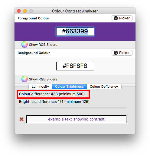
The range for color brightness difference is 125. The range for color
difference is 500.
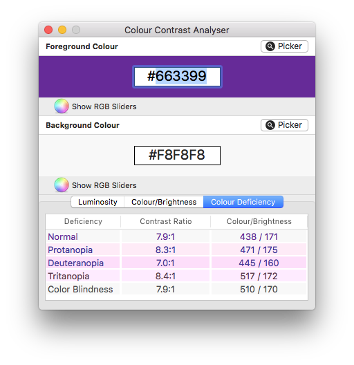
Increasing color difference will help with some visual impairments, but it's generally contrast that is the main thing to consider. However, high contrast colors can sometime cause problems too, in particular for dyslexic readers. I believe this is why HP's old colour contrast tool used to specify 400 as the suggested range. In my opinion to get a balance, it's best not to maximize contrast but to aim somewhere around the 450 to 550 range.


