2

I'm working on a responsive web app.

When a user searches for something they have the ability to set filters. Would it be best to keep them in the context of the page with a drop down/accordion-style filter for the options or, is it better to bring them to a screen overlaying the content? Keep in mind that this is a responsive web app and I'm trying to keep things consistent, as much as I can, across the different mediums.

I'm leaning more towards keeping it in context, however, I want to keep a consistent style of filtering throughout the application. The filter is more complicated on other screens with more options.

2
  • 1
    Can you provide a quick sketch or mockup of the options you're considering? It will make it easier to give you specific feedback. Commented Sep 21, 2016 at 17:23
  • I agree with @DanielNewman and also add the question: how much filtering are we talking about? Is it something like category/brand filter present in e-commerce (which full screen is usually the pattern) or more of a Newly added sort of thing (which the dropdown are more commons). The amount of parameters that the user can choose can influence in how to show it in a clearer way. Commented Sep 21, 2016 at 21:59

1 Answer 1

3

It might depend on how many filters there are... if there are just a few, keeping them in the context of the page might work fine. If there are a lot, you might want to hide the filter panel until requested (along with providing a way to show the user what filters have been selected and a way to clear them, even outside of the filter panel itself).

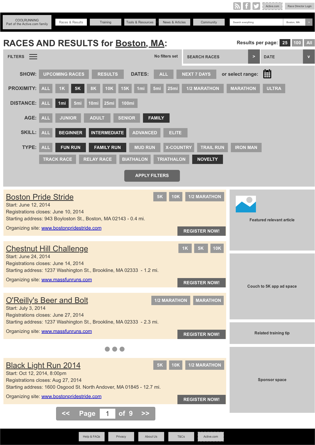
Here are a couple of filter options I've done. The first is wireframes for a proposed redesign of a site with a LOT of filter options. Here's the filter panel open:

enter image description here

And once the user clicks Apply, the panel closes and shows the filtered results:

enter image description here

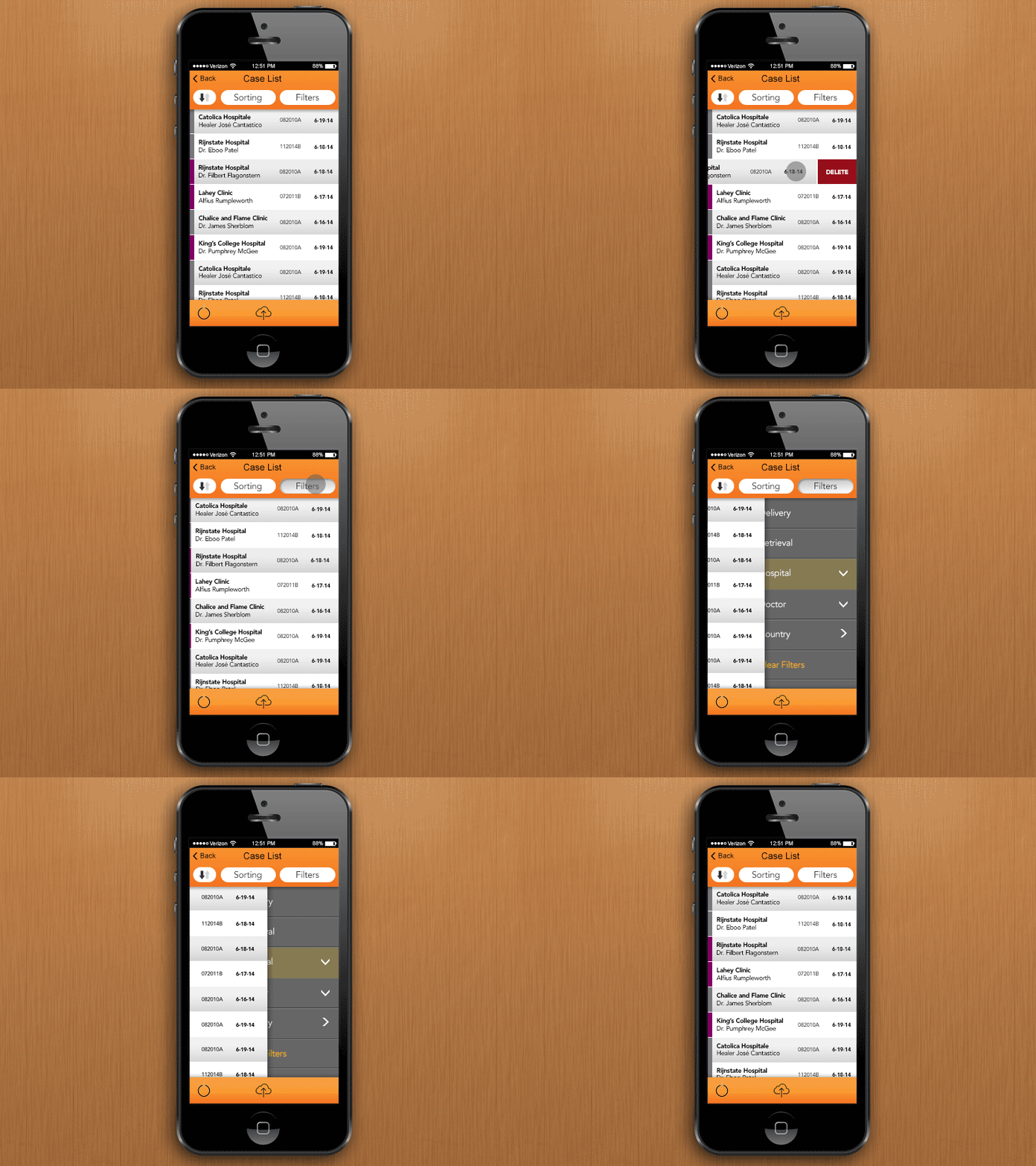
Here's a fly-over panel filter option for a mobile app (with a couple of other controls demoed):

enter image description here

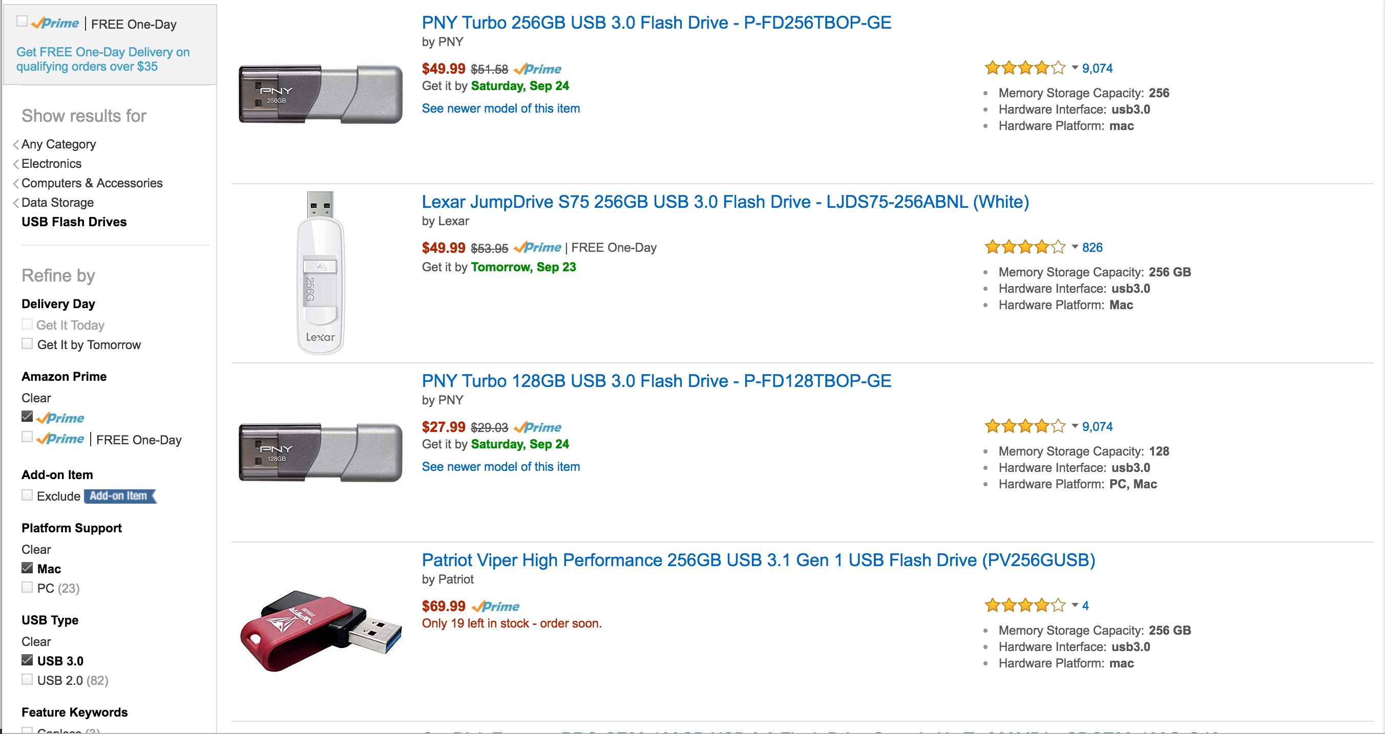
Clearly in that first example some serious content rejiggering would have to occur for the responsive version of the page, but it's doable with the right controls. You could always go in an Amazon direction, with a list of filters down the left side and the results in the main page to the right:

enter image description here

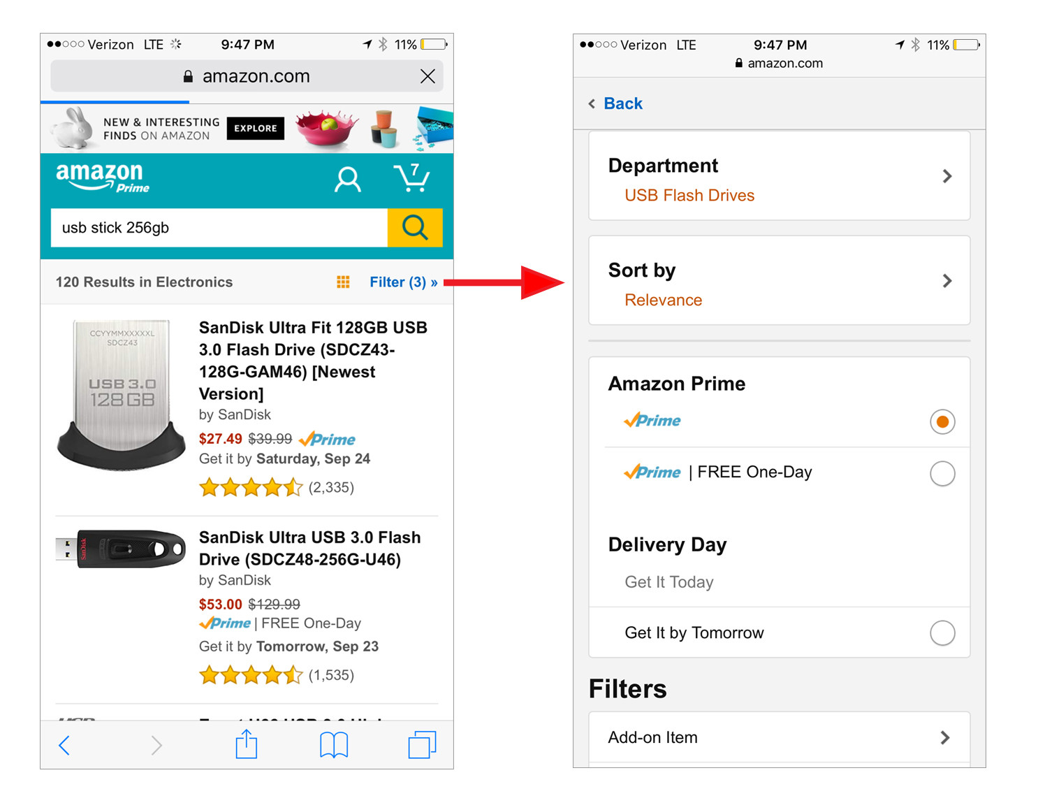
However, in a mobile environment (mobile web, not the app), those options are collapsed into a fly-in panel similar to some of my options above:

enter image description here

It will all come down to your requirements and settings, so of course the answer is "it depends!"

Your Answer

By clicking “Post Your Answer”, you agree to our terms of service and acknowledge you have read our privacy policy.

Not the answer you're looking for? Browse other questions tagged or ask your own question.