Background
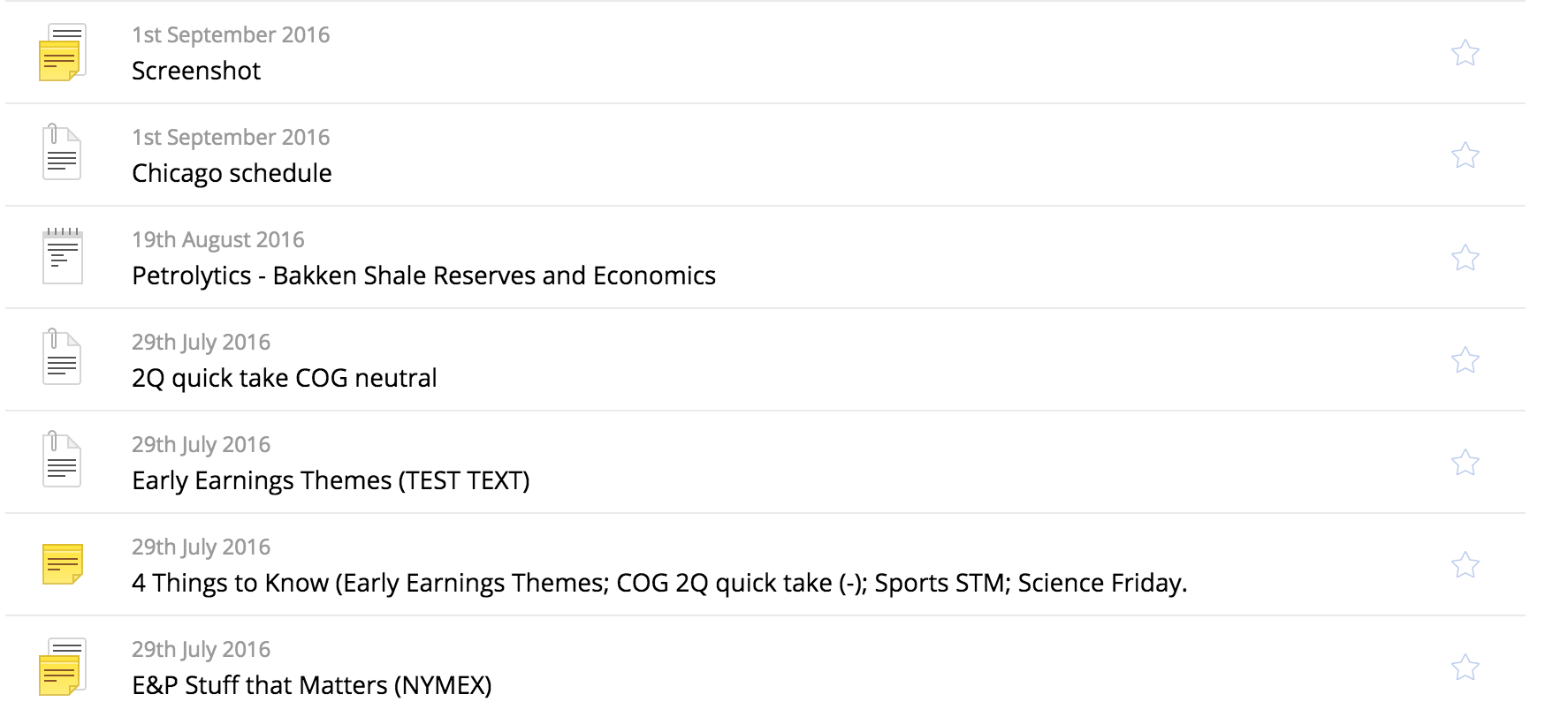
I'm working on this iOS / web service, which sells analysis focused on petrol market, its companies, research and other stuff. The main screen of the app is basically a list of documents (analysis), displayed in chronological order.
Problem
When we released the service it had only 5 different products, which should have been set in the stone for some time (but you know how it goes). It quickly escalated to 14 products and it keeps growing. At first, differentiating them with icons sounded like a great idea. And the products had names like "Morning Notes", so making a printed document icon with a coffee stain was a must. But there is only so many ways how you can design a document icon, and its even harder when the product names a get very specific like "Basin Quarterly Research".
So ...
Question(s)?
- Are icons enough to distinguish different products? Even if the difference between them is getting smaller with every added product?
- Is it even an issue?
- I also have a case, where using different icons is not an option. So I partly agreed to use color (until I find a better solution) but there are too many issues with it. What do you use then?


