14

Take a popup that closes automatically, either by losing focus, by other elements being brought into focus or clicked, or upon expiration of a set display time. Is providing a redundant close button on this popup necessary?

Compare the two examples shown side by side in the mockup below. In the first example, the popup appears when the combo box header is clicked and disappears when the combo box is clicked again or any other element on the page except for the popup is clicked. In the second example, the popup appears when a point on the map is clicked and disappears when another point on the map is clicked.
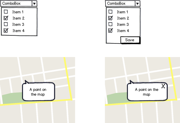
mockup

download bmml source – Wireframes created with Balsamiq Mockups

I can also provide an example where a right click opens a context menu containing the close button. But I prefer not to place a close button in a context menu. If there is also a different UX standard about this I would like to know about it.

4
  • See also How important is Close button in an expanded view?
    – TripeHound
    Commented Aug 26, 2016 at 16:10
  • 1
    You don't talked about audiences. It is depends on your audiences. Commented Aug 27, 2016 at 9:01
  • In the second example, if the popup appears when you click on a point on the map, and disappears when you replace it with another popup by clicking elsewhere, then how do you return to the state where there is no popup? What happens when the user wants to view the map without any popup obscuring it?
    – JBentley
    Commented Aug 27, 2016 at 16:21
  • To me (and I'm no UX expert), seeing that little x in your second example tells me that clicking outside of it will not dismiss that box (it's persistent until I click the x). Without the x, I would expect a click or interaction elsewhere would close it (it's more of a temporary thing).
    – Steve
    Commented Aug 28, 2016 at 14:07

3 Answers 3

30

A combo box has a specific interaction which has not changed for decades. Its interaction is aligned with a simple user goal - to select one or more items. Most users will expect this interaction. Note: A combo box does not have a pop-up - it is an expandable/collapsible list.

A tooltip has a completely different user goal - it is to provide additional information to a user, and it is normally displayed when someone moves the mouse cursor over an object, and disappears when you move the mouse cursor away from the object. Most users will expect this interaction.

So you should not expect the combo box and the tool tip to have the same interaction, and to compare them is wrong.

However, what you are describing is a pop-up styled to look like a tooltip which is being triggered in some way (click or tap) to persist on the page, so you should display something explicit which allows the user to close it.

Now, there is nothing wrong in closing your pop-up by clicking/tapping elsewhere in the page, but this is a hidden interaction which needs to be learned, but it does not hurt to also include an explicit close icon, so that it is abundantly clear how someone closes it. Redundancy (multiple ways to achieve the same thing) can be a good thing.

7
  • Customers pay to use the application I am working on. So they have learn to use it. Also we provide training courses to new customers. In a situation like this, it is easy for customers to learn how to close a pop-up. I personally think that the closing behaviour is also intuitive. I am an UX noob but I think UX is also about expanding the user's exprience. Could you say it depends on the context? Commented Aug 27, 2016 at 9:29
  • 5
    @GökhanKurt "...and disappears when another point on the map is clicked" Presumably opening another popup? And to close that popup, you click elsewhere on the map, opening a third popup? That would frustrate me to no end. I think the close button is needed.
    – Nateowami
    Commented Aug 27, 2016 at 11:30
  • 7
    @GökhanKurt Why purposefully design a system that requires learning/training when you could design one that doesn't? The argument that if a customer is paying, they will be happier with a learning curve than someone who doesn't pay, makes no sense to me.
    – JBentley
    Commented Aug 27, 2016 at 16:22
  • @Nateowami Precisely, the pop-up disappears on mouse down on any point on the map. Also if the pop-up is open, the first click doesn't open another pop-up. I am actually using this behavior right now and it seems to work well. Google Maps also uses it but it also has a close button on the window. However, I noticed I don't ever click that close button but instead click somewhere on the map to close the pop-up. Commented Aug 27, 2016 at 16:29
  • 1
    @GökhanKurt: "I noticed I don't ever click that close button" -- in general that is quite a bad reason to omit a UX feature that's typically present in similar apps. "I studied many users, and few or none of them used it" is a better reason. Of course the few who do use it will hunt you down, but that's the risk you take messing with their expectations. If you turn out to be right and them wrong, and they do better without it, then they'll recover in time. Commented Aug 28, 2016 at 17:39
17

A tooltip without a close button lacks affordance on how to close it.

Therefore, users would want to close the tooltip but may not know exactly how. It's not evident that clicking anywhere else on the page will close it. This can cause confusion and even some novice users might leave the current website/app because they might change or mess something.

That is why there should always be a visible close option for the tooltip. However, this does not concern tooltips that are closing when they lose focus.

2
10

To add to the answers already given, let me say that if the two ComboBox mockups you show are intended to be equivalent, at least one of them is confusing/misleading.

Having a "Save" button implies that changes will not be saved unless you click it. If the changes are saved automatically even if you click away or close the window, without clicking "Save," you shouldn't have a "Save" button at all as it is misleading.

The mockup without the "Save" button implies that changes are saved automatically.

Assuming changes are saved automatically, I would recommend no "Save" button on the ComboBox mockup. Neither would I recommend a "Close" button as it could similarly be confused with "Canceling" the changes made.

A "Hide" button could be appropriate as it doesn't imply anything about saving or canceling changes.


For the "point on the map" popup, the small X button is a good idea for reasons discussed in the other answers.

3
  • 3
    Yes, this, exactly. I was about to post the same thing. The save button implies that not saving is an option. Then, if the user intends to discard their changes and so just clicks outside it without clicking save, they'll be surprised and possibly confused that they were saved. I'd actually expect to start seeing a few bug reports along the lines of "Changes are saved even when I discard them".
    – Jason C
    Commented Aug 27, 2016 at 1:19
  • "The mockup without the "Save" button implies that changes are saved automatically." I disagree. If I saw that mockup, I would be looking for a save button somewhere else on the page - I wouldn't assume it would be saved just because I had selected some items and closed the popup.
    – Dezza
    Commented Aug 27, 2016 at 10:41
  • @Dezza, in that case I recommend you never use Apple products. Settings in both macOS and iOS are almost universally saved without requiring you to click "save." But, did you see what I said in the answer about a "close" button?
    – Wildcard
    Commented Mar 30, 2017 at 18:48

Your Answer

By clicking “Post Your Answer”, you agree to our terms of service and acknowledge you have read our privacy policy.

Not the answer you're looking for? Browse other questions tagged or ask your own question.