1

I have a situation, Where a user lands on a page full of photos of team members upon click I have to show description/content regarding the particular. But my question is, do we need to show CLOSE option? Isn't self-explanatory that user has to either click on next picture to see more in regards or click on the same user to collapse the expand.

Real scenario/behavior is exactly how Google image acts upon click, where you search for a picture and click on particular, and you see CLOSE on top right corner and rest of the images are pushed down.

How do I solve this?

4
  • 3
    So, what is the reason to not have a close button? I don't see any downside at all to having it.
    – user31143
    Commented Aug 11, 2016 at 8:09
  • 1
    I do not think that closing on clicking on the same image is intuitive. I guess that is why Google does have the close button in the expanded view as well. Clicking next image is fine, closing is not. Close is a vestige of old UI habits and it still has a lot of following especially when you have varied user base.
    – Harshal
    Commented Aug 11, 2016 at 9:08
  • 1
    I'd echo dan1111: why not have a close? For me, the CLOSE icon on Google's image page is too inconspicuous and one several occasions -- on semi-autopilot -- I've used BACK to try to get back to just the thumbnails and ended up on the previous page. If their CLOSE "X" was more prominent, I might have done this less.
    – TripeHound
    Commented Aug 11, 2016 at 11:07
  • 1
    @dan1111: I don't see a downside too. But I was wondering that why do we need to add an additional action! but after the discussion, I seem to clear that CLOSE plays an important role and it reduces cognitive load and of course It's been a tradition since and best to follow.
    – Harshit
    Commented Aug 12, 2016 at 5:43

2 Answers 2

2

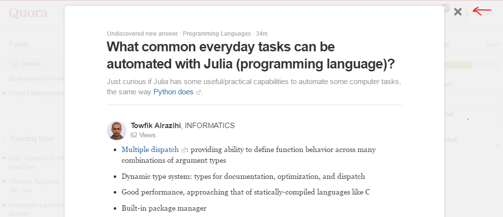
In my opinion, there are still a very large number of users who are used to searching for these options, like the close button icon/text even though back of the mind they know that pressing the escape button too will have the same effect, and it is for the same very purpose that big websites like google-images, facebook, quora and lot more...

enter image description here

6

I always think we should offer users a couple of ways to achieve tasks that may be driven by habit rather than cognitive effort. Closing a panel/modal/expanded view is one of these tasks; the user just wants to close the view, not think about how to do it.

Some users may well have developed the habit of simply moving from one view to another. On the other hand, some users may be in the habit of closing each view before moving on to the next.

This would make an excellent subject for some quantitative guerilla testing: You could draw up a wireframe of your expanded view and ask one of two questions to each respondent, a) "how would you close this view?" or b) "how would you move to the next image?". I would hypothesise that you're likely to find close to a 50-50 split between users favouring the clicking close button and users selecting the next image.

If you choose your respondents from your target users then you should get a really good idea of how they'd respond.

As a side note, I'd suggest creating a couple of tests on Usability Hub and mailing out the links at random across your user base - be generous with your links as you probably won't get a high response rate and you still want a good sample size. Usability Hub will tell you if the result is statistically significant or not.

1
  • 2
    Well, after looking at your comment @AndrewMartin: I actually did a small group test which got me the same answer why not CLOSE!. So I'm going ahead with close now. Thanks for the wonderful help!
    – Harshit
    Commented Aug 12, 2016 at 5:18

Your Answer

By clicking “Post Your Answer”, you agree to our terms of service and acknowledge you have read our privacy policy.

Not the answer you're looking for? Browse other questions tagged or ask your own question.