1

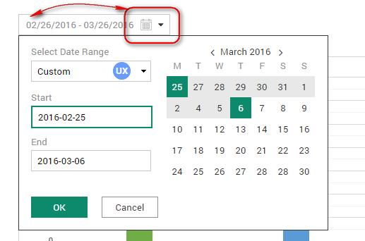
I am thinking about both UX and UI date picker look. Here is the date picker I fighting with :)

enter image description here

So, obviously I have both calendar icon and arrow icon on right side. The arrow indicates the behavior of input field, and calendar icon associate date picker. At very end whole field should be clickable.

I am thinking about two solutions:

  1. Place calendar icon on left side, and keep arrow on the right.
  2. Remove arrow and keep calendar icon on the right side.

Hint: Following the style-guide that we have the label for search field is placed on right side within whole web application that we are developing.

5
  • Can you elaborate a little more on the purpose of the arrow. What are you selecting when you click it?
    – SteveD
    Commented Aug 4, 2016 at 9:05
  • Also, who is the user and what is their goal, which ends when they click the OK button?
    – SteveD
    Commented Aug 4, 2016 at 9:11
  • There is a table bellow which consists of some reports. So the user choose the time range he wants to see reports.
    – Jerry
    Commented Aug 5, 2016 at 12:44
  • Thanks - this is actually the context that is missing from your question. So you have a table of reports and the purpose of this feature is to filter the list of reports in the table to only those Reports which fall within the date range?
    – SteveD
    Commented Aug 5, 2016 at 12:55
  • @SteveD Just like you said :)
    – Jerry
    Commented Aug 6, 2016 at 7:02

3 Answers 3

1

You have 2 options to choose from:

I think from the visual affordance standpoint, 2 visual clues are not required for the date picker input. Either the input can have a date picker icon or just a placeholder text with an caret (mm/dd/yyyy).

Option 1: Input with mask and date picker icon

enter image description here

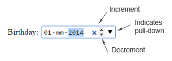
Option 2 (HTML 5): Input with date format as a visual clue which indicates that this field is date entry.

Default State:

enter image description here

Hover State:

  1. Displays the incremental (^), decremental (v) and caret (V).
  2. Clicking on ‘v’ arrow, launches the calendar

enter image description here

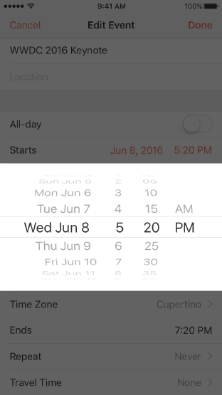
IOS uses text format "Jun 8, 2016 5:20 PM" as a visual clue for date picking.

enter image description here

Placing the caret icon towards left in input, probably requires some research and usability testing.

0

Its matter of consistency or parallelism. If you do have other icons for rest of the entry fields then it will be best to group them all on the right side. The chevron is an indicator that there are more options when clicked or selected. I agree its too much having icon and chevron but again its matter of design preference as long as it does not affect the actual function. Others would use this to cover the white spaces and balance the look.

0

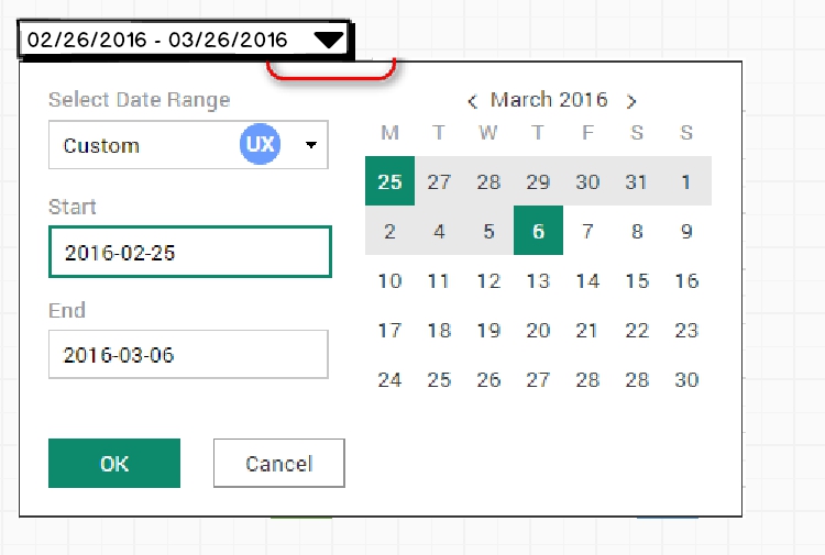
If the whole field should be clickable and display some information, and I insist on that, I would delete the calendar icon and only place the caret on the right. That will looks like a dropdown, which is the kind of behaviour you want. enter image description here

The reason behind my choice is that your design looks like a flat design, and you icon can be misunderstood to be a 'flat' minimalist button. An icon looks cool, but in your case, it doesn't give any additionnal information to the user since you display a date, which is pretty clear.

With that solution you have maximal affordance with less elements, which is the best option in my opinion.

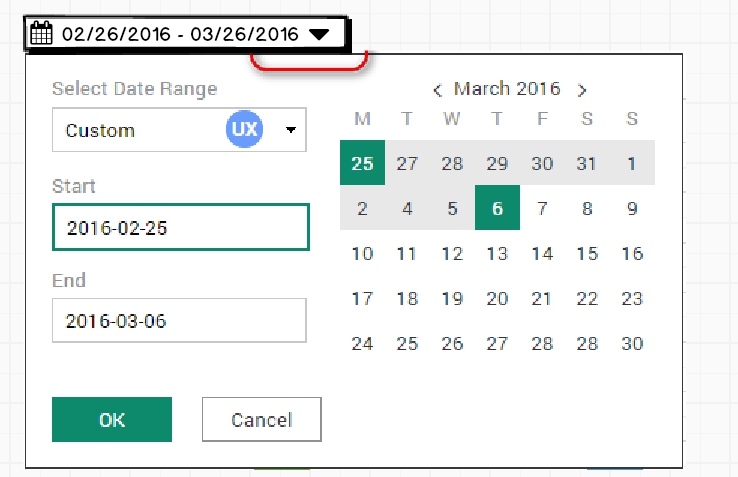
EDIT : I tried the icon and caret combination, it looks pretty confusing and overloaded to me : enter image description here

Your Answer

By clicking “Post Your Answer”, you agree to our terms of service and acknowledge you have read our privacy policy.

Not the answer you're looking for? Browse other questions tagged or ask your own question.