1

I'm working on a service that handle users which have a position in the system. The service is flexible in that positions can be of any dimensions (understand, 2D or 3D or... well 4D even if that's probably unlikely).

In my service status page I want to represent the position of all users in the space, as well as the space itself, which is split in several "zones".

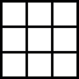
For the 2D case, this is trivial (I think), as I can just go the traditional way of displaying a grid of zones and on top of it, points for each user.

Everybody seems to understand that at first sight so I guess it's kind of the right way to go there.

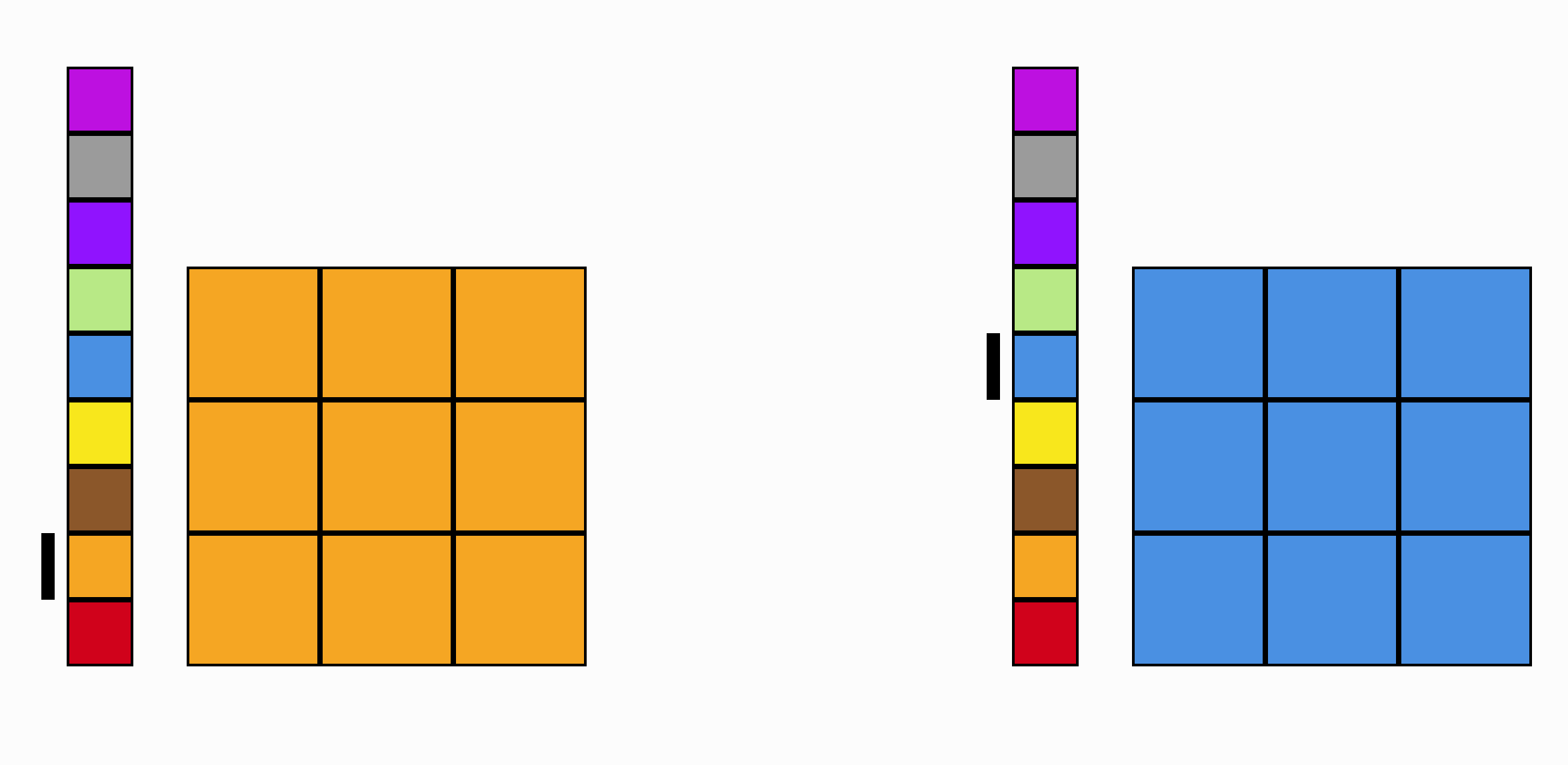
enter image description here

A 3x3 world space. Each small square represents a "zone".

My problem is for the 3 dimensional case:

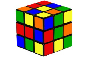
enter image description here

A 3x3x3 world space. Each small cube represents a "zone".

I just took the picture of a Rubik's cube here, but here is basically the problem I'm facing: I can't find a way of representing the whole space in a way that makes it understandable. I obviously made the representation with some transparency (but can't share the real image for corporate reasons).

The 3D-mapped-to-2D representation does not allow me to easily select a zone and there is always ambiguity as to which zone exactly a user-point is located in. Making the cube rotate on some user action is not viable as my typical user is not a 3D specialist (and I feel my design should adapt to its users, not the other way around).

The 4D case is even more of a nightmare. I can't even begin to imagine what it should look like.

I may be totally wrong with my way of approaching this problem, and could do with some help right now. I do hope my question, as it stands is a good fit for this site. I am obviously not a UX designer and despite my many recommendations to hire one for our team, that is just not happening.

What is a good way to represent such a n-dimensional space of users in a way that makes (zone) selection possible ?

1

4 Answers 4

1

The media where you are trying to represent your model has 2 physical dimensions. You are using the position in your example. The model is understandable until you try to represent a third dimension.

So using position to represent your model works until the second dimension. From there on you need to find a different way of representation.

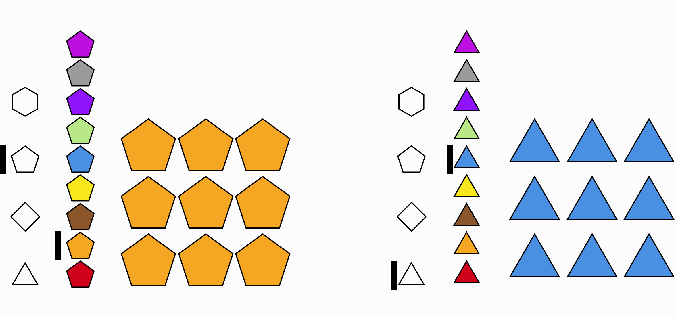
Color can give you a new dimension to be used as the third one, for example.

3d

Shape could be used for a fourth dimension. And so on.

enter image description here

In this last example the dimensions are represented:

  • 1d: position x
  • 2d: position y
  • 3d: color
  • 4d: shape

However, you could use different properties instead of position x and position y.

1
  • This seems to be the best option, though I'm not sure color and shape are the best ways to label the dimensions. Textual labels would probably be best, if that works. Mar 6, 2017 at 19:53
0

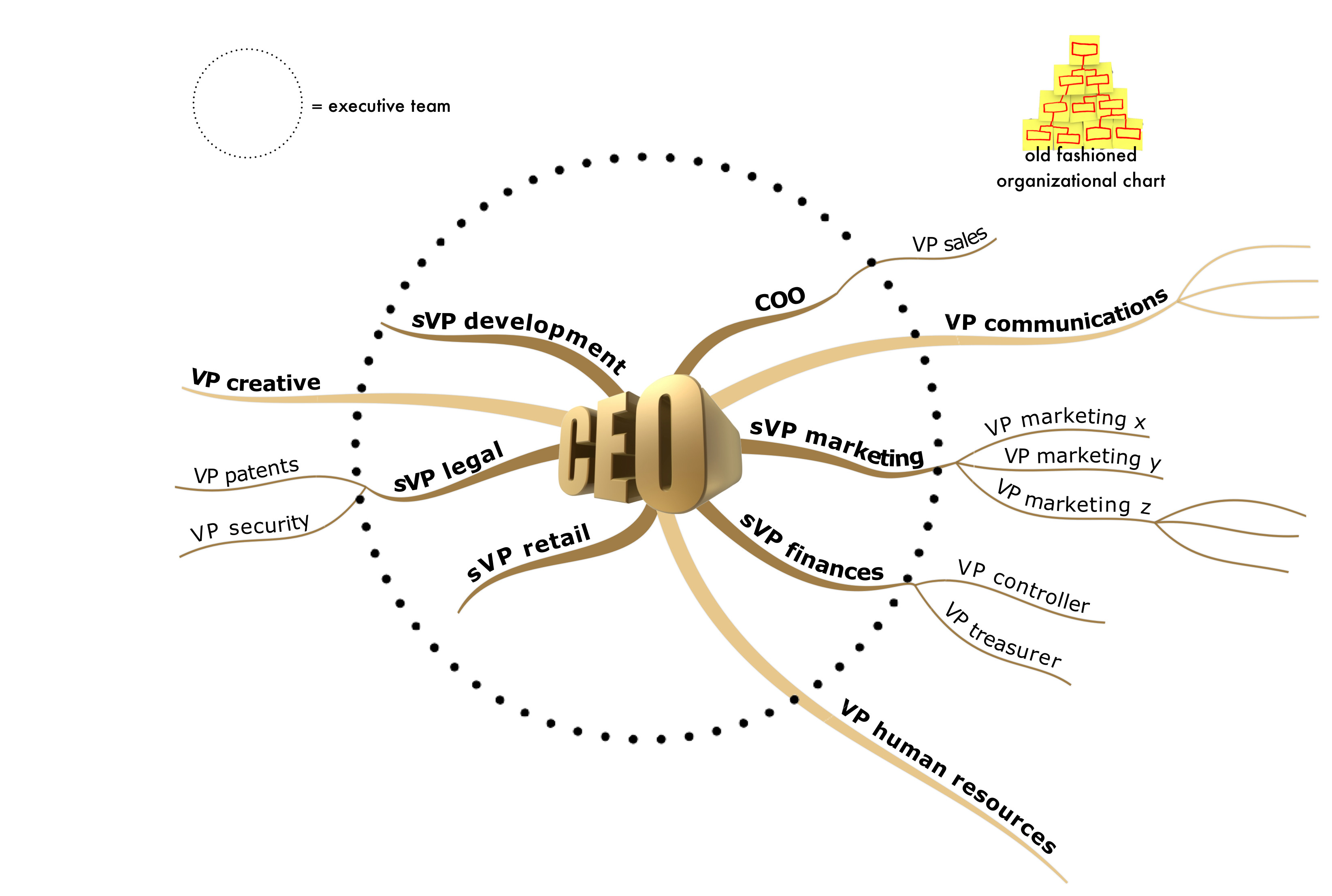
Have you considered a mindmap UI?

https://en.wikipedia.org/wiki/Mind_map

It should scale better for what I think you are trying to do.

enter image description here

0

Posted this as a comment, but it's not bumped the question up the page any so might as well give a longer waffle:

Parallel coordinates are used to represent n-dimensional datasets in visualisation circles - https://en.wikipedia.org/wiki/Parallel_coordinates Interactive version here: https://bl.ocks.org/jasondavies/1341281

Their advantages are that every dimension is represented equally and filtering is pretty intuitive - each axis effectively has a range slider. The disadvantages with using the x,y,colour,shape scheme above isn't so much you run out of attributes but that some of those attributes are much more dominant than others - position (x,y) and colour are pre-attentive, shape and others like area and texture aren't.

Disadvantages to Parallel Coordinates are they're not that common outside vis circles so will need explaining to first-time users, and that each user is not represented as a point, but as a line, which confuses some.

0

TL;DR - I suggest that a plain old table is best to visualize the data, with form inputs for select, unless there is a strong reason otherwise.

Adding to mgraham's response, anything in n-dimensional space can be represented in code by a vector. In 2D, [1,3]. In 3D [4,1,7]. Etc.

As to visually representing this back to the user, the main problem to me is what the user understands, or expects to see. Below are some examples:

Are you representing a user in finite, limited, 'actual' space? Like in a skyscraper? If so, a spatial representation (grid, cube) makes sense. They are on floor 6, room 3, hall 4. Easy. Selection is still a challenge, but there could be form input to select each of these values. (enter floor: __)

Are you representing a user in infinite or sparsely populated space? The above representation fails, because you may need to show a grid that is 1*10^30 long. Also, it may be difficult to select beyond the displayed bounds. Similarly, anything with values encoded as spatial differences will be bad, such as with parallel coordinates.

Are you representing features of a user? For example: age, salary, etc? If so, spatial representations may be unexpected and confusing. In this case, a wide table may be most sensible. It would have a user as a row, and each column a dimension.

Your Answer

By clicking “Post Your Answer”, you agree to our terms of service and acknowledge that you have read and understand our privacy policy and code of conduct.

Not the answer you're looking for? Browse other questions tagged or ask your own question.