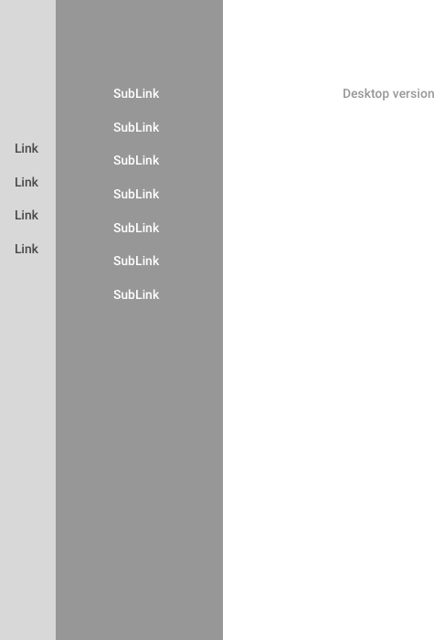
I got stuck with dealing making two sidebars for mobile screens. How I can make responsive to display nice on mobile? Maybe it's some pattern?
Thanks.
I got stuck with dealing making two sidebars for mobile screens. How I can make responsive to display nice on mobile? Maybe it's some pattern?
Thanks.
I create a little prototype to deal with this situation on devices with little space. You can find it here http://5rsg1w.axshare.com/
https://i.sstatic.net/AFl3z.jpg
The dissadvantage here is: the user have to click twice to reach a link on the first level navigation. You can improve this by adding a splitbutton-pattern on each link:
https://i.sstatic.net/UC0Zr.jpg
This example is shown on the second page of the demo.
Can you elaborate more ? Are you seeking an answer from
user-experience/programming perspective ?
If programming, then you should search for three column layout design such as
Additionally, if you really want to see more creative and clean design of the sidebar while learning how to structure your web application and other great tricks.Check this codyhouse. They have implemented a clean, user-friend and responsive sidebar (Demo) and (source-code).
Hope this useful.