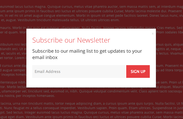
I would 100% argue that these pop up modal windows take away from the user experience - I don't think there is much doubt about that. You mentioned that they destroy the flow of reading the content and I think that any user would disagree.
The reason they are used, is because they likely are successful. I guess it's going to come down to what's more important - the user's experience on your website or conversion rates. I suggest a balance of the two.
Personally, I can understand why it's used (particularly on landing pages, where the user's attention span is often shorter), but I think it's a lazy solution.
There are plenty of better ways of capturing an email without impeding on experience.
Examples?
- The InVision blog - as you scroll, a newletter signup appears in the header. It's always visible on the page, so if you want to sign up you can always do it - but it never gets in the way. Services out there like HelloBar make it really easy to implement this.
- Ask for a sign-up midway through your content. If you've a lengthy blog article, putting a sign-up halfway through the content not only breaks up the piece visually, but also means it'll only be seen by the most engaged users, resulting in a better engagement rate.
That being said, sometimes, if it's just about leads - the popup window is hard to argue with for conversions. I just think there's cleverer ways of doing it.
In terms of it being a dark pattern, personally I don't see it as a dark pattern. A dark pattern by definition from darkpatterns.org:
A Dark Pattern is a user interface that has been carefully crafted to trick users into doing things, such as buying insurance with their purchase or signing up for recurring bills.
I don't see these as being 'tricks' - it's lazy but without ill intent in my opinion. A dark pattern is more likely to have something a bit more sinister about it (in my opinion, often money-related - think aeroplane websites, ticketing insurance).
In terms of studies
A great article to read is over at Nielsen Norman - Overuse of Overlays: How to Avoid Misusing Lightboxes - they discuss lightboxes more generally, but you can see how it would apply to your question I'm sure.
There's a more directly related article over at usertesting.com worth a read too -- you can find it here.

