0

I can't give the exact purpose of the app (under NDA!) but I'm trying to design an interface that lets you explore data about various data objects that are all interlinked. I have an idea of how to do this but want some feedback on other approaches.

Some example objects, one of type person and one of type project (where many people can be on one project and one person can manage many people):

Type: Person
Name: Bob
Age: 32
Salary: 20000
Manages: [Alice, Fred, James]
Projects: [ProjectX, ProjectY]
Company: [Company1, Company5]

Type: Project
Name: ProjectX
Members: [Bob, Fred]
Budget: 23000

I have maybe 10 other types, where some types have about 20 properties and many of the properties are lists of references (which can be up to 50 items long) to other objects.

The interface I'm going with so far has a category sidebar on the left and a details pane on the right. When you start the app, it lets you browse all the objects by category:

Overview

   Sidebar  | Details
----------------------
> People    |  Alice (Age: 33, Salary: 303000)
            |  
  Projects  |  Fred (Age: 31, Salary: 403000)
            | 
  Companies |  Bob (Age: 35, Salary: 503000)
            | 

Here the people category is selected and you can see all the person objects on the right. If you select Bob, the interface is replaced with a similar layout that lets you browse the details for Bob:

Viewing person Bob (Age: 35, Salary: 503000)

   Sidebar | Details
----------------------
  Summary  |
           |  
> Manages  |  Fred (Age: 31, Salary: 403000)
           | 
  Projects |  James (Age: 51, Salary: 533000)
           | 
           |  Alice  (Age: 41, Salary: 233000)

The extra "Summary" category can be used to display non-list properties about Bob e.g. age, salary, date of birth, location. You can then continue browsing this way by browsing to a different person, a different project etc.

To help with browsing the objects, the user needs a way to go back to the previous object and also back to the overview/root. I was thinking of adding a "back" button and a "home" button like in a browser for this.

  1. Is there a better way interface I could use? One concern I have is the user might be confused at what happened when e.g. "Bob" is clicked on and the whole interface switches from being about the Overview to being about Bob. Should I be using something like nested dialogs to help the user realise what's going on? I find it hard to explain but I prototyped this and it doesn't feel right at the moment.

  2. Are there interfaces that exist for browsing similar data and does this general type of interface have a name? It's vaguely like Apple's Finder interface but there the sidebar doesn't change.

3 Answers 3

0

I think the answer here has to be a very firm "it depends".

It sounds to me like you need a few different things:

  • A means to see an individual object that you're currently looking at, and clearly see both the common properties and the specific properties for that type of object.
  • A means to see where that object is connected to other objects, and the nature of those connections.
  • A means to navigate along those connections.

Whilst it's not always necessary to expose it, it's a good idea to have some kind of taxonomy by which you can enumerate the possible ways that each type of thing can possibly be related to each other type of thing and what properties need to be exposed in each case. It doesn't have to be much, but it'll help enumerate what what exactly needs to be shown.

Once you have that taxonomy, no matter how rough it is, you can start to design a way to meaningfully display each kind of thing and the various relationships.

What are similar UIs

The closest analogy I can think of to how to display an object is based on how social network profiles operate - think of each object as a person, and each property as something they've decided to enter into their profile.

It might seem like an odd analogy, but it's one that'll typically work.

Think of all your kinds of things as being analagous to people, organisations, groups, friends lists, block-lists and so on... It's a pretty close analogy, one that's fairly widely understood. It includes items with both properties and relationships to other "items", often with different types of relationships (assorted friends lists & groups, block lists, etc).

So, with your example, you'd design a mechanism for showing those profiles, and for exposing links from each profile to related profiles - along the lines of links to friends, acquaintances or co-workers on social networks.

My approach would be to have common behaviour and visual components for all types of "profile", but with visual (including textual) distinctions to provide cues about which type of thing you're looking at. So that (using your example) people, projects and companies are all presented using the same framework and layout tools, but with different visual cues layered on to them to help a user immediately tell when they're looking at a different kind of thing.

That common behaviour would need to cope with the idea that there are some properties which are common to all types, and some properties which are specific to only one type... so a component based layout would seem like an ideal fit.

Something else I think you need to think about, though...

Is your data hierarchical or not?

Is your data a tree - is there a "top level" object with child objects, which in turn have children? If so, you're looking at hierarchical data.

Is your data a graph - is there no top or bottom, and the relationships are all non-hierarchical, or with multiple hierarchies depending on how you look at it? If so, you're looking at a graph, and they have a different set of needs.

If you have a tree, then your options for navigation are much simpler, as navigation trees and breadcrumbs are viable - wayfinding in a tree is well understood and you can make use of well established patterns.

If you have a graph then it gets tougher, as there's no "top" to drive breadcrumbs or navigation from. In that situation, you're going to need a different kind of entry point. When faced with that exact problem, I've than the approach of providing a count of each type of object as the top level view. So the behaviour for browsing navigation is as follows:

  1. See a list of types of object
  2. Click a type of object that I want to find
  3. See a list of all objects of that type (with sorting, filtering, etc...)
  4. Click on an item in the list
  5. See a "profile page" for that object, with clear links to connected objects.

Given that you can start anywhere and browse around in any direction without ever having a "top" to match your position to, it's a very good idea to have the following too:

  • A good "baked in" search / very clear links & metadata for search engine indexing
  • A strict "don't break the browser's back / forward button functionality" policy
  • A strict "every object can be accessed directly from a reliable, consistent URL" policy (if it's a browser based UI).
2
  • Thank you very much for taking the time to write all that. You've given me a lot to think about! To relate to what you wrote, my data is graph. I think what I'm going with is similar to what you wrote at the end but with a shortcut button to jump back to the initial top-level overview interface. The user will mostly be browsing the overview and drilling down into a few objects+connections but will rarely go more than say 2 levels deep and will frequently need to return to the overview again. I'm going to try varying the colors, text etc. when the currently viewed object changes as well.
    – hvrpn
    Commented Jul 8, 2016 at 9:29
  • Not a problem - glad you've found the response useful! Commented Jul 9, 2016 at 15:53
0

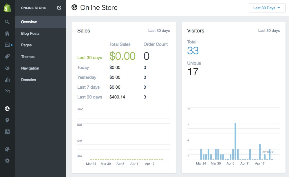
The Shopify backend comes to mind.

enter image description here

On the left you have the main navigation. Every directory has a sub directory.
When a sub directory is selected (like in the image) the main directory folds in. This will keep the main directory still visible and accessible.

0

Tags are the first thing that spring to mind. Consider the StackExchange's own various subsite tags (for example you've tagged this as GUI Design, Browser and Relations related)

This lets you stamp whatever area you're in with the tags that relate to it, and allow people to navigate to other places with those same tags by clicking on them, as well as allowing people to 'favourite' tags that they use often and build their own UI (within reason of course) that works best for their specific workflow.

This system also allows you to add theoretically unlimited subsets without having to manually add anything to the design.

Your Answer

By clicking “Post Your Answer”, you agree to our terms of service and acknowledge you have read our privacy policy.

Not the answer you're looking for? Browse other questions tagged or ask your own question.