1

I have a rather complex form that might require some additional information to the user so (s)he might be able to fill in the form correctly.

Just above the form, there is a piece of brief information about the form, but in some cases that piece of information is not enough.

In order to display additional information about how to fill in the form, I have three suggestions: There is a button labelled "How do I fill in this form" or something similar. When clicked, the help information will be shown...

  1. In a smaller browser window above the form. That window is striped down so only the text and borders are left and there is an obvious "close" sign in that browser window.
  2. In a new tab along side the current tab.
  3. In a new layer in the same browser tab, dimming the background and with an obvious "close" sign.

Which one of the proposed solutions is the moat user friendly and why? Are there some other perhaps even better solutions?

This question is not about why the form is so complicated, that just the premise of the discussion and nothing I am able to fix.

Edit 1: This form will be uses many times each day so the users will learn how to fill in the form in time. Therefore, there is no need to always show information about how to fill in the form. Still, when new users arrive, or when people get back from vacation, the information has to be easy to find.

2
  • Is this additional information field specific and/or section specific?
    – SteveD
    Commented Jun 10, 2016 at 8:51
  • It's rather more field specific i.e. what to enter in each field. Commented Jun 10, 2016 at 14:03

1 Answer 1

3

All of the 3 proposed examples in my opinion assure bad usability. I think you have two main options:

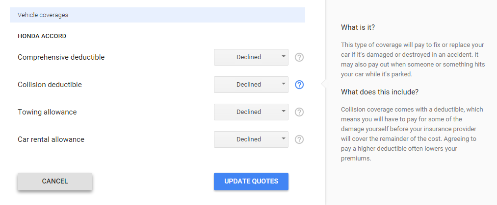
Show the help text on the page when the input element is highlighted.

This way the user don't need to do anything, the help text is rendered when he selects the intended input field. That makes it easy for the user to spot the help text and read it if he/she needs. In my opinion that is the most efficient way to show help messages.

enter image description here

Use tooltips

Tooltips doesn't take much space in the screen, and work quite well on desktop. However, mobile users might have some difficulties using tooltips, specially if they are triggered on mouse hover. For the mobile devices you should trigger them on tap/click.

enter image description here

I would suggest using the first way of displaying help messages because it better supports mobile devices, it does not require the user to hover or click to activate it, and its already on the screen. Overall, its more usable.

1
  • When choosing between these two examples, the first one is the best of course choice. My users will use that form several times a day and they will eventually learn how to fill in the form. Updated the original post with that information. The challenge with that solution is when people, due to accessibility reasons, changes focus from the input to the text (i.e. people using screen readers and/or magnification), the extra info at right will disappear. Commented Jun 10, 2016 at 14:25

Your Answer

By clicking “Post Your Answer”, you agree to our terms of service and acknowledge you have read our privacy policy.

Not the answer you're looking for? Browse other questions tagged or ask your own question.