Go with the flow
Seems to me your users are telling you the solution: make right motion increase the annuity proportion.
You see the slider as some kind of horizontal stacked bar chart, but your users don't. They see it like a car's AC/heat control. So don't fight it.
Make a stacked bar chart more like a stacked bar chart
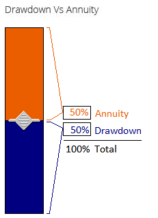
If you really must have the gap between the text boxes represent proportions, you can try making it more like a stacked bar chart --turn the slider sideways. Make the track wide. And, yes use the colors. Color the text box labels and values to match the "bar" colors to make the association. Put the labels beside the bars, not at the extremes of the slider (top and bottom for a vertical one), so it's associated with the bars more than the direction of motion. Dynamic brackets may help.

Obviously, this would need to be a custom-made control (e.g., in Flash), which may not be worth the development resources. I'm skeptical you'll have sufficient success using a standard slider because the whole problem is you're making a slider that works opposite of what users expect of a slider (where sliding towards a label at one end gets "more" of it). To avoid that problem you need to make the control not look like a standard slider.
Only a usability test is going to tell you whether going vertical, thicker, moving the labels and text boxes, matching the colors, and adding dynamic brackets is going to get users thinking "this is a stack bar" rather than "this is like an AC/heater control," but it sounds like you're doing usability testing so you can find out for your users.
FWIW, I tried the drawing below on five people in my office this morning (including one small re-design iteration), asking "What would you do if you wanted to increase the Annuity to 75%?" One-and-a-half said they'd pull the slider up. Three-and-half said they'd pull the slider down. ("Half" because one user changed her mind from "up" to "down" after looking more closely at it). I'd say it still needs work, but maybe it's better than what you were getting with an ordinary slider, so, again, if you feel you must have the gap between the text boxes represent proportions, then this approach may be a good starting point.
The more general advice is that if you're going to use a metaphor or association, like "stacked bar graph," then the more your graphics invoke that metaphor/association, the better it will work.
No slider
Maybe you don't want a slider at all. Sliders are best when the user is making an adjustment to the point where it "looks good" (or sounds good, in the case of an audio presentation), rather than trying to achieve a specific value known beforehand. Before, during, or after making the setting, sliders are great for giving users an at-a-glance general impression of where they are on a scale.
However, if users almost always arrive at the page with specific value in mind, you may be better off with simply two text boxes. Sliders are kind of a pain to get to a precise value (e.g., exactly 33%), and aren't so good at checking a precise value (33% versus 30%). Using text boxes also saves real estate. User research will tell you what the deal is.
Two editable text boxes can be coordinated so that changes to one update the other in real time to keep the percents totaling 100. See, for example, how Google coordinates the texts boxes for its Unit Converter (Google, say, "meters to feet" to see it).
Put the text boxes together in a frame labeled "Drawdown vs. Annuity" so users will be more likely to see them as associated. That's about all Google does and may be all that's necessary. If it causes confusion, it might help to have static read-only text below the two text boxes showing they (always) total 100%. If you're up for building a custom control you could try adding a small noninteractive graphic between the text boxes showing relative proportions. I'd go with a pie graph rather than a stacked bar to avoid confusion with a slider.
Of course, you can have both the slider and the editable text boxes if some of your users are going by looks while others have a value in mind beforehand. In fact, I assumed that's what you were doing.
Mumbles to self
Why can I never give a short simple answer? Maybe I should've stopped with the first sentence.


