2

I am building a page that has to be mobile friendly. This page will have a lot of master detail data and I was wondering what the best practice is. I found a lot of articles on the web but they give, I would like to call them, abstract guidelines rather than working examples.

My idea was to put a button on the master view that would say 'View details'. Clicking on that button would take user to details view for that particular master row. Details view is just a grid with all the details and clicking on edit button for particular row would take user to edit detail view.

Any suggestions or link on working examples?

1
  • 1
    Can you provide a screenshot or mock-up of what you've got so far?
    – Monomeeth
    Commented May 23, 2016 at 22:36

2 Answers 2

1

On phones, some common master/detail patterns are

  1. New Page drill down. That's what you have so far, but I would make the most common action available with a single tap.
  2. Expand/Collapse a list item. You can show the details on part of the screen, i.e. as part of an expandable list item section. This is useful when you don't want to lose the context of the main list.
  3. Flip. You can use animation to make the item appear to flip over to reveal details on the back. This works better on larger items like a card than a list.

If you're including tablets, then a bunch of other patterns are viable that only update a section of the page, i.e. a split view.

0

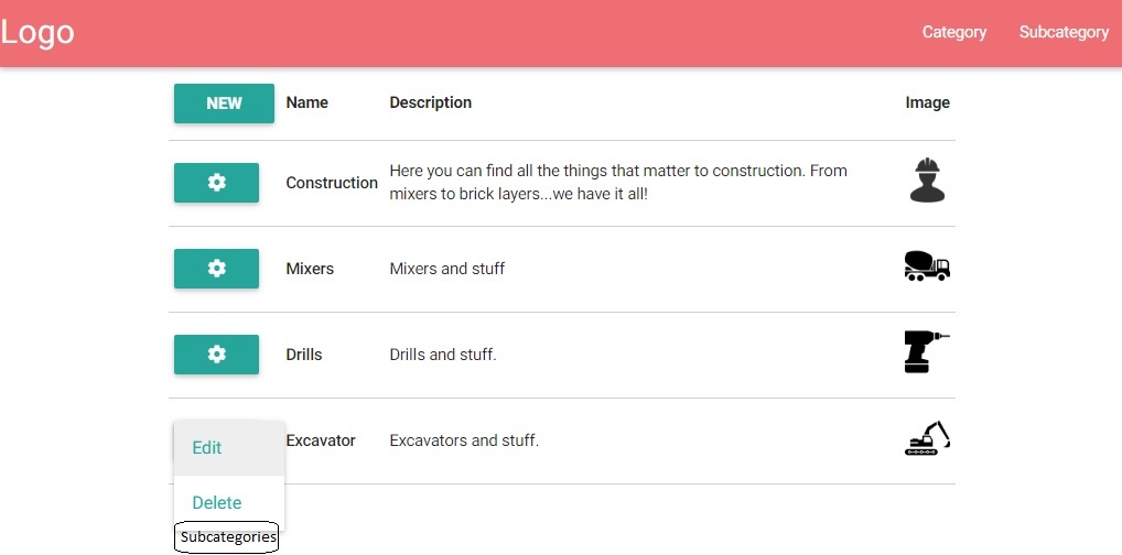
This is what I got by now and I am partially happy and I do not know for which reason. I guess if I saw the right thing I would immediately know it is the right choice.

For starters I would have a categories listing.

enter image description here

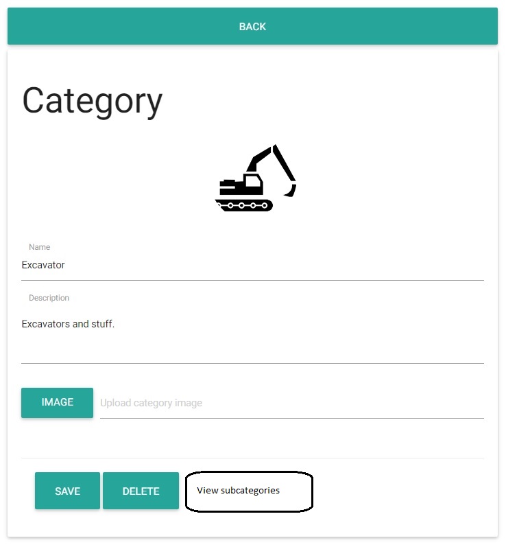
Clicking on 'New' or cogwheel and than on 'Edit' would lead user to screen on which he can enter new or edit existing category. This is the page for doing that.

enter image description here

It would go on as much data there is. Clicking on 'Subcategories' or 'View subcategories' would load a page on which we can view subcategories for selected category and if we choose to enter new or edit existing we would get a similar screen as it is with category edit.

I guess I'm torn with best design or practice(call it whatever you like). Where do my buttons go? Is putting button back on top the right thing to do or should I put it on bottom and maybe stack them so they take full width? Should I overwhelm user with options in cogwheel?

All in all I feel like I am going in right direction but I also think I might take the wrong turn sometimes soon since I come from WinForm background and much of my design feel is hardwired in that direction :)

Thanks for help.

Your Answer

By clicking “Post Your Answer”, you agree to our terms of service and acknowledge you have read our privacy policy.

Not the answer you're looking for? Browse other questions tagged or ask your own question.