2

Trying to figure out the exact reasons why websites or web applications on wider screens 1. have space on either side (aligned center as a container) 2. instead of being left-aligned or 3. stretched to fit the entire width such as 1920px.

How is the usability better if it the content is centered?

Examples

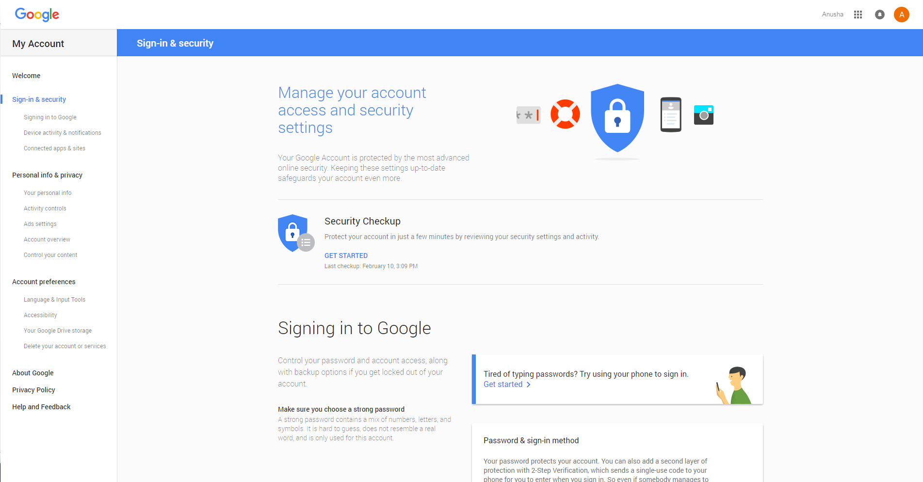
Google Settings

Have gone through previous discussions such as http://www.ixda.org/node/23895 & Is there a usability reason for centering a website's content area on a page?

But they are from 5 years ago, looking forward to learning about recent improvements.

1
  • I think you have to look at the different types of pages and their content to be able to provide a comprehensive answer to the question. For example, you wouldn't want to left align a login page that has almost no content, but you might want to left align a page with a left hand nav (like your example) so you don't create a big gap by center-aligning the main page content.
    – Michael Lai
    Commented May 15, 2016 at 23:27

2 Answers 2

2

If you let if run full width, the text will be very annoying to read. The ideal line length is somewhere between 50 and 100 characters. You could increase the font, sure, but then you'd have to move your head more. So we try to keep text lines shorter.

And left aligned with a huge amount of whitespace on the right is just ugly.

1

To expand on the answer given by @PixelSnader there are also occupational health and safety (OH&S) implications regarding head movement.

There is a lot of research indicating that while sitting at a computer the screen should be set up so that you can read the screen with very little movement of your head, neck and shoulders. If a website was designed so that content, especially the main content being read, was stretched to fit, this would increase the need for head movement etc.

The need to reduce head movement is so important that experts also talk about other items such as document holders being located to minimise head movement. All this is designed to limit the potential for work related musculoskeletal injury (WMSD).

Below are some related references:

While the above don't relate to website design as such, they do indicate the importance of workstation setup and limiting head movement. This is easily transferable to trying to reduce as much as possible unnecessary head movement due to website design, especially now that many large organisations are rolling out 24" and 27" monitors as an option versus dual screens.

Stretching a website's content to fit the screen may not have been an issue with 15", 17" or even 19" screens, but now that 21", 24" and 27" screens are becoming the norm for many standard operating environments, it has the potential to become an issue.

In fact, I am already getting negative feedback about how our internal SharePoint sites look on larger screens - not only in terms of presentation, but also in terms of neck strain. This is because they were designed originally for 19" screens with a 4:3 aspect ratio, while the 24" models being rolled out are not only larger, but the aspect ratio is 16:9 by default. These sites were designed primarily with the One Column with Sidebar layout option which looked great on older screens, but now are causing a headache (no pun intended) because the one column of content is stretched across the screen and the sidebar is so far to the right it's uncomfortable for users.

So, in a nutshell, web content is best not to be stretched across the screen and keeping it centred reduces head movement, even moreso then left aligning your content would.

2
  • So far to the left you mean? "...because the one column of content is stretched across the screen and the sidebar is so far to the right it's uncomfortable for users." Not being nitpicky, but just clarifying. This is extremely useful for me. :)
    – Anusha
    Commented May 14, 2016 at 0:22
  • No, the sidebar is on the right. The One Column with Sidebar layout has a quick launch on the left (this is a default across all SharePoint), content in one centre column, and a sidebar to the right. On larger screens what happens is that the centre column stretches out. The net result is that the quick launch bar on the left remains the same size, the sidebar on the right remains the same size but the column in the middle stretches out to fill the extra space. Users end up having to turn their heads to the right for reading the stretched content (now harder to read) and to view the sidebar.
    – Monomeeth
    Commented May 14, 2016 at 1:50

Your Answer

By clicking “Post Your Answer”, you agree to our terms of service and acknowledge you have read our privacy policy.

Not the answer you're looking for? Browse other questions tagged or ask your own question.