The first thing to get out of the way is: your reader will either be skimming and hopping through your document, or they will be actively fighting the urge to skim and hop. To successfully guide your audience through the page, you'll need to minimize these temptations, and make your intended approach more or less irresistible. Eyes can't be "Forced," and that shouldn't be your goal. Making the correct order the easiest way to read, that's how you'll get results.
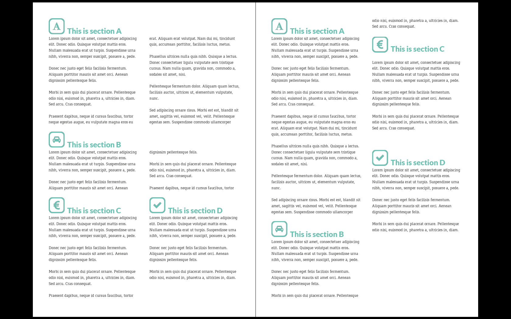
I actually think the left mockup is closer to what you want, because this scheme will minimize any temptations for readers to hop across the page to glance at a section prematurely. The right layout is definitely what our left-right/top-down conventions would suggest, but it places big, colorful section headings directly next to long, boring content. This will distract readers more often than keep them on course.
The Right layout is hard to read in order. (Or, put another way, it's easier to read in an incorrect order than it is to read in the correct order.) Moving down Section A in the Right layout, your eyes get pulled by both Sections C and D. Later, while reading B, you the reader must jump the length of the page, past C+D again, to read the last two lines of B, without starting in on C or D. Comprehension of B becomes dodgy, and readers abandoning A for C/D is at least a possibility and distraction, if not a tendency. I am inclined to believe a page like this would get skimmed, fairly frequently.
Your Left scheme keeps these issues in check - your reader won't be distracted by nearby section headings that they shouldn't be reading yet. The temptation to skim and hop through the page is minimized, and the easiest way to navigate the whole page is the correct way.
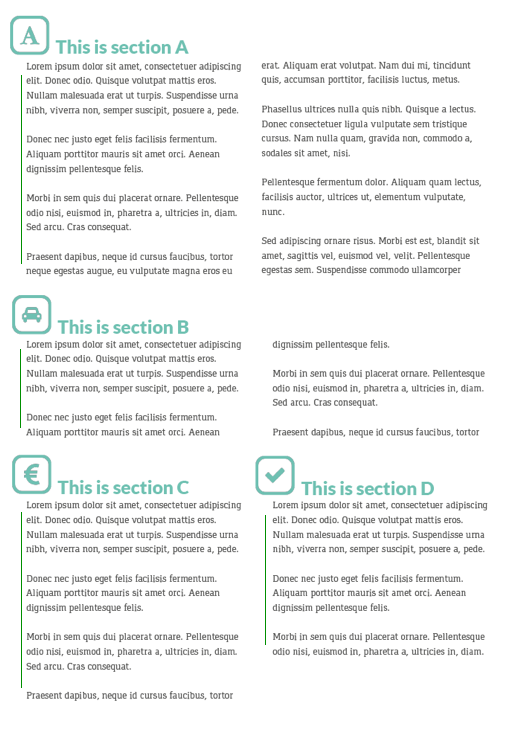
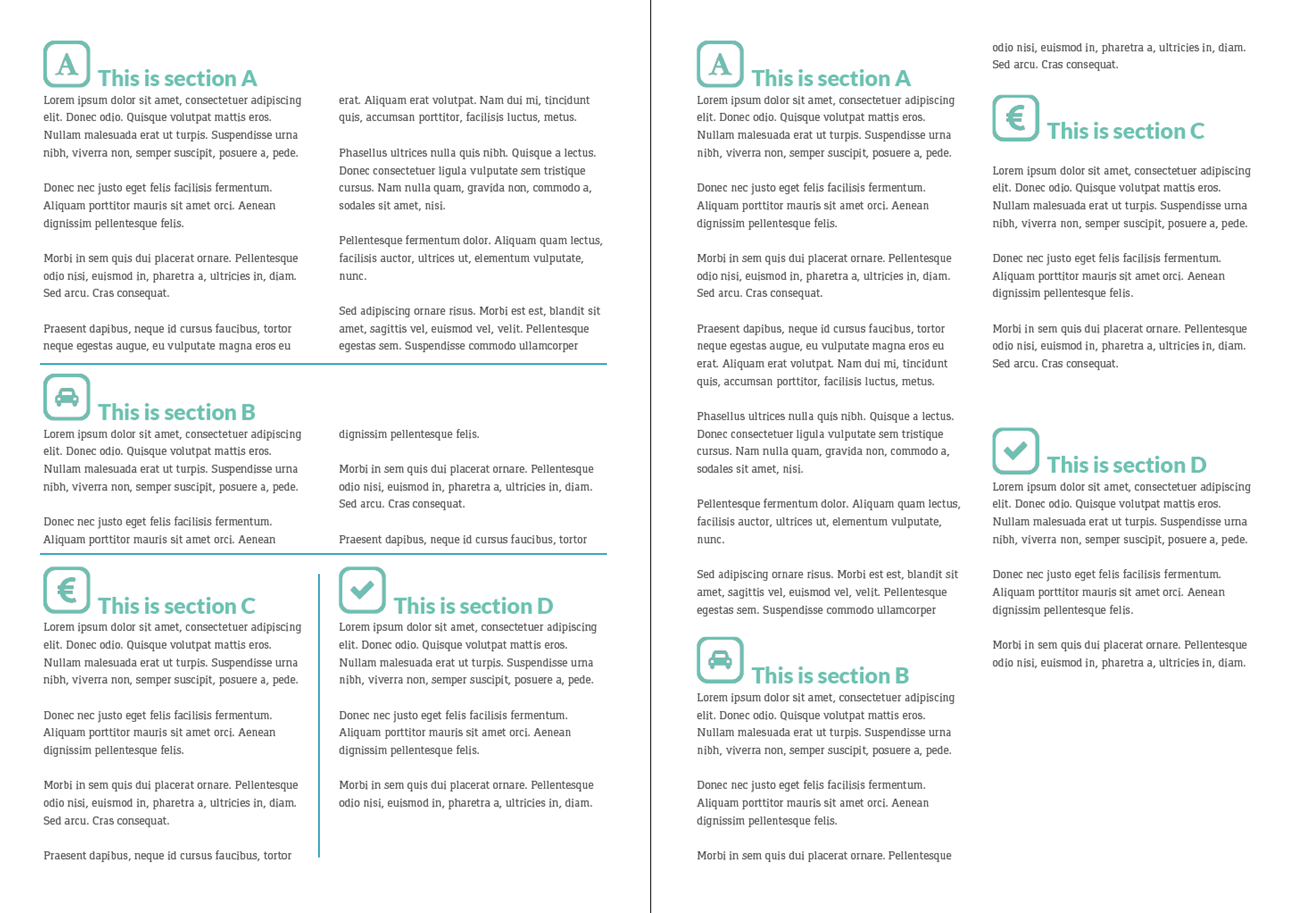
Here's my edits on your Left layout. 
Mainly, I added some guidelines to each section, and moved the headings to the left to sit atop the guideline and the contents. It makes the Headings "own" the text beneath quite strongly, and makes reading in the right column feel like you're anchored to the section guideline from the previous column. Because the right column text of Sections A and B don't have guidelines, they feel a bit naked, and want to hang on to something nearby. What they hang on to is... the preceding text!
I also made the gutter between A's columns a bit tighter, to enhance this effect, making the second column clearly grouped within A. The gutter of B is as is - notice how wide it feels, and how the second half of B is left floating, untethered. While reading the first half of B, the temptation to jump down to heading C is strong. Bringing the last half of B closer to the first half will encourage readers follow to the end of the text, rather than abandoning B for C at the end of the first column.
Other suggestions:
- Justifying all your text will make your Sections feel fuller, more solid, and more defined. As it is, the text risks becoming blobby and amorphous, and swallowed by uneven whiteness.
- I would also play with moving sections like D lower, so that it is clearly the "last" step of reading the page.
- Experiment with keeping the gutters between neighboring sections (as with C and D) about as wide as you have them, while thinning the gutters of same-section contents (as I did in A). The spacing you have between sections C and D feels natural, especially with the section header pushed to the left in my example.


