I've been put in charge of making a simple website. I'm also new to front-end web design and just design in general (I've always been a back-end programmer).
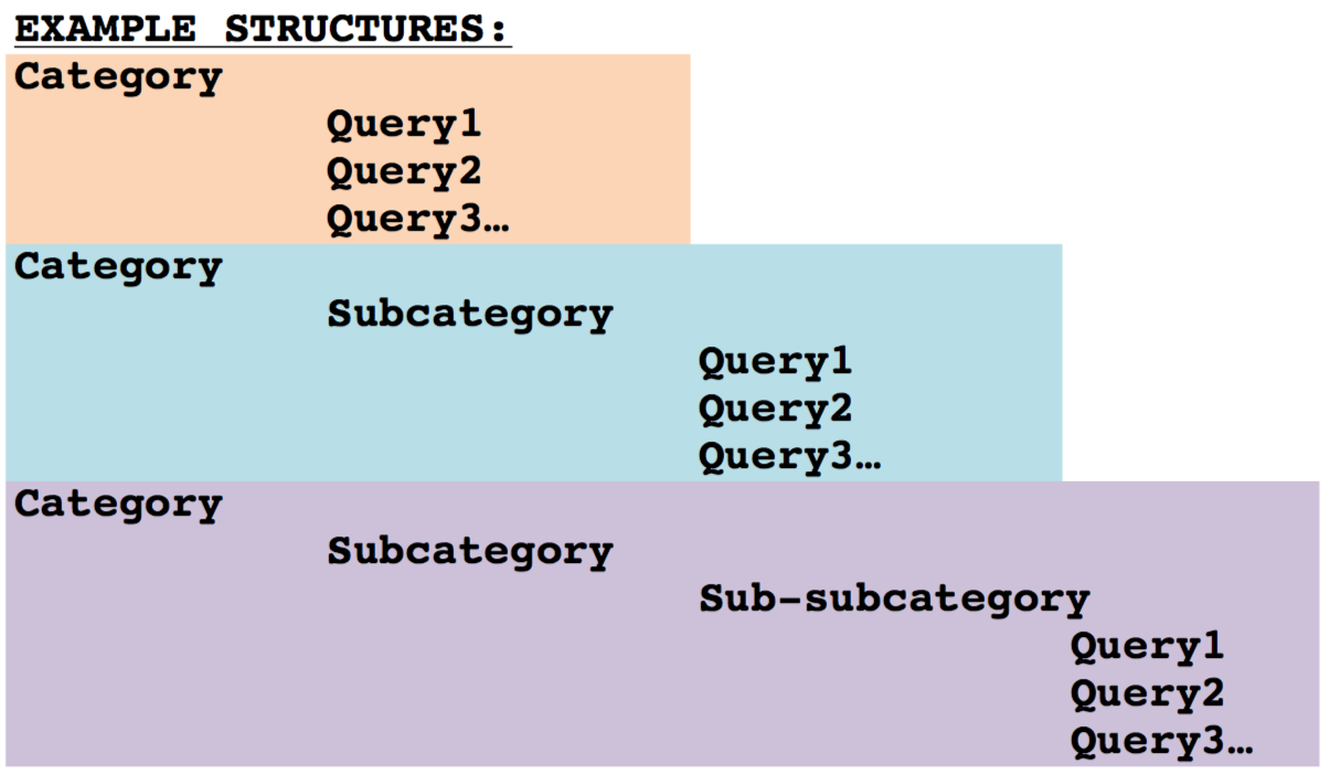
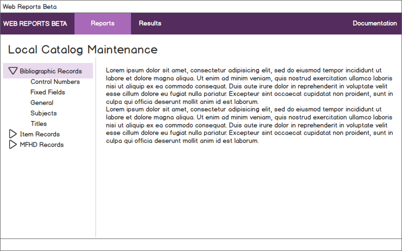
I was given a document by my superior that I should follow as to how certain data is to be structured and how they want the main navigation/basic look of the site to be. Here is a screenshot of it:
I think it's important to note that the maximum depth of categories is bounded. We've settled on a max of 3 levels deep (so what is shown in both pictures is the deepest the categories will go).
tl;dr version: Is there a well-regarded UI design pattern I should follow that would best mirror the structure in the first picture?
My first attempt at a site was not well received. I used nested menus in a navigation bar at the top. The last menu item in a category when clicked would open up a set of accordions for each query to be displayed. The menu was universally disliked and so were the accordions to an extent. This is what the menus looked like:
Below the menus you can see the accordions with the top one open.
I started doing my own research on UI/UX design and read that nested menus are considered poor design (and even removed from Bootstrap 3). I've been researching interface design techniques as well. But so far I have not been able to come up with anything that was able to mirror the structure of the first picture as well as nested menus. I guess I'm not very good at designing things (I can't draw very well either! :)
My question: What is a good way that does not use nested drop-down menus to display the data structured and shown in the first picture on a website?
If not a specific technique or html component, then is there a good reference I can check out that would help me out?
Thanks in advance.


