146

We've all seen these types of warnings: "Are you sure you want to shut down Windows?"

I hear a lot of people frustratingly reply: "Yes, of course, otherwise I wouldn't have clicked it!"


These types of warning messages can be very annoying, but it can also save you from data loss.

In modern Windows versions, Microsoft has removed this warning message. But in many software and on many websites, we still see these types of warnings:

  • "Do you want to save your work?"
  • "Do you want to close all tabs?" (which some browsers ask, while some browsers don't).

The utilitaristic way to solve this dilemma would be to say:

"many people click a button deliberately and just a few people click a button by accident, so the warning message should be removed." (which I hear a lot). But is this the right way of thinking?

So the question is:

Are there any studies or heuristics on when and where to use a warning message and how can we prevent using them (if that's preferred)? Also I'm curious to read your opinion!


The Answer

At the moment, steveverrill's answer about a "don't show this message again" check box is the most easy and safe solution.

In some cases (maybe in the future when computers are more advanced), auto save and/or restore buttons could be a better solution. Check those other well thought out answers too!

16
  • 39
    IMO "Do you want to save your work?" is completely different from "Do you want to close all tabs?". I can always reopen tabs from my history, but I would be furious if a piece of software allowed me to shut it down without warning me that I have unsaved work.
    – Rotem
    Commented Jan 16, 2016 at 14:28
  • 3
    related: ux.stackexchange.com/questions/39337/…
    – Peter
    Commented Jan 16, 2016 at 15:31
  • 14
    Important airplane switches/buttons hidden under a protective cover come to mind. Commented Jan 16, 2016 at 19:30
  • 164
    That title is such a click bait in the hot network questions list
    – Drathier
    Commented Jan 16, 2016 at 20:35
  • 9
    The most utilitaristic way to solve it is actually to reduce or eliminate the consequences of proceed, which is the way tech is heading. For example, browsers used to ask “Do you want to close all tabs?” because there was potential data and workflow loss from proceeding. It's far less common now because tabs re-opening when the browser re-opens, and page state being restored when reopening (such as filled-in form fields) has now become state-of-the-art. I know this doesn't directly answer your question, but I think it's important to see these messages as stop-gap solutions. Commented Jan 17, 2016 at 14:46

5 Answers 5

144

Yes. There is a very simple, effective heuristic that adjusts to the preference of each user.

Place a check box in the warning message dialog that says:

Don't show this message again

Which can be improved further by stating where that dialog can be reenabled.

20
  • 3
    Like firefox does. It's fun to see the contrast between your answer and @icc97's answer, while both adequately cover the question. Commented Jan 16, 2016 at 22:01
  • 45
    ...which can be improved by stating where in h... that dialog can be reenabled. Commented Jan 17, 2016 at 15:12
  • 2
    This is the easiest fix to solve the problem at the moment. However, what I can conclude from ready other answers, is that not showing a warning message and automatically remembering the previous state of the software would be more user friendly. With a "don't show this message again" checkbox, there's still the danger of data loss if the user checks it. Commented Jan 17, 2016 at 16:18
  • 3
    This is the general problem with 'are you sure you want to do the thing you just did?' dialogs, isn't it - once people get used to hitting 'OK' on them most of the time, chances are high they'll hit 'OK' by reflex on the one occasion they actually need to cancel. (I went in search of a reference for this but my corporate filter says asktog.com is a malware site.)
    – nekomatic
    Commented Jan 18, 2016 at 14:29
  • 11
    I never click on "Do not ask me again". I really like being asked, because I always believe there could be some situation in the future in which I would want to make the other choice. Commented Jan 18, 2016 at 18:47
63

These are Confirmation messages - Windows have a fairly detailed page on their guidelines. The whole of that page is pretty useful but here's some excerpts (emphasis mine):

Confirmations are most useful when the action requires the user to make a relevant and distinct choice that can't be made later. That choice often involves some element of risk that isn't obvious to the user, but risk isn't essential to confirmations. These elements are necessary to justify the interruption of responding to a modal dialog.

(No further emphasis from me for the below):

Is this the right user interface?

To decide, consider these questions:

  • Is the user being asked a question to proceed with an action that has two or more responses? If not, the message isn't a confirmation.
  • Is the UI presenting an error or problem that has occurred? If so, use an error message instead.
  • Does proceeding with the action require the user to make a choice that doesn't have a suitable default? If so, a confirmation may be appropriate.
  • Is there an alternative design that eliminates the need for the confirmation? The need for a confirmation sometimes indicates a design flaw. Often there is a better design alternative that doesn't need a confirmation.
  • Is the user about to perform a risky action? If so, a confirmation is appropriate if the action has significant consequences or cannot be easily undone.
  • Is the user about to abandon a task? If so, don't confirm. Assume users understand the consequences of not completing a task.
  • Does the action have consequences that users might not be aware of? If so, a confirmation may be appropriate.
  • Given the current context, are users likely to be performing an action in error? If so, a confirmation may be appropriate.
  • Do users perform the action frequently? If so, consider an alternative design. Frequent confirmations are annoying and have little value because users learn to respond without thinking.
  • Does the action have security implications? If so, a confirmation may be required even if the previous tests indicate otherwise.

...

Consider the design alternatives

Here are some design alternatives that eliminate the need for routine confirmations:

  • Prevent errors. Design tasks so that significant mistakes are difficult to do accidentally. For example, physically separate destructive commands from other commands, and require multiple actions to complete.
  • Provide undo. Provide the ability to revert actions. For example, deleting a file in Microsoft Windows usually doesn't require a confirmation because deleted files can be recovered from the Recycle Bin. Note that if an action is very easy to perform, just having users redo the action may be sufficient.
  • Provide feedback. Make undesirable outcomes obvious. Providing undo alone isn't sufficient if users don't realize when they make a mistake. For example, the effect of direct manipulation (such as a drag-and-drop operation) should always be obvious.
  • Assume the probable outcome, but make it easy to change. If you aren't sure what users want but there is a likely, safe, and secure choice, assume that choice, make it clear what happened, and make it easy to change using a context menu. For example, Microsoft Word assumes that users want to spell words correctly. If it recognizes a misspelled word and it knows the likely correct spelling, Word automatically makes the correction but allows users to revert.
  • Eliminate the choice completely. If the choice isn't important, users just won't care. Better to simplify your program and eliminate the choice.

Edit:

Further than this, which I think is also worth mentioning from a separate page on UI principles taken from various books talks about novice users:

10. The principle of safety

...

Novice users need to be assured that they will be protected from their own lack of skill. A program with no safety net will make this type of user feel uncomfortable or frustrated to the point that they may cease using the program. The "Are you sure?" dialog box and multi-level undo features are vital for this type of user.

Apple Guidelines don't seem to have any guidelines on when, just "don't over use":

When it’s possible that users are unaware that their action might have negative consequences, it can be appropriate to phrase the alert message as a question. For example, a question such as “Are you sure you want to clear history?” pinpoints the action users took and prompts them to consider the results. However, don’t overuse this type of alert; users tire quickly of being asked if they’re sure they want to do something.

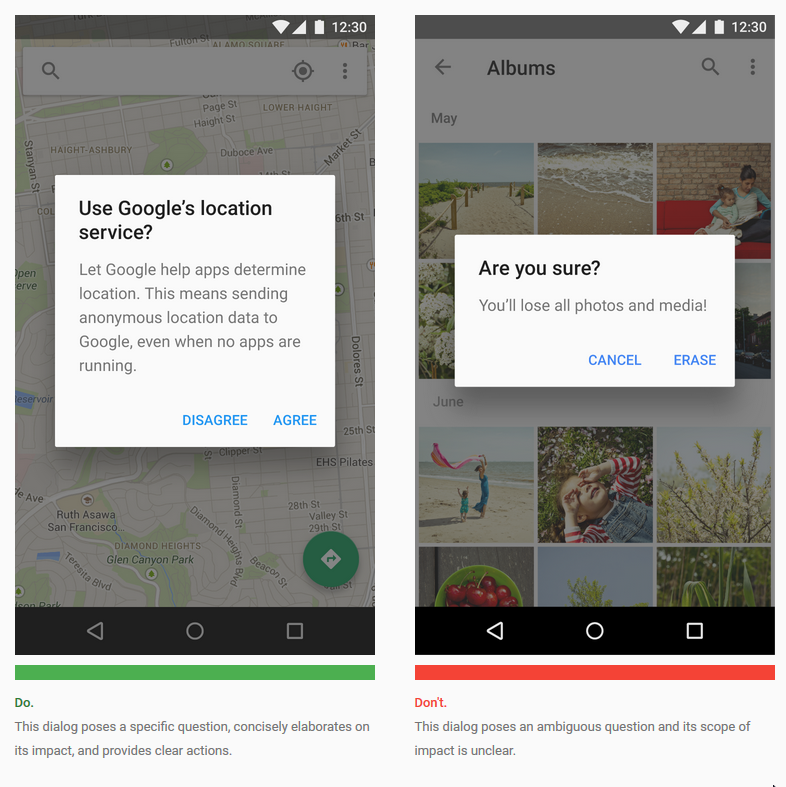
Google material design suggests that you should only use them for high risk situations and use a clear question rather than 'are you sure?' (that is obviously what you should write, rather than when):

Alerts with title bars

Use title bar alerts only for high-risk situations, such as the potential loss of connectivity. Users should be able to understand the choices based on the title and button text alone.

If a title is required:

  • Use a clear question or statement with an explanation in the content area, such as "Erase USB storage?".
  • Avoid apologies, ambiguity, or questions, such as “Warning!” or “Are you sure?”

Google design screenshot

15
  • 5
    It's interesting to see all the (very good) sources! Though some sources (to mee) seem to partially disagree with each other, like Apple and Google. I think the best parts of all sources can be a good foundation for a new 'general UX principle'. What still seems missing to me is a conclusion. By the way, should Google Chrome add a confirmation message, or should Mozilla Firefox remove it? :-) Commented Jan 16, 2016 at 21:53
  • 1
    Quite honestly, I wish all browsers showed that message. I think it's a good way to ask the user what they want the default behaviour for the close button to be: close all or close current. It's not so much about warning the user, but asking for the user's preference. Commented Jan 16, 2016 at 22:16
  • 1
    @icc97 Accidentally closing all tabs can indeed be frustrating. mikryz had an example of safari, which has a button to open all recent tabs. In that case, I think both answers cover the problem. Commented Jan 17, 2016 at 14:18
  • 2
    @nekomatic what you're saying is quite right and it's a good article too. This is where you have to be very careful using them. Closing an application is probably the worst offender! Typically you might use them when you're deleting something. Users are scared that they might hit the wrong button and delete everything - but having a confirmation (once they know it's there) can reassure them that they have a chance to stop the action if they didn't intend to.
    – icc97
    Commented Jan 18, 2016 at 11:11
  • 2
    The final "Do/Don't" images are confusing. They don't seem to be results of the same action, so it doesn't seem reasonable to show them in contrast. And personally, I far prefer the "Don't" example; but I'm a 40+ year developer, so what's right for me isn't a good general case. Commented Jan 19, 2016 at 23:56
29

I'm surprised nobody brought up the Mac OS X shut down dialog. It presents you with an "Are you sure?" window, but has a timer so that if the user walks away, expecting the computer to have shut down, it will while still allowing the user time to cancel.

6
  • 3
    Good observation, though putting a timer on confirmation messages for software / browsers can be annoying, in my opinion. Commented Jan 17, 2016 at 0:00
  • 5
    Many desktop environments for Linux do this as well.
    – cat
    Commented Jan 17, 2016 at 6:35
  • 8
    @MaxdeMooij It's not a general solution, but works well for shutdown— the user's next likely action is walking away from the computer, so a 60-second delay is not a pain point. Still, this type of interaction (performing a potentially-destructive action after the user has shown they're not interested in preventing it) could be used more often. I suppose iOS's Photos app's “Recently Deleted” album — which works like a trash can with 30-day-delayed auto-delete — is another example of this. Commented Jan 17, 2016 at 14:50
  • 6
    I'm suprised nobody brought up a "I'm surpised nobody brought up a"-answer earlier.
    – phresnel
    Commented Jan 18, 2016 at 16:00
  • 1
    Waze does this a lot too. You can leave an action "half done" and it has a timer where it just defaults to the most common options for that action. To me this is the best solution.
    – rr1g0
    Commented Jan 18, 2016 at 23:35
14

There are 3 cases.

The destructive action

Do you want to delete this file?

Don't. Just do the action, and display a confirmation snackbar (non-blocking small widget somewhere where it is visible but not in the way of operating) that allows to cancel (then, either delay the action, or make sure you can revert it easily).

The question can only be answered by the user. e.g.

Do you want to allow this application to access whatever?

First time, show a popup. If you use the "Don't ask me again", make sure it is super-easy to change their mind. Google suggests a snackbar to unobtrusively allow the user to change that setting afterward.

The committing action

Shutdown the computer? Send this email? Publish this article?

Depends on you capability to cancel the action. Several options are available. In order of preference:

  1. Delay the action to give the user time to cancel.
  2. Make sure you can undo whatever has been done. (e.g. restarting a software quickly and restoring the previous state)
  3. Ask for confirmation. Try to avoid doing that. It is annoying most of the time, and seldom useful.
6
  • I like the fact that you worked out 3 different cases, because there are multiple types of conformation messages. Do you know some studies to back it up? Commented Jan 18, 2016 at 21:07
  • not really. some comes from google.com/design/spec/components/dialogs.html#dialogs-behavior and google.com/design/spec/components/snackbars-toasts.html# and also from the permission implementation in Marshmallow, some from practices in softwares that I find intuitive and easy to use.
    – njzk2
    Commented Jan 18, 2016 at 21:35
  • Also, that comes from trying to minimize friction for the user, which in turn gets more users to do more things with your system.
    – njzk2
    Commented Jan 18, 2016 at 22:43
  • So ideally, windows and apple should have a 'snackbar' coming up after closing a program to quickly open it up again if the user has mistaken, right? Commented Jan 19, 2016 at 8:04
  • 1
    @MaxdeMooij for closing a program too quickly, since the feedback (the program is closed) is obvious, an extra snackbar is probably not necessary. But to access the closed program recently, something like the recent apps menu in Android is nice.
    – njzk2
    Commented Jan 19, 2016 at 14:09
9

I'm a big proponent of not showing messages blocking users from doing what they intended to do. The UX solution with confirmation popups came from the Stone Age of computer UX practices. It originates from a correct assumption that if we have a critical resource, we should not let users damage it by an accident. However, an accident is called that way because it happens rarely. This means in the majority of cases that confirmation is just a waste of a click.

However, we do have to protect users from accidents. So the right way of doing this is to save current state in undo stack, proceed with the operation, but then let user cancel or undo it. I would consider this solution more like a guideline, rather than a rule, but I'm sure it can be applied to many cases.

For instance, in case of shutdown Apple saves current state for all your applications. When you power up again you come back to your work as if you haven't shut it down.

If an operation may destroy irreversibly a critical resource (for instance, delete something in 3d party application via API) then schedule the action to start in nearest future, say in 60 seconds, but let user cancel it, if they like.

That said, I think in majority of the cases these kinds of confirmations are not needed.

20
  • 3
    I like your approach on this. It makes me think of Sublime Text (a code editor), which never asks to save an unsaved file, because it simply remembers the work. It might be harder for heavy software to do that, but I'm not sure if that's true / relevant. Commented Jan 16, 2016 at 23:48
  • 1
    The problem I have with this approach is that I will sometimes click shut-down / exit precisely in order to discard my current working environment, and get a clean session next time. There still needs to be some UI somewhere to choose this behaviour, so we haven't really got rid of the problem of how to avoid that choice being in a popup.
    – IMSoP
    Commented Jan 18, 2016 at 11:42
  • 1
    I really dislike the solution of executing tasks without showing a confirmation just because I can undo them. In the past, confirmation messages have frequently saved me from a lot of trouble when I accidentally hit a keyboard shortcut I did not intend to hit, without being aware I did. If I am not informed by a message box that something is about to happen, I will continue working and not realize something has happened until the action has long disappeared from the undo stack. Commented Jan 18, 2016 at 12:50
  • 2
    @O.R.Mapper that's another problem in the UX. allowing the user to perform actions a/ without them realizing it and b/ without giving feedback that the action was performed. Consider how gmail handles that. Whenever you do something, like deleting an email, there is a feedback snackbar that a/ indicates you what has been done and b/ allows you to undo it.
    – njzk2
    Commented Jan 18, 2016 at 16:14
  • 1
    @njzk2: "Like when you delete a file. you don't want to have a confirmation popup" - yes, I do. I'd rather have a popup than accidentally moving a file in the trash and wondering where it is later on. That's why I prefer steveverrill's answer where I can choose to still have these popups even though "most people" can disable them upon their first appearance. Commented Jan 18, 2016 at 17:12

Not the answer you're looking for? Browse other questions tagged or ask your own question.