4

Here we have a settings screen that appears from a sliding view. You tap "Messaging" and the following modal shows up:
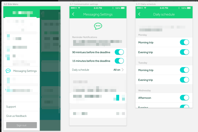
In order to avoid the complexity involved with synchronizing settings every time a toggle is switched, I chose to only save those settings when exiting the Messaging Settings screen.

I'm thinking about two options for saving here:

  • A back or close button that when tapped would show "Saving..." and then dismiss the modal. My issue with this is that as a user I wouldn't expect a back/close transition to be interrupted by a spinner.
  • A left cancel button that would discard changes and dismiss the modal + a right save button that would show "Saving..." and then dismiss the modal. It's one more button for the user to think about.

What are your thoughts about the two options? Is there a best practice around saving forms which only contain toggles, when constrained to saving in the foreground? Ideally, no spinner would ever be shown and everything would be synced in the background, but for technical simplicity I'm choosing to make the user wait for sync completion.

2 Answers 2

1

If I toggle a switch, I expect immediate response from it. I see reasons why you don't want to make a lot of server requests but if you would call the server on a single button press, at least one request might be failing and I'm not sure how you would present this to the user in a proper way. Would you want him to toggle each switch again? A switch can visually take some time to toggle in any app or setting on iOS (Or basically all OS's that have these components) to indicate that a request is made - And if it is failing, it falls back to off and might give you an alert / message on why it failed to switch on.

That's why I personally recommend to handle these one by one instead of making many requests at one time with the press of a button (Any of these: back, close, cancel).

2
  • Thanks for your answer! The decision about saving all at once is already made, I'm only asking about what's best between a back button or cancel/save, knowing that the back button will block the navigation transition while it's saving. Any thoughts on that?
    – ldiqual
    Dec 18, 2015 at 19:29
  • 1
    Then I'd suggest you go with "Save". It provides context to the actions on the view and is the best label to indicate... well, that something was saved.
    – Christoph
    Dec 19, 2015 at 6:59
0

If there is a Done button on the right top corner and the header is sticky (always visible) then that is enough to tell/indicate the user that changes will be saved only on clicking the Done button.

Also, if the user uses back button of the phone then you can show a modal-box to check if user wants to save their changes or not (just to be on safe side). If that model box seems to be too heavy (if the task/changes done are too trivial to warrant asking), then show a check-box suggesting Don't show this message again so that if user doesn't want to bothered again he/she has the choice to do so.

Your Answer

By clicking “Post Your Answer”, you agree to our terms of service and acknowledge you have read our privacy policy.

Not the answer you're looking for? Browse other questions tagged or ask your own question.