1

I'm trying to determine what the best approach is for displaying a master/detail list. I've taken the approach where the details are displayed in a pane that is adjacent (to the right) of the master pane. As a user selects an item in the master pane, the detail pane to the right is updated with related info.

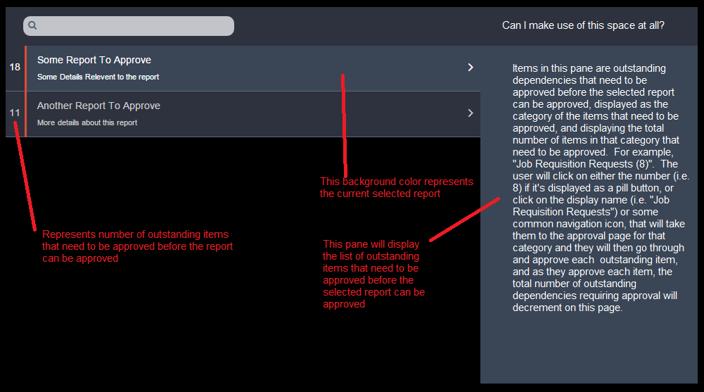
This question is specific to laying out items in the Details pane. The background color of the selected item in the Master pane is the same background color of the Details pane, as I thought this would allow the user to clearly understand that the data in the Details pane relate specifically to the selected item in the Master pane.

There may not always be data to display in the Details pane, either. The Master pane contains a list of reports that a user needs to approve. In order to approve a report, a user must first approve all of the dependencies related to that report. If a report has outstanding dependencies that require approval, I display a thin red vertical bar on the left of the Master pane, and I also display the total number of outstanding dependencies.

If they select the item in the Master pane, and there are dependencies that require approval, those items will be displayed in the Details pane. The items in the Details pane are displayed as the category of the dependency that needs to be approved, i.e. "Job Requisition Requests (8)", where "8" is the total number of job requisition requests that need to be approved. The user will click on either the number "8" that could be displayed as a pill button, or on the "Job Requisition Requests" text or on some common navigation icon, that will take them to the approval page for that category and they will then go through and approach each outstanding dependency, and as they approve each item, the total number of outstanding dependencies will decrement on this screen.

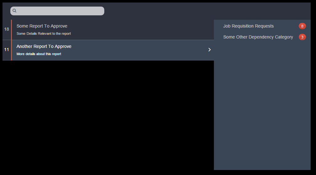
So, my question is with regards to how to present the list of the dependencies in the Details pane, and I'm struggling with that. My attempts thus far make it look like the dependencies may still relate to a subsequent Master row, based on the spacing and alignment of each dependency item in the Details pane. So I'm turning to the experts here on advice/suggestions on how to best display items in the Details pane such that there is clear separation from other Master items in the Master pane.

Below is a mockup:

Mockup

enter image description here

Including a subsequent mockup with an example in the Details pane. I'm just not satisfied with the layout and display of the dependencies in the Details pane.

In response to further suggestions ...

enter image description here

4
  • Not sure I understand the issue. For starters, remove the right pointing arrow from the non-selected row so it doesn't point to the details. Commented Oct 31, 2015 at 16:33
  • Thanks for the suggestion regarding removing the arrow from the non-selected row. I've added a subsequent mockup to show some example dependencies in the Details pane. It just doesn't look correct or intuitive, with respect to the display and layout in the Details pane.
    – Chris
    Commented Oct 31, 2015 at 17:05
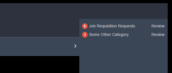
  • The part that feels unintuitive to me is clicking on the issues to review. Not hard to learn, but it could be clearer. You could move the count left of the name and place a 'review' link on the right side. Definitive words can make a big difference. Commented Oct 31, 2015 at 17:30
  • @plainclothes something like this? imgur.com/d0L7lSc
    – Chris
    Commented Oct 31, 2015 at 18:56

1 Answer 1

1

To sum up the comments that lead to the solution ...

  1. Remove the right pointing angle from non-selected rows to avoid the subconscious message that it relates to the details.
  2. Clarify the action of clicking to review the sub-items.

Amended based on comment discussion

There are a lot of ways to solve the set of problems you've outlined. I think your basic solution will work fine, you just have to account for the various states, conditions, and edge cases.

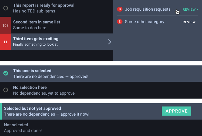
Here are some options I tossed together to illustrate what would take too many words to explain. I mocked two approaches to approval, one of which creates a logical place to display dependency counts for those items not yet ready for approval.

enter image description here

Another point occurs to me as I look at that image. Since you have ample room, I would add a heading in the dependencies pane explaining it's purpose. Something like "Approve these reports first" or "Report dependencies" or whatever makes sense to your audience.

11
  • just saw your updated answer and noticed the comment about red having a negative connotation. The only reason that there will ever be content in the details pane is when there are dependencies that require approval. The workflow for the user is structured such that by the time that the user gets to this screen, all dependencies should have already been approved, so, if at this point there are outstanding dependencies that need to be approved, I want to draw the user's attention to this. Given this information, do you still think that I shouldn't use the color red?
    – Chris
    Commented Nov 3, 2015 at 15:23
  • I also had one additional question - if a report item has no outstanding dependencies, there the details pane will be empty. This seems like a waste of real estate. Alternatively, having the Details pane slide out when a user selects a report that has outstanding dependencies seems like a bad user experience. Any suggestions?
    – Chris
    Commented Nov 3, 2015 at 15:23
  • Additionally, in your example, you removed the total number of outstanding dependencies for a report from the left of the row. Any reason why this was done? With respect to the work flow, if a report has no outstanding dependencies to approve, then the user should see an action button on that row (either on the left or right) to approve that report
    – Chris
    Commented Nov 3, 2015 at 15:26
  • Sliding out the details on click doesn't seem bad to me. If mobile is a play, you might want to consider just having it expand below instead. The catch there is that other targets in the view (report rows below that point) will move -- that's not ideal. It's reasonable to have your expand solution change from one platform to another. Commented Nov 3, 2015 at 17:08
  • The reason I removed the dependency count is because it seems superfluous -- that may not be accurate. When users see the highlight, they should expand and resolve, right? There's also a possible break point is if the count hits 3 digits. In that case you'd have to make room for the boundary case in all rows and you'd have a lot of wasted space throughout. Commented Nov 3, 2015 at 17:11

Your Answer

By clicking “Post Your Answer”, you agree to our terms of service and acknowledge you have read our privacy policy.

Not the answer you're looking for? Browse other questions tagged or ask your own question.