1

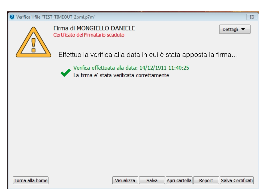
I'm designing the interface for a software for digital signing (with legal value in Italy). The software has a function to verify if the sign is valid and I could have more than a single response.

Cases are:

  1. The sign is valid because the certificate is still valid (easy);
  2. Error: the sign is not valid because the certificate has expired, BUT the sw runs the verify again to check if the certificate was valid at the signingtime.

It's important (for legal reasons) to give evidence of the error in first instance and the success right after on the same screen.

I'm trying to design this case and it seems too confusing to me.

Any ideas?

enter image description here

1 Answer 1

0

I'm trying to design this case and it seems too confusing to me.

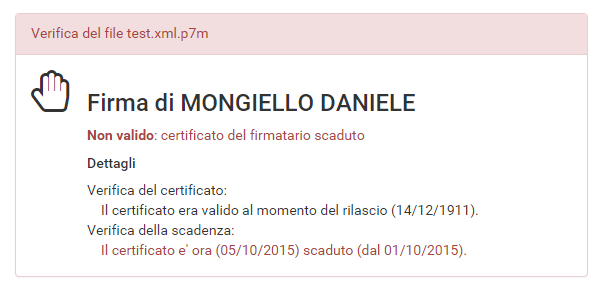
If you give both responses one after the other then I agree with you, it may be confusing for end-users (is it valid or not?!). What I would do is to have a summary (valid or not) and then list of performed checks.

Something like this:

Dialog mock-up

Few notes:

  • Do not abuse colors. If you want to use red for errors then do not also use green for successful operations: it's implicit because if it didn't fail then it's not red. Too many colors are annoying, it's hard to make it right for color blind people and they're distracting: red text is eye catching when it's alone but in a form full of colors it'll be less prominent.
  • Do not rely only on color and graphics. Do not rely only on colorization to highlight error messages, be direct: "this certificate is not valid because...".
  • Do not use generic error messages. In your example confusion comes from a negative message followed by a positive generic message. End-users may not fully understand the difference between signature has been verified correctly and certificate is valid and this will cause confusion. You may rephrase "signature has been verified correctly" with a more friendly (and less technical) "Certificate was valid when it has been issued".
  • Give a quick summary at very beginning of your form, if they do not need any other detail then they won't need to scan entire form. Law prescribes to put error messages at very beginning, do it. Then put positive and negative responses in a more logical order.
  • Leave out unnecessary details. Details (especially technical details) are often unneeded and confusing. Unless user explicitly asks for more information you should leave them out: do not put time part in your dates, differentiate as much as possible your messages, try to build a text paragraph instead of a log session, give an option to have all details if and when required.
2
  • Thank you Adriano. Your answer helped me to think more efficiently.
    – panna
    Commented Oct 5, 2015 at 13:13
  • You welcome, if you have just few possible cases you may even give a specific message: "Il certificato è valido tuttavia è scaduto il...". Hardly any user may need to know more. Commented Oct 5, 2015 at 13:42

Your Answer

By clicking “Post Your Answer”, you agree to our terms of service and acknowledge you have read our privacy policy.

Not the answer you're looking for? Browse other questions tagged or ask your own question.