2

I'm trying to use the toggle to indicate the on and off state of a feature. One of the features will be turned on by default and cannot be turned off.

See below.

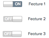
enter image description here

Feature 1 is turned on by default and cannot be turned off. Feature 2 and 3 can be turned on but are turned off by default.

What's the best way to show it? How about checkboxes?

Thanks!

4
  • 3
    Is there a reason why you have to show it in the first place? If it can't be toggled why do you have to provide a toggle for users?
    – DasBeasto
    Commented Sep 18, 2015 at 23:57
  • Why are you using toggle buttons just go for check boxes or radio buttons. Commented Sep 19, 2015 at 4:29
  • @DasBeasto Because feature 1, 2 and 3 are similar, but 1 is turned on by default and cannot be changed. I want to show feature 1 is on.
    – Julia
    Commented Sep 21, 2015 at 14:20
  • 5
    Does this answer your question? How to best represent a ToggleButton (representing on/off) with the ability to be locked
    – jpierson
    Commented Jan 30, 2020 at 11:38

4 Answers 4

4

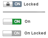
I see two options, if you want to stick to the current color scheme the toggle provides some affordance to include a lock icon to signify it isn't able to toggle.

Provided you can change the colors I would make the actual on state pop more with a green color, then when disabled have it be a gray color.

enter image description here

1
  • I think I'll use this locked icon solution and perhaps combine it with the feedback from @Angelos Arnis Thanks!
    – Julia
    Commented Sep 21, 2015 at 14:22
5

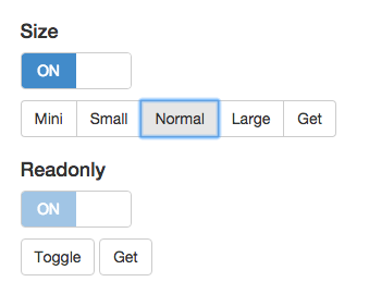
You can check the link below: http://www.bootstrap-switch.org/examples.html

Basically you want an active switch or a read-only. Correct?

toggle and inactive toggle

1
  • Hi welcome to Ux.SE, can you try to pull relevant images or reasoning out of the link you provided (which I find helpful). If the link were to rot then future visits will not know how your answer helped. Thank you.
    – DasBeasto
    Commented Sep 19, 2015 at 0:13
2

I wouldn't do anything very different from the examples you showed, except that the slider for "Feature 1" could have a less-prominent border (it would be "greyed out," indicating that it is disabled) and should do nothing at all on hover. The sliders for "Feature 2" and "Feature 3" are fine just as they are, but a hover effect that indicates that they are "live" would invite interaction.

1

Simply, don't go for the toggle. The inactive state should be communicated through the label. If the label is grayed out, it doesn't matter any more what state the toggle is in.

Toggle = user-input Label = communication

Not the answer you're looking for? Browse other questions tagged or ask your own question.