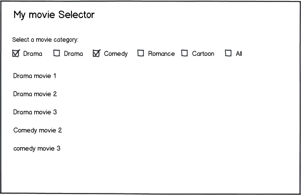
Whether a pattern is "better" or not is completely related to the users need and project constraints. It's hard to determine in your mockup if what your attempting to create is a faceted navigation, or an advanced search. I suspect it's the former. In order determine if a solution is "better" we would first need to know more specifics about the user and challenge. If you can provide those details I'm sure we could more accurately recommend a solution.
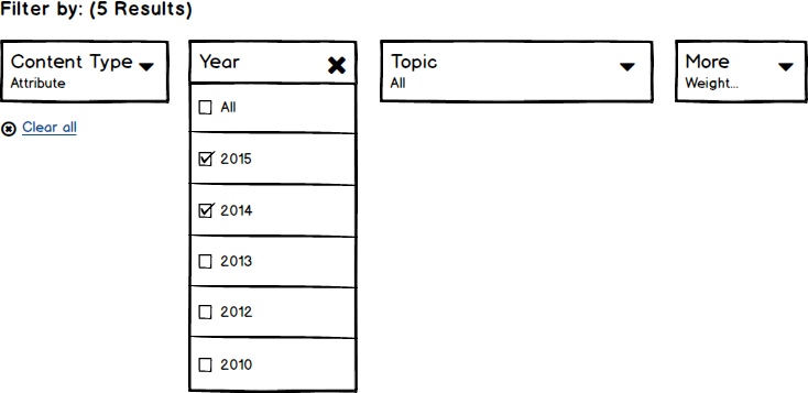
That said, what I can offer you is a "different" solution. Perhaps the challenge with the current design is real estate. Perhaps the application is complex and your looking to simplify the interface while providing the same level of choice for the user. Perhaps your attempting to promote discoverability and usage of the few important facets. You could consider rolling up the exposed facets into a horizontal filter bar:

In addition there is some evidence that suggest that horizontal filtering outperforms traditional vertical facets in Ecommerce implementations.
http://baymard.com/blog/horizontal-filtering-sorting-design


