2

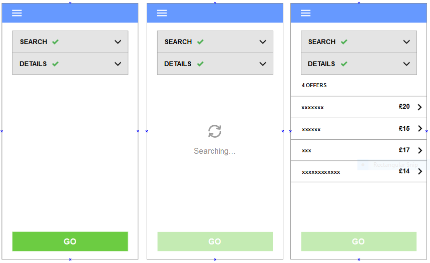
Once a user has carried out a search on my mobile app they are presented with a list of offers.

enter image description here

At this stage (3rd screen), the user can either:

1) accept ONE of the on-screen offers

2) carry out another search using different parameters

I don't think the third picture clearly tells the user what is expected of them next. How would I best:

  • Indicate to the user that they need to select only ONE of the offers. Currently they just need to tap on the item and it will take them to a new screen. But I don't think it is clear enough to the novice.

  • Indicate to the user that they can carry out another search, if they are not happy with the offers presented.

  • I think the positioning of the 4 offers section in the third screen above clashes with the rest of the UI (it looks a bit busy). How would I best declutter the screen and make it easier for the user to select the offer that they want?

Update - 08/08/2-15

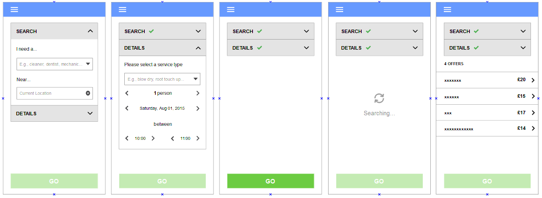
This is the full flow:

enter image description here

2
  • What do the checkmarks and the weird drop down indicator next to the search and details boxes mean?
    – tohster
    Commented Aug 8, 2015 at 0:46
  • @tohster This is the flow of the app, it will help you understand wha the checkmarks and drop down indicator do - i.imgur.com/EfUy2vZ.png. Look forward to your response!
    – methuselah
    Commented Aug 8, 2015 at 7:32

3 Answers 3

1

Guide the workflow better

Observations

  • There is too much information on the screen. The SEARCH and DETAILS panels persist and clutter the user's flow at the top. This makes scrolling awkward, and it's easy for the user to feel overwhelmed with choices because of the number of widgets on screen.

  • Fundamentally you are using a very linear workflow. The perfect pattern for this is a wizard, which guides the user clearly through the process.

  • Wizards can also allow users to go back to change their choices.

Wizard design

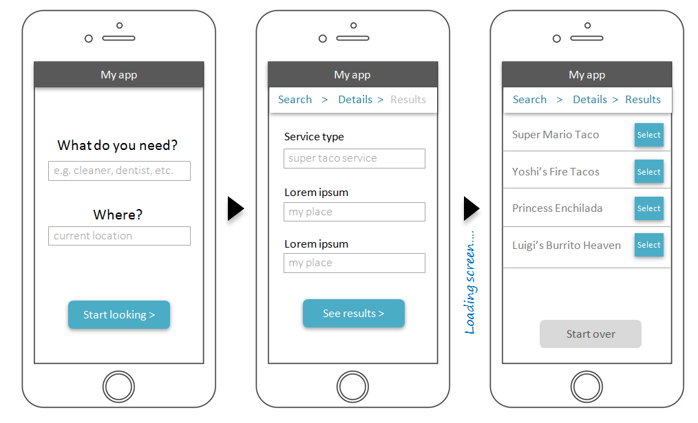
Here's a flow which uses progressive disclosure to guide users clearly and simply through the workflow, minimizing the number of onscreen components while providing (optional) breadcrumb navigation in the subheader bar to allow users to go back at any time.

In each screen the next step is clearly indicated with large blue buttons, so the user immediately knows what to do next.

wizard

There will be some adjustments needed:

  • For the loading screen I'd recommend switching to the results (last) panel and having a loading throbber before the results fade in. This gives users a sense of forward progress and allows them to go back to details while waiting, if they decide to change their search.

  • The start-over button on the last page may need to be docked if there are a lot of results typically.

  • etc. this is only a sketch.

0
1

I'll get this out of the way since it relates to my answer below... From what I can tell, the "GO" button is used to submit a search. Is there any way of consolidating the search submit button into the search area? This would allow you to appropriate that button into a "Select offer" button described below...

Select an offer

If you change the "GO" button to a "Select offer", it gives the user a call to action as well as a confirmation message. The button can appear after the user selects an offer.

Change the right caret icon on each offer into a more info icon. This will free up the rest of the tappable area for the user to select/highlight the offer (whereupon the "Select offer" button would contextually appear).

Also, instead of the offer count (i.e "4 offers"), it may help to use a descriptive heading such as "Select an offer below".

Search again

I think naturally, people will try other search terms if they don't get the results they want. As long as the search bar is static, users will be able to repeat the process they just performed. Also, give the users an easy way to clear out the search field to encourage searching again.

Interface

The interface doesn't look too cluttered to me, but assuming the detail dropdown is related to the search, you may try showing the detail dropdown options only when the search box is active. Therefore, when the user is not in search mode, they only see a search bar. Once the user chooses to search for offers, they are presented with relevant filter options.

1
  • Hi Lawrence. Thanks for the response. I've updated the question to include a UI/UX flow of the interface in its totality. As seen, the user initially provides the criteria and details. Once done, they can carry out the search and receive their offers.
    – methuselah
    Commented Aug 8, 2015 at 7:42
-3

At third screen the user expect something Solid rather than giving them more options to search. So you can either display only resulted data and search criteria,so that screen will be cluttered .

1
  • Sorry I don't understand your answer. The purpose of the search is to provide the user with a number of options given their criteria to search from. The difficulty in currently experiencing is how to prompt them visually how to carry out one of two options ... i.e. select one of the items or try another search.
    – methuselah
    Commented Aug 7, 2015 at 10:10

Your Answer

By clicking “Post Your Answer”, you agree to our terms of service and acknowledge you have read our privacy policy.

Not the answer you're looking for? Browse other questions tagged or ask your own question.