1

I am designing a mobile application and I need to display a list of Bluetooth devices in the homepage.

There are two flavors of the list :

  • devices that are in range
  • all the devices, without considering the location

The separation is needed because the user will mostly use the in range list because they can act upon the device, but they also need to see all of them for the special case where they need to request permision to connect to a device, before using it, even though the device is out of range.

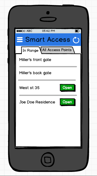
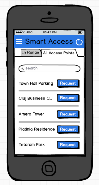
The solution I have so far is to separate the two lists in different tabs, but for some reason this doesn't feel right.

enter image description hereenter image description here

An alternative could be to use a single list with two sections, with the in range section at the top, but this is lacking the discoverability when the first section is too long and pushes the second one out of screen.

What would be the best solution in my case?

Thanks in advance!

4 Answers 4

2

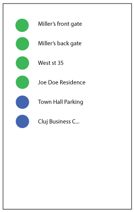
I think there is a great reason to use the single list with two sections. The user doesn't have to switch screens to view the alternative blutooth devices, and are more likely to want to use the ones that are on in the first place. Even with the scrolling, it seems less complicated. People seem like they would be less likely to try to access something that's not available than what is available.

enter image description here

2

Some good ideas here already, but in case you decide to go with the single list, you could add a filter button at the top (could also be a checkbox):

enter image description here

1

I would have your design follow the path/user story you describe- you said users want to see devices in range, or they want to request permission to connect to a new device.

I would have a single screen/tab- the left screen is visible at first, but a button or clickable hyperlink at the bottom that says "Or request access to new device". That would open the right screen (the list of the devices that lack permission, regardless of range).

1

since you tagged your own question with the Material Design tag, I'd suggest using actions that fires bottom sheets for each of your alternatives. This way, you could clearly display both options on same page, providing the user with simple and direct access and displaying the alternative paths an user can follow on a single screen.

This being said, tabs aren't a bad idea either, and if you use Material Design tabs, then they'll look more direct since they're not so "tabbish" but more like inline links, which is something known by any user, just in case this is what bothers you

Your Answer

By clicking “Post Your Answer”, you agree to our terms of service and acknowledge you have read our privacy policy.

Not the answer you're looking for? Browse other questions tagged or ask your own question.