1

I'm working on a large website editor application, and in order to achieve the "best" initial designs I have slightly different versions of UI patterns according to the context in which they're being used ("best" as far as what we can do with no data from user testing yet). I know this doesn't necessarily agree with Usability in regards to pattern consistency, so i'm using it sparingly.

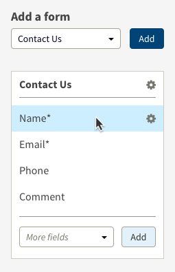
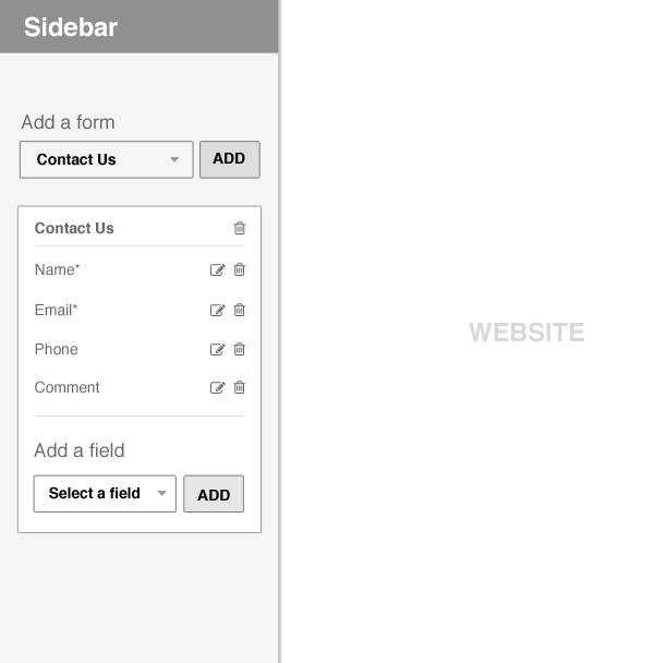
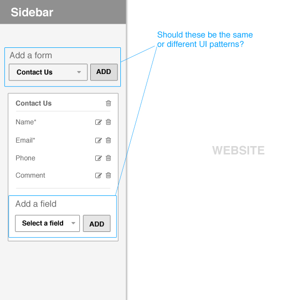
For instance, on the contact us page the user has the ability to add a new form with unique form fields, or edit the current form included with the template of their choice. In order to add a new form, the user selects the form type from a dropdown, then clicks the "ADD" button to create the new form. Along with being able to edit the fields within this new form, the user can add fields using the same dropdown + ADD functionality within the form itself. All interactions take place in the sidebar, but the website is updated in real-time to the right. There are more options/actions for this component, but for the sake of brevity i've stripped it down to just the necessary details.

My question is this - Is it more important to have consistency or visual clarity? Is consistent but repetitive UI within slightly different contexts better or should they be tweaked to reflect context?

To me it seems that although adding forms and fields are done with the same interaction / action, fields are a smaller unit than forms, so a case could be made for changing the pattern subtly to reflect this smaller unit context. Yae or Nae?

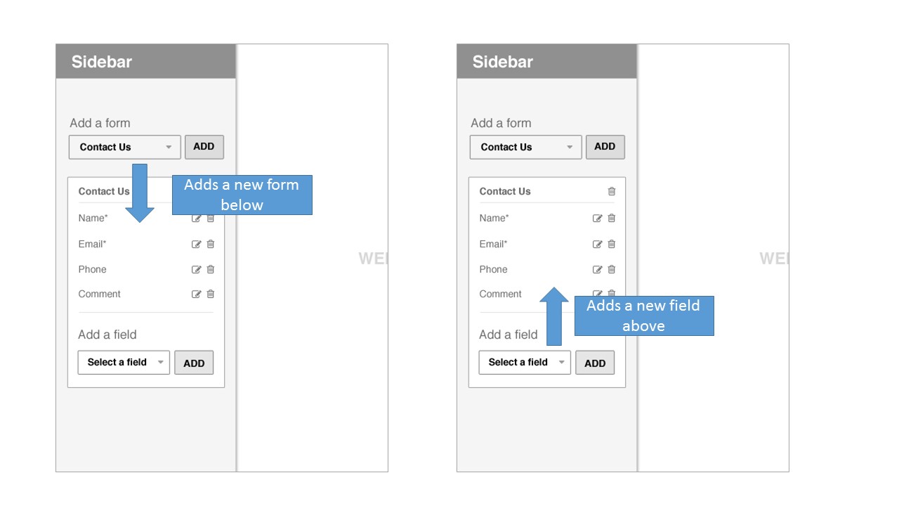
In the attachment I show the UI patterns being the same not different, but the question remains the same.
enter image description here

enter image description here

5
  • Not sure I understand your dilemma. Do you have an alternate solution you'd like to use that varies from the pattern? Or are you just wondering if varying the pattern would help emphasize the difference in element types? Commented Jul 1, 2015 at 23:23
  • Apologies for the confusion, its quite possible i'm overthinking this one. What i'm wondering is what the lesser of two evils is, varying the pattern to emphasize difference in element types, or keeping things consistent regardless of different element types. Commented Jul 1, 2015 at 23:56
  • 1
    From your mockup, the UI seems to follow the same design. Or are you referring to the layers beneath them?
    – Alan
    Commented Jul 2, 2015 at 1:28
  • the fields that you can add are always pre-loaded? I mean, users could add a any field name they want? Commented Jul 2, 2015 at 22:04
  • The users would select a field from a pre-defined set, so they would not be allowed to create any field name that they want Commented Jul 6, 2015 at 16:25

4 Answers 4

1

Consistency + heirarchy = mo betta

There's nothing wrong with consistency among controls. I think the problem you're sensing is hierarchy. In your example, adding a field (the low-level item) is more prominent than added a form (the high-level item). The controls are identical, but the ground contrast is greater within the form edit module.

With a few minor tweaks, I think you'll find that the consistency isn't a problem at all. In this example, the header on "add a form" is stronger and it's button has greater contrast. Adding a field only gets placeholder text and the button is styled to be subordinate to the primary action.

I also lumped the field edit controls into a single "settings" icon and hid them until hover to clean up the space and reinforce the order of things.

Revised form editor UI

Caveat

There's a few decisions in there other UXers are sure to take issue with, but I think this solution would work well in a desktop setting. On a touch device, I'd go ahead and expose the edit controls on all fields. And I'd probably just disagree on other objections ;-)

0

The ideal answer is "test both" and see which works better for your users.

Without testing, if you have to make a choice, clarity always trumps consistency.

Focusing on your specific answer, I would suggest a different UX pattern for adding fields to make it even more different than adding a form. For example, eliminating the dropdown completely, and replacing it with an "Edit" button that displays all available fields that you can drag into the form.

2
  • If you follow the logic of your recommendation, every thing would have it's own control pattern and the UI would quickly fall apart. Using the "edit" approach also adds an unnecessary click and some kind of modal or contextual control to choose. Seems like the user is losing on both accounts. Commented Jul 2, 2015 at 20:19
  • I'm certainly not advocating unique interfaces for everything: The perfect state is both consistency and clarity. I just answered his question directly: If you must pick one, go for clarity. That's all. As for the "Edit" approach, it's just one of many options possible. I just wanted to steer the designer away from overuse of dropdowns because they're not very mobile friendly in general.
    – UXUiOS
    Commented Jul 4, 2015 at 3:13
0

The UI you have presented is not consistent either. It has visual consistency. But the interaction is not consistent.

When a user adds a form, it is added below the dropdown, but when a new field is added, it is done above it. This affects consistency as well. The user has to get used to one of this pattern (either adding above or below). Otherwise, it might lead to cognitive load as the user has to be consciously aware everytime he adds something.

Interaction consistency issue

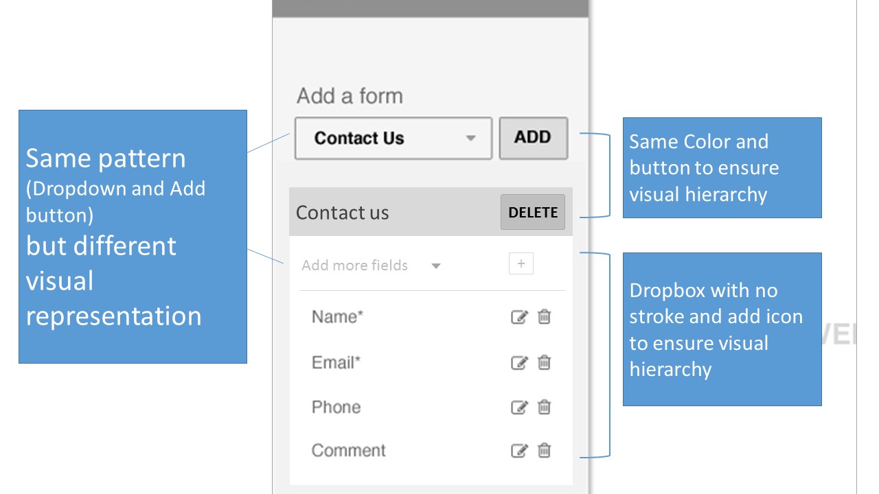
Here is my suggestion that removes this inconsistency. I have also presented a way to add a sense of hierarchy to the form and the fields.

  • The forms here have a gray background with a solid rectangle button for action.
  • The fields have a white background with an icon for action.

This way you maintain the pattern and at the same time can avoid confusion

enter image description here

1
  • If you still prefer a rectangle button for Add fields, make it visually different. One more way is to hide the button and let it appear after a field is selected Commented Jul 3, 2015 at 0:39
0

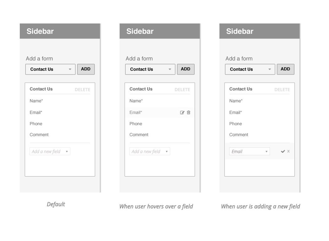
Some good answers here. Since its for web, I would try and use the power of the medium in defining meaningful interactions. Attached is an example. Notice how the edit/delete fields come in on hover, and the add a new field serves/indicated a quick clear way of adding a new field. (Note - Its assumed that the form will have Save, Cancel kind of functionality overall).

enter image description here

Your Answer

By clicking “Post Your Answer”, you agree to our terms of service and acknowledge you have read our privacy policy.

Not the answer you're looking for? Browse other questions tagged or ask your own question.