37

I have a grid of people where for each person the user needs to decide whether to include the person in a predefined group, exclude them from the group, or leave it undecided. The initial state is undecided. Having two radio buttons won't work because the user should be able to change their mind back to "undecided" after initially selecting "in" or "out" (that's why this is a different question).

Two approaches came up. One is to have two toggle buttons, and the other is to have a tri-state "switch" (which is essentially a group of three radios, visualized differently).

mockup

download bmml source – Wireframes created with Balsamiq Mockups

  • The toggle buttons would be mutually exclusive (only one can be selected, but both can be unselected)
  • This is inside a pretty busy grid, so real estate (column width) is definitely a factor
  • This is not a touch interface

What's the best approach here? Pros and cons?

16
  • 11
    I don't call those toggle buttons. To me toggle is a single button that toggle to multiple values. Why do you say radio button won't work? That is what 1 is in my mind. Why not three radio buttons Include, Exclude, and Undecided. ? means help to most people.
    – paparazzo
    Commented Jun 29, 2015 at 10:55
  • 1
    From a UX perspective 1 is not the same as 3 radio buttons as it is not 3 radio buttons. No indication it is exclusive and looks like a command as much as it looks like a selection. People are uses to radio buttons for a selection - why are you tying to invent something new?
    – paparazzo
    Commented Jun 29, 2015 at 11:05
  • 1
    @Blam In the toolbar of your favorite text editor there will be a three-way switch for left, middle and right adjustment of the text. Hardly inventing it here. The fact that it looks like a command to you is probably due to the L&F of the Balsamiq prototypes. Commented Jun 29, 2015 at 11:15
  • 2
    Interesting question. Are in out and undecided the actual choices? I'd really need to understand what that third choice means in order to design here. Undecided is different from unselected, which in turn is different from "neither". Irrespective of the layout constraints, what does that third choice actually mean in your domain and would the user find it helpful for it to be explicit?
    – tohster
    Commented Jun 30, 2015 at 8:43
  • 2
    @tohster The latter two cases are unlikely.They won't be getting any new info except what's in the grid, so changing their minds is usually because they pressed the wrong button or they weren't very sure in the first place, so it's a coin toss for them. Later changes are also rare, because the main flow is akin to a wizard to get the project started. Commented Jun 30, 2015 at 9:05

12 Answers 12

39

Design for the micro-workflow


Observations

  • Most users will make a selection and move on, as you noted. Users are not very likely to deselect a choice, either immediately or afterwards.

  • In and Out are the primary choices here. The undecided choice is an unbiased default.

    • Null/default/undecided/unknown choices are often very difficult to design correctly, and designers often don't think about these enough when designing controls.
    • Programmers are often better at this by habit (think of null vs '' vs undefined in javascript), but even then the semantics are often easy to screw up.
  • Grid alignment and economy of space are important....given that there are a lot of other controls on the page.

One possible design

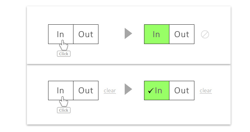
in/out button pair, with visually distinct and de-emphasized 'none' button

The design logic here is:

  • Make the primary choices clear. The large buttons provide easy landing spots for the cursor, and the primary options are visually clear.

  • De-emphasize the undecided choice. You can hide it until the user makes a choice (top example), or keep it shown (bottom example and probably better). This button is a relatively rare option/scenario, so there is no need to promote it to the prominence of the primary selections.

  • Get rid of the icons. These just add visual clutter and take up valuable horizontal real estate.

  • Consider adding a checkmark to the selected button for clarity (bottom example).

  • Keep the buttons grid-compliant for compactness and to calm the overall interface.

On toggle vs tri-state...

This answer (hopefully) illustrates that neither approach is intrinsically better than the other. I believe the way to decide between the two is to lay out the design goals and constraints, think carefully about what the null state means, and then the design task should become much clearer.

7
  • 1
    I always love your answers and the way you lay them out. Awesome +1.
    – JonH
    Commented Jun 30, 2015 at 19:13
  • 4
    I have no idea why this suggestion doesn't have more votes. Since users are primarily expected to select "in" or "out", a two-state toggle makes the most sense here, alongside a de-emphasized option to "clear" or "reset" the choice (i.e. deselecting both). This makes it clear that "undecided" isn't so much a legitimate option unto itself, as it is a means of undoing an accidental click.
    – Doktor J
    Commented Jun 30, 2015 at 21:19
  • Your visual example is really nice and right along my lines of thinking.
    – 2rs2ts
    Commented Jul 1, 2015 at 1:59
  • excellent observations! a pretty perfect implementation
    – BatlaDanny
    Commented Jul 1, 2015 at 7:32
  • 2
    hi @jazZRo i intentionally used a very flat design to communciate the interaction rather than styling, but your point is a valid one. personally i would use shadows or embossing/debossing to communicate that they are buttons, but since this depends on how the rest of the form is structured (material design? iOS? skeuemorphic?) i tried to stay unopinionated on that in the answer...hth
    – tohster
    Commented Jul 3, 2015 at 22:34
25

If you do not mind hiding the available options at first glance, you can also use a combo instead of radio buttons that could save you some column width.

mockup

download bmml source – Wireframes created with Balsamiq Mockups

7
  • 1
    Was going to suggest this given the restricted space.
    – TripeHound
    Commented Jun 29, 2015 at 11:56
  • 6
    This might of course have much worse usability than any of the two options proposed by the OP because this one needs two mouse clicks and two mouse moves to select an option whereas the OP's require only one of each. This might not seem like a big deal unless you need to do it for a lot of entries. No references to cite, just personal experience/preferences, the less actions you need to perform to finish an action the faster you can work and the sooner you're done with a boring, tiring and braindead menial task.
    – Maurycy
    Commented Jun 30, 2015 at 7:56
  • 4
    Combo vs radio buttons is usually a no brainer but 3 options is exactly where the grey area sits - 4 is really too many for radio buttons and 2 is just too few for a combo but 3 sits right in the middle where it would work equally well as either. Commented Jun 30, 2015 at 9:22
  • 2
    Yes, a combo box seems too "heavy" for a three-option selection. @AndrewMartin I'd say 4 is actually probably the middle ground (4 radio buttons can get a bit unwieldy if not managed right, but a combo box still requires a significant amount of effort relative to the radio buttons). For three options, especially when one is basically only an "undo", a combo box still feels "heavier" than a set of radios.
    – Doktor J
    Commented Jun 30, 2015 at 21:17
  • 2
    Every lesson I fill in registers where there are about 8 options (each a character in length), and they're represented with combo boxes next to each student, and now I hate combo boxes because I use about 100 every day. If the page was just a bit wider it would be so much easier with a single click. I yearn for the single click. Please give us a single click. Avoid combo boxes unless it's rarely used or the options are lengthy.
    – AndrewC
    Commented Jun 30, 2015 at 21:41
23

I would suggest a set of three radio buttons: one for 'in', one for 'out' and one for 'undecided'.

Mutually exclusive toggles is likely to require lots of explanation and could leave the user confused: A pair of toggled buttons seems to offer 4 different combinations (A+/B+, A+/B-, A-/B+, A-/B-) but you are going to need to explain that there are only three (A+/B-, A-/B+, A-/B-). On top of that the third option is never explicitly show in the control settings - in your case you show 'in' or 'out' but 'undecided' is only shown by the absence of any other setting. This too would require further explanation.

A set of three exclusive radio buttons should do exactly what you want: all three options are visible and the fact that the user can only select one is indicated by an established pattern.

2
  • 1
    While I like your answer, I think Mutually exclusive toggles require barely no explanation, user can learn by experience in a couple clicks. Once they click one option, they'll notice other options are excluded. If they try a second option, they will notice that the other options are excluded again, so it's a fast cognitive process
    – Devin
    Commented Jun 29, 2015 at 23:25
  • You are, of course, free to take my advice or choose your own path - I won't be upset either way. But, to clarify my thoughts about this, any cognitive load added by the individual controls is taken away from understanding the process as a whole. My philosophy here is that an interface should be as intuitive as possible and not require the user to learn in order to complete their chosen task... but, as I said, that's my philosophy and you don't have to follow it if you choose not to. I hope you find the solution you're looking for! :) Commented Jun 30, 2015 at 9:15
7

To answer your question, the frequency of this action should be considered.


Low frequency:

Users do not remember their options when they don't use them regularly and so the options should be easily findable and understandable.

Considering the screen real estate you have mentioned, and for users to easily understand their options, I would also suggest a dropdown similar to Vincent's.

Of course, the dropdown adds an extra click to reach the options, but it is ok as the primary focus here is to make the user identify and decide his next action without much hassle. Hence, it is recommended to use UI elements that the user is already familiar with for screens that are not frequently used.


High frequency:

If this screen is used often, and the users have to frequently toggle between undecided, in, and out, a dropdown is going to frustrate the user. Here, the users should be given quick access to their options.

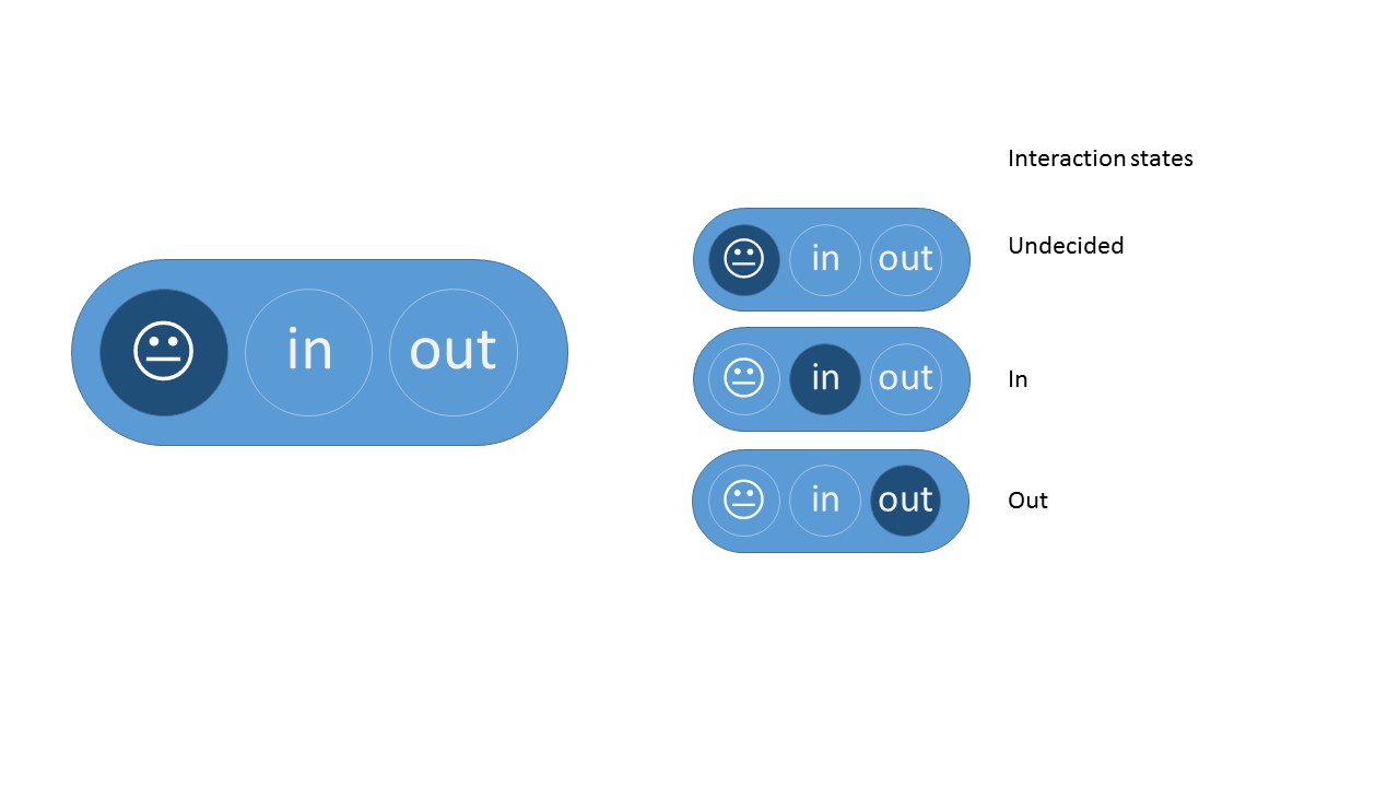
In this case, I would recommend the tri-state switch. The learning curve is small when users use this toggle frequently, and so in due course will be able to adapt to your tri-state switch. But, I would not suggest a Question mark.

Please check out my mock-up below. It's a simple tri-state switch with some fun added to it, which might result in better user engagement. It will fit the real estate you have described. But, take my suggestion into account only if this toggle action is frequently used. Thanks

Tristate switch suggestion

2
  • 1
    Using an smiley icon is an interesting idea but its not very intuitive unless you are person who can relate the icon and its meaning fairly easily.
    – Mervin
    Commented Jul 1, 2015 at 3:18
  • Yes. That's true. People who are not familiar with this particular smiley and its meaning will not be able to understand it first. That's why I do not suggest this design if this screen is seldom used. But, if a tool tip is provided it's just a one time learning, and users can easily go with the flow, if this interaction is used often. Commented Jul 1, 2015 at 3:38
6

First option is better, with the toggle. The reason why is because users given clear instruction on possible answers are more likely to understand and answer them (correctly) than when the instructions are obscured. In the case of the tri-switch, there are two visible options and one invisible option. Each has three states, but the latter has one option that isn't inherent, meaning you'll have to provide instruction or hope the user can "figure it out".

Depending on your demographic, that may not be a problem. Younger and more tech savvy users will get the switch with a single instruction. However, since I've switched jobs to a company whose demographic is white 55+ year olds, even simple instructions aren't always enough. For instance, your example of three buttons wouldn't work: the undecided button doesn't list that it's undecided, only that it has a question mark. In my universe that means "I have a question and clicking this button will either let me ask it or provide tips".

2
  • I'm sorry, your answer is very confusing to me. The first option in the mockup is (what I called) the switch, but you refer to it as the toggle, which is what I called the 2nd option.. AFAIU the "invisible option" exists in the toggles but not in the switch, where it is visible. Also it seemed to me that you said that the first one is clearer, but then you say that it wouldn't work with your users. Could you clarify? Commented Jun 29, 2015 at 8:29
  • 1
    @VitalyMijiritsky Clearer doesn't equate 'perfectly clear'. In this case he was simply point out that even the first example isn't perfectly clear, because the 'undecided'-state lacks a text. Something he deems fine for 'normal' users, but which might be an issue with an older demographic. Commented Jun 29, 2015 at 9:38
4

There appears to be two issues at hand

Explicit or Implicit Tri-state? Quite unanimously for reasons given explicit Tri-state is better

Compact visualisation of explicit Tri-state Three buttons, radio button group, combo box all do the job. But another UI that helps communicate connectedness of concepts clearly is also the slider - or other similar visuals reminiscent of a likert scale

mockup

download bmml source – Wireframes created with Balsamiq Mockups

2

Your solution is still a radio button. It's a radio button with three options: "in", "out" and "undecided"; of which "undecided" is the default. If you clearly show "undecided" as a third option, then there is no ambiguity to the user.

There is no UX reason why you can't select one radio button option and then change it later, same as selecting toggle buttons or typing stuff. I'm not sure where your preconception comes from that this wouldn't be acceptable. If your design launches a whole load of stuff when you select one or the other then I can understand how it would complicate your implementation, but in that case you'd probably be starting with the wrong design in the first place.

1
  • Please see my reply to Blam. Yes, the tri-state switch is essentially a group of three radio buttons, I know that. I meant that having two radios won't work. I will update the question to clarify that. Commented Jun 29, 2015 at 18:25
1

Although some UI guides would suggest that check-boxes should only be used in cases where any combination of selections would be valid, I would suggest (and some designers seem to agree with me) that they are also appropriate in many cases where, given any combination of previous states and clicked state, it would be "obvious" what the desired next combination of states would be.

In the particular situation where check-boxes would represent a choice with "A, B, or neither" semantics [with "both" not being a valid choice], the choice of whether to use a three-state button or a pair of check-boxes would depend upon whether the "neither" case represents a state in and of itself, versus a lack of other states. For example, the "Font" box for 1990s MS-Word had check boxes for "All caps" and "Small caps", and for "Superscript" and "Subscript", along side the boxes for "Bold", "Italic", etc. Using checkboxes for everything gave a neater appearance than radio buttons would have, and also avoided the need to come up with labels for "Not all caps or small caps" and "Not superscript or subscript" buttons.

If one uses a three-state button for "include", "exclude", or "undecided", the latter choice would suggest that their state should be set to "undecided". Given checkboxes "include" or "excluded", leaving both boxes unselected would suggest that the people should be left inside if inside, or outside if outside. If the latter semantics are intended, using checkboxes might be better.

1

Between your two mentioned options, the two toggle button option will be a good method. Advantages:

  • clear affordances
  • doesn't distract from the main content

existing examples:

upvote / downvote buttons across various sites like this (stackexchange), reddit, quora etc.

[ p.s. since the elements would be inside a busy grid, implementing a design with emphasis on visuals would draw a lot of attention and add to the busy-ness]

0

This is one that should be tested because I have no idea if it will work. I wanted to come up with something that uses common elements and shows all options in a compact way. The idea is to leave out the "undecided" label by using two checkboxes.

Why checkboxes? It should be common to people that if no option is wanted you just have to uncheck them. It's unavoidable that people think that both can be checked. This can be solved in two ways:

  1. by disabling the other checkbox when one gets checked:

enter image description here

  1. with a message when people try to check both. In this example, "Out" got clicked:

enter image description here

I like #2 better because it doesn't give the idea that you're stuck with your choice and is more helpful when someone doesn't understand the intention.

0

You can use three radiobuttons with their backgroundcolor colored with Red = Out, Yellow = Undecided and Green = In (this because you mentioned a busy (tied) grid) and use a legend explaining the color meaning.

1
  • 2
    Using color to infer meaning is a bad idea; on average, about 4.5% of the population suffers some type of color vision deficiency -- this means if you have at least 20 users, you very likely have at least one colorblind user who will be frustrated (especially with red/green, which is one of the most common CVDs). Source: I worked with someone who had CVD and was very frustrated by our admin panel's usage of red/green buttons to indicate a server's online state.
    – Doktor J
    Commented Jun 30, 2015 at 21:22
0

Why not simply use an intuitive tri-state check-box column (if it's available)?

It saves space, and properly represents your data (if/when users are familiar with such controls).

Not the answer you're looking for? Browse other questions tagged or ask your own question.