0

I'm designing an input field for IPv4 addresses and netmasks. My problem is that when you enter a IPv4 address with its netmask you can type "192.168.0.1/24" or you can type it like "192.168.0.1" and then netmask "255.255.255.0" or just 24. In my application all three ways are allowed. It's just a simple form like this:

IPv4 address: _________________

Netmask: _________________

Right now in my application if you enter "192.168.0.1/24" in the IPv4 field and then press tab the netmask field gets filled automatically with "255.255.255.0".

You can also just write "192.168.9.1" in the IPv4 field and fill in the netmask yourself. You can also just write "24" in the netmask field and it will automatically change to "255.255.255.0" after you tab or leave the field.

How do I inform my users about these shortcuts when filling in this data? This is a task that is used frequently so users don't just fill in fields like this one time.

2 Answers 2

1

If users are going to be doing this frequently, then they will want to do it quickly and the same way each time.

First, the input form should display the formatting, so that users only have to type in numbers, like so:

___.___.___.___/___

Second, I'd recommend that the user be able to configure their preferred method for entering the numbers, and the input form change based on their preference. Having a variety of options is good, but the variety of options can also create cognitive load if the user has to take a second or two to remember the "best" way of entering the information.

2
  • The problem with this method is that I don't think many expert users like it. My issue is more about discoverability than about options. Once a user knows that he can use /24 or just type 24 he doesn't struggle to choose anymore it's just that I need a way to let users know. ux.stackexchange.com/questions/33564/… if you read this thread you can see many seemed to be against separators because they don't know how they behave.
    – uraza
    Commented Jun 17, 2015 at 6:54
  • That could be. Have you tested it with your target users? If they prefer an "open" input field, without any separator or guidance, then a quick bit of instruction the first time they use it will probably be sufficient.
    – mhick
    Commented Jun 17, 2015 at 12:15
0

This is a great question. I don't think you need to make drastic changes to your UI since the behavior you are describing seems easy to learn if repeated a few times.

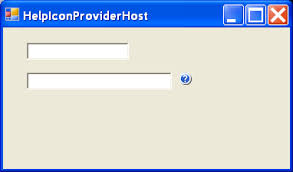
I would just add a tiny help icon next to the field and when the user clicks or hovers it, display a small tooltip with the instructions.

enter image description here

Your Answer

By clicking “Post Your Answer”, you agree to our terms of service and acknowledge you have read our privacy policy.

Not the answer you're looking for? Browse other questions tagged or ask your own question.