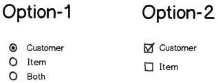
Two options shown here. We can use both types. Both have pros & cons. Which one is better?

Two options shown here. We can use both types. Both have pros & cons. Which one is better?

Radio buttons usually express mutually exclusive options (EITHER this OR that), so giving an option that includes an item but excludes it at the same time won't be consistent.
Contrary to checkboxes, it's expected to select exactly 1 item, neither less nor more.
Checkboxes are used to select several items (this AND that) which is the case. Also they let you select none.
Bear in mind that it might happen that you have to add a new option and if you use radio buttons, then "both" will be meaningless and you'll have to redesign this control (also remember users hate changes unless they're great improvements). With checkboxes that's not a problem.
"Both" option has more cognitive load since it doesn't express something by itself, it's a reference to another items, so the state is not directly showed. Additionally you are adding +1 element to the UI.
A way to improve it would be to explicitly name the label "Customer + Item" or "All", similarly as the case of the classic single choice questions, where you can find options like "Answer D: "All previous answers are correct" or "A and C are correct".
But anyway, if the answers are not mutually exclusive, you could add an "All" checkbox as a shortcut for users, without losing visibility of the selection state. There's a similar approach used in table-like components, like Gmail Inbox, where you have a "select all" checkbox.
There are use cases when they both could fit the requirements, each one having its pros and cons, then you really need some user testing to see which generates less confusion. See this question for a very special use case.
Beside making the eligible options and combinations thereof explicit, as noted in various other answers, there may be another use case where the radio buttons are preferable:
If the options are conceptually independent of each other, and selecting both options just means a mere addition of options, two checkboxes are fine. However, if selecting both options means that the result will somehow merge the options, the three radio-buttons can be a better choice.
This is a "soft" definition, and there are certainly borderline cases. However, let me explain the subtle difference I see in two examples:
As a concrete example, the travel website Expedia provides, for their "click&mix" packages, three mutually exclusive toggle buttons:

This reflects the fact selecting Flight + Hotel + Rental Car is not the same as booking Flight + Hotel, and then Flight + Rental Car (even if we ignore that this would leave us with two flights in this particular case). Flight + Hotel + Rental Car is a combined offer that only works for a common set of travellers and a common date range for the trip, and that is sold as a combined package.
A note about None being eligible: Even with the checkboxes, this is not usually a problem. None is a very special state whose invalidity in certain contexts can very intuitively be conveyed to users. When selecting items to order, hardly any user will be confused by the fact that selecting no items to order means they cannot continue the ordering process. Therefore, disabling the Ok button or showing an error message upon clicking Ok if no options are selected is not contrary to user expectations. Accordingly, whether or not None is a valid choice is only a secondary factor in the presented decision between checkboxes and radio-buttons.
In general, the checkboxes are better. The exception is when all of the below are true:
Note that the same discussion can be had if None is an option but Both is not.
In cases where there are two or more items and it is legal to select any item by itself, and some but not all other combinations of items are valid, the question of whether to use radio buttons for all valid combinations of items, or whether to use check boxes but recognize that some states may not be valid, is something of a judgment call. In most cases when there are three or more items, one approach will be clearly superior to the other (either because the radio button would entail too many choices, or the validity conditions for the checkboxes would be harder to understand than a list of valid combinations). When there are exactly two items, either approach may be reasonable depending upon what else is going on with the form.
If both "None" and "Both" are valid combination, then the checkboxes are likely the better approach. If "None" is not a valid combination and one is willing to accept that clicking a checkbox on a valid form may cause it to become invalid, checkboxes may still be better. If it is necessary that a click on a valid form must leave it in a (potentially-changed) valid state, however, clicking the only checked item will create a somewhat awkward situation. If X is initially checked and Y is initially unchecked, and the user wants X unchecked and Y checked, having X not do anything until after Y is checked would be awkward, but having X check Y would also be strange. Having the click on X not visibly alter the state of the checkbox but set a flag so that clicking Y would turn off X might often achieve the desired behavior, but it would be strange. Perhaps clicking X could "dim" the checkbox for a little while, and clicking Y while the checkbox is dim would uncheck it, but that would be rather unusual.
The checkbox situation works out a bit better if "none" is a valid choice but "both" isn't. While user-interface guidelines may not particularly smile at such behavior, it is not uncommon for the act of clicking on a checkbox to automatically click off any checkboxes which would be incompatible with the new selection. If the checkbox being clicked highlights itself for the duration of the click, all affected checkboxes should do likewise. That behavior doesn't seem suitable for your present scenario, but it might be if the wording of the conditions was reversed.
There are good answers and if you are still looking for alternatives:
Step 1: Display Customer and allow the user to Skip or Select
Step 2: Display Item and allow the user to Skip or Select
Order of display is purely driven by the context and that will also influence the usability.
Displaying one after the other keeps the Cognitive load to the minimal with no choices to make.
To keep the user NOT guessing, the second option could be displayed as grayed out but transparent (similar to how modal windows are expected to allow the user to allow user to still retain the view of the underlying screen content).
Progressive disclosure technique is pretty apt fit for this.
Hope this helps.
Based on your question and attached image, you are providing options to the user. And I believe for this kind of requirement, Checkbox is more appropriate and rather intuitive to the user. And visually, checking something relates more to options.
Radio buttons, on the other hand, are better suited for toggling requirements (turning on/off something). IMHO.
TLDR: It depends on the requirements.
Between the two screenshots you provided, there's VERY different functionality. For the radiobuttons, one (and only one) must and can be selected. But for the checkboxes, none or more can be selected.
Assuming the user must pick at least one option, the radiobuttons would be better. Assuming the user is free to pick no option, the checkboxes would be better.
As for general guidelines, radiobuttons should ideally only be used when there's conflicting choices. In the case of your first example, this is not correct. I would advise to re-write it two a simple small form:
Customer: yes - no
Item: yes - no
If picking the checkboxes, your current example is fine.
Note that it never hurts to give the user some visual feedback! Whichever you pick (radio or check), below the form you can have a small summary of the picked choices.
Example for checkboxes:
Wrap my order in giftpaper: yes
Include the order confirmation with the package: no
Sent me updates on the status of my order: yes
You have chosen to wrap your order in giftpaper and wish to receive updates on the order status. We will not include the order confirmation with the package.
A solution like this would be a bit more work to implement, but if done right (read: with proper sentence construction), it will make it a lot easier for the average user/customer to validate their choices.
To make it easier to read, you should list all positives first followed by all negatives. Using them interchangeably might confuse the user/customer.
Currently, you have option a, b, or both. That takes up either 3 lines with option 1, or 2 with option 2. No big difference, you might say?
Lets say in 6 months, you add another item to the list, say retailer, because your site is expanding and you are adding 3rd party retailers.
Now, using option 1, you have 7 lines - Customer;retailer;item;customer and retailer;customer and item;retailer and item;all 3. Whereas with option 2 you increase from 2 lines to 3.
Then, you decide to add reviews to your site and want to search on those. Option 2 is going to become 4 lines instead of 3. Option 1 is now some number I can't be bothered to calculate.
If you are deciding between two roughly equal optionswhy not not choose the option that can scale, on the chance that you might eventually need to.
@rewobs has given valuable insights on why and how one should select the controls.
Already much has been written and said about the choices and if I have to pick, I would go with the "check boxes". For the reason they will select either ONE or ALL the options available, based on your parameters ("All of the Above") (I consider it as not a good option to include)
You can also use controls which will be useful in terms of saving space, innovative interaction and ease of use. Try Select 2
It offers improved and enhanced versions of traditional check boxes control.
Have a look at the examples which can invoke some thoughts.
Checkbox is more preferrable in simple terms easy for user to select.You can also go for a dropdown list box with three options Customer,Item and Both too .