3

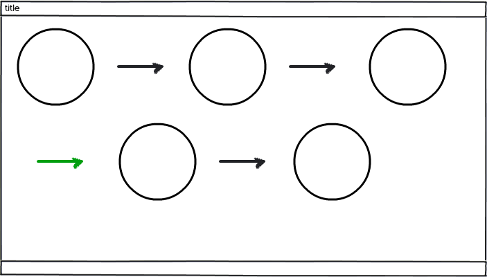
I have this long sequence of elements following a path. They work OK in desktop views, but I was wondering how to deal with the orphan arrows (in green in the mockup) while still preserving the visual representation of the connection paths.
mockup

download bmml source – Wireframes created with Balsamiq Mockups

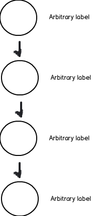
Of course I'm aware that I could simply make it all vertical, but I was wondering if there's a better way where I can keep the horizontal paths. The problem I'm facing is these elements have hierarchies in their data (despite the visual order) and I don't want to confuse the user in a vertical layout making them think the top element is more important than lower elements.

As an addendum, all circles have heavily hierarchized data inside them. I also took a look to Responsive Web Design - what should happen when the mobile device is rotated? but really not helping me

To better explain the concept, think on the first element as just a departure point, say a small town, and then you could go to a state capital, then a small city, then a big city, then a village and so on. Thus, what matters to me is the followed path, yet I don't want to confuse users with added visual hierarchies. I played with radial layout concepts, but really not making it work, so looking for some help here!

2 Answers 2

5

Maintain grid alignment

  • For complex flows and hierarchies, grid alignment is crucial for calming the complexity and providing a sense of order to the user.

  • If you get the grid layout correct, you can de-emphasize the arrows because the user really only has to look at the arrows once to understand how to navigate the flow (so you don't have to make them prominent unless the visual path changes).


Here are some examples of grid layouts

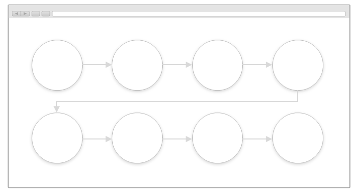
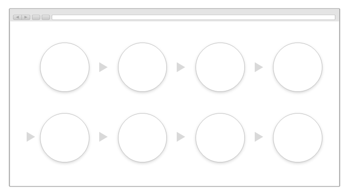
  • Align the content, and use interstitial arrows: enter image description here

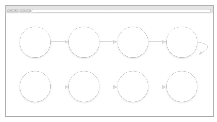
  • Use faint arrows between rows (arrows with knees are a little more grid-compliant than diagonal arrows): enter image description here

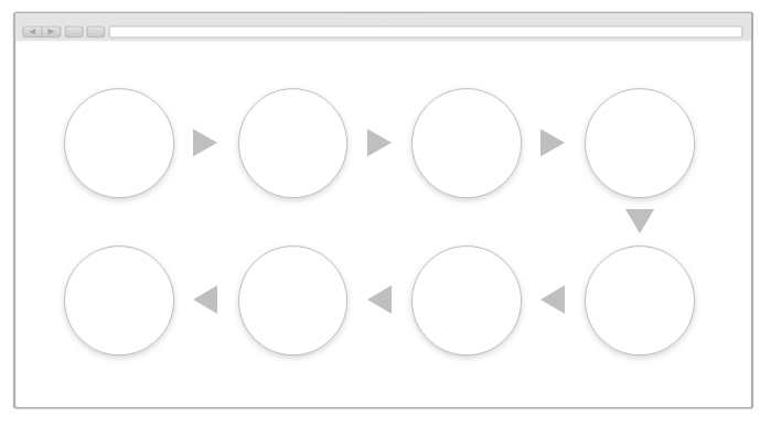
  • Use a new line indicator: enter image description here

  • Use snaked layout (I'm not a fan of this approach, but am including it for completeness): enter image description here

2
  • 1
    Both are great answers so I voted them up, however there was a bigger problem I forgot to include in my question and now I realize it's what bother me most: the connections have info themselves, so guess vertical view will have to be the one to use. Or kaybe a slider with nav buttons for the elements and a dialog for their data, will have to study it. Thank you Tohster and Obelia, your input really helped me
    – Devin
    Commented Jun 7, 2015 at 14:43
  • +1. As long as there only is one arrow in and one out, it's a line, and both nodes and connectors can be wrapped the same way text is.
    – JOG
    Commented Jun 7, 2015 at 23:24
3

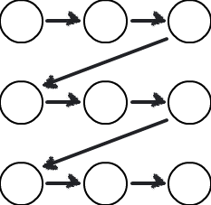
Why not have arrows that explicitly point the the next circle in the sequence even when it's on the next line:

mockup

download bmml source – Wireframes created with Balsamiq Mockups

But, FWIW, I don't think a vertical array of things implies the top element is more important, just that it's first in the sequence. Circles and arrows could be used to reinforce the sequential nature of it:

mockup

download bmml source

Your Answer

By clicking “Post Your Answer”, you agree to our terms of service and acknowledge you have read our privacy policy.

Not the answer you're looking for? Browse other questions tagged or ask your own question.