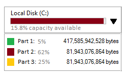
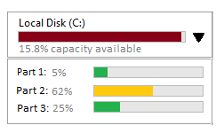
Currently, capacity available is represented using a single icon in green, yellow, or red (green = lots, yellow = some, red = low).
Due to API changes, there is an option to modify this data to show percentages.
My knee-jerk reaction is that the iconography is the superior representation because percentages are too much of an ask to the user to apply a value judgement. (I think I remember reading this once, but can't recall that I definitely did nor where.)
Additionally, there is an option to break down a whole into its parts, to show the available capacity for each remaining part. Where those would be different than showing the available capacity for the whole.
Again, my knee-jerk reaction is too much information is possibly not the best solution and that expanding the information available to the user might overly complicate both the UI and therefore influence user decision making ability negatively.
The context is retail transport.
Any thoughts on 1. percentage versus colours 2. expanding breakdown of information into parts versus whole?


