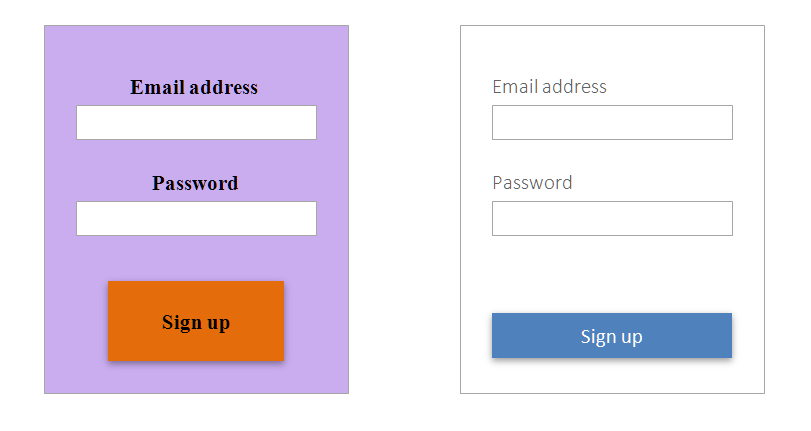
I'll use a simple example to show how visual design can impact user experience, particularly usability. The science behind it has to do with how you are driving the end-user's eye down the page. One of the best things you can do with sites or applications that display large amounts of data is to use Gestalt Principles to create groups of data. Done properly, the brain will no longer perceive the information as one large data set, but chunks of data which is much easier to process.
It's easy enough to create 2-3 large chunks the user can bounce to while ignoring the others. An example of this might be a site with a header, left nav, and content area. The user can very quickly bounce to the content if they are confident in the current location on the site, but what happens when the content needs to be broken down into more chunks.
At this point we're reaching a point where we're nesting chunks inside of other chunks. If we simply use white space, we might wind up with too much white space and that won't work. If we use borders, we'll wind up with a visually noisy page that will almost destroy all of the hard work we're trying to do to make the visual search task easier for the user. You're brain will processes visual noise, whether you're directly attending to the information or not. Less brain process effort = higher performance, so it's always good to reduce noise.
So if we've determined our chunks, what do we do to solve the problem? Depth and color add additional dimensions that can create Gestalt groups just as effectively as borders and white space without all of the messiness. By using a different background color on a certain group, or by triggering a text color based the state of items, suddenly all of the chunks we want to represent are present. The user's eye can freely bounce around based on their personal intent, and the items that aren't of interest are easier to ignore. "I'm interested in all active list items in my queue" - they're colored green, "I need to find a certain item in this list" - all list heading backgrounds are light blue.
The "art" part comes into play when you chose where and what kind of color or depth you want to apply where. Applying it properly mainly comes from experience right now as most of this stuff isn't documented (as far as I can tell). However, google's materials design language does a good job of explaining how they apply there visual design and why. I recommend it if you're interested in this topic. However, and in all honesty, visual design is really the product of research and engineering. The science comes from neuroscience, cognitive psychology, experimental psychology, and the like. The research comes from end-user research, activities like persona building, task analysis, and A/B tests. The engineering comes from the application of the previous to to user interfaces.
After several years, I've found that all parts of UX, including visual design, have very little to do with personal preference. The design should present itself based on your research and understanding of the domain, just like any other field.


