0

I'm building a CMS using Zurb Foundation with a direct edit philosophy, eg as much as possible users should be able to drag to resize or move elements etc.

I prototyped it at desktop resolution, and this is the pattern I used for editing columns:
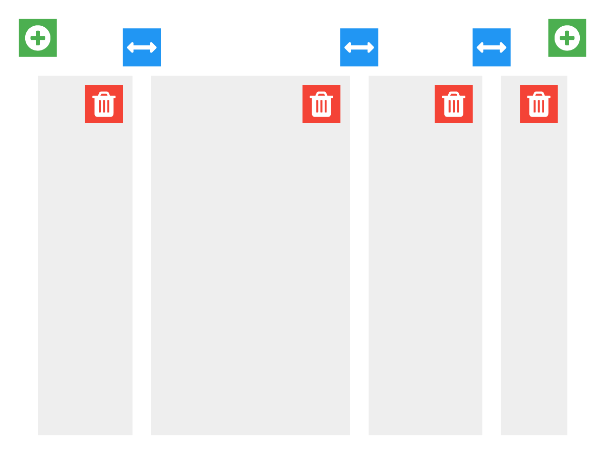
large-columns

I think this illustration should be self-explanatory, but just in case, you can click to add new columns with the green icons, the blue icons can be dragged horizontally to adjust the widths, red to delete a column etc.

As I was prototyping at desktop res, I used Foundation's "large-n" CSS classes for the column widths.

Now I want to add Foundation's breakpoints to the CMS, (so you can, for example, set "medium-n" and "small-n" columns) and I'm having trouble visualising how this should work - at the moment if you had the column set above and change to a medium screen width, the columns are rendered as rows by Foundation (as expected):
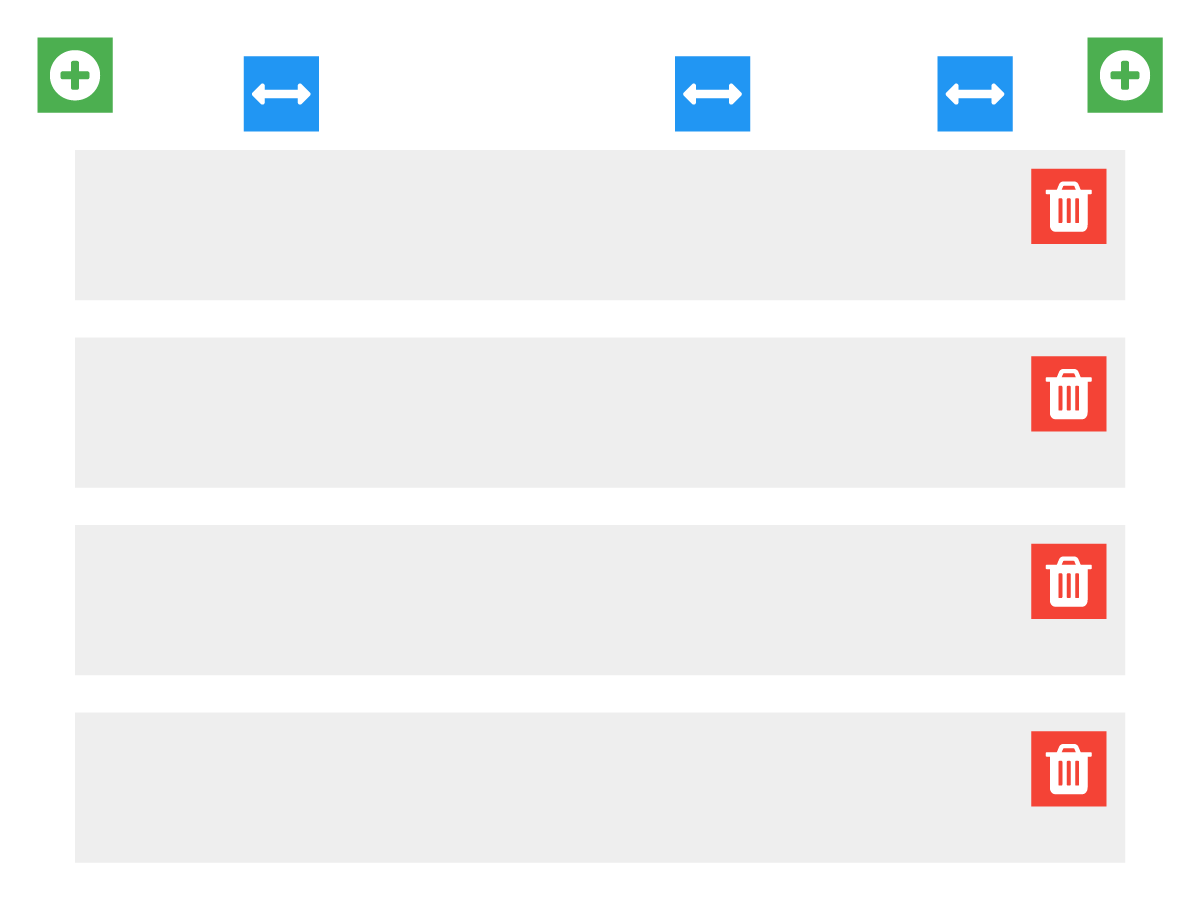
medium-columns

Note that it shows the controls from the large column state - I left those in to show that I'm unsure what to do here.

So - the paradigm works fine if you're only ever dealing with "large", but it's hard for me to visualise how to handle the transition, for example the person using the CMS would probably now want to limit this particular four column layout to say, 2 or 3 columns for "medium", and 1 or 2 for "small", depending on the column content. They need to be free to make that decision.

What would be a better pattern, or a modification to my existing pattern, for allowing users to control the columns widths across different breakpoints?

2 Answers 2

1

I think icons are fine to a degree, however when you need to display information that isn't easily represented by icons, I'd revert to text.

Example

In use (sorry I don't have the same icons, hopefully you get the picture)

enter image description here

1
  • Thanks for your input, and I certainly agree that textual feedback is important. It doesn't address my problem though, which now that I've had time to reflect is really caused by the fact that I'm treating columns as elements that always live within their own row, when in fact Foundation's treatment of columns means that they can in fact wrap around, a little bit like text or other inline elements. So my attempt to have the resize paradigm be like that of resizing, say columns in a table is misguided. I'm going to post an update shortly.
    – nrkn
    Commented Apr 24, 2015 at 1:20
0

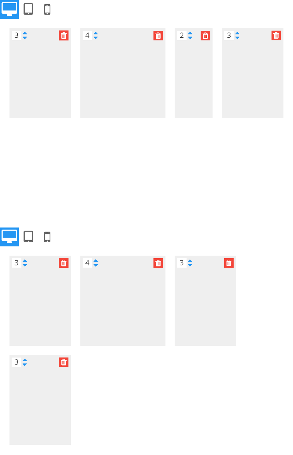
OK - so as mentioned in the comment above, my assumption that "every column in the set sits in the same row" was misguided, as was my trying to use the ux paradigm that we're used to for resizing say, columns in a table.

Here's my working model going forward. Please note, I removed the UI elements for adding additional columns for clarity in this example.

I am going to replace the "drag the space between columns to resize" action with a numeric spinner defining the width on the grid.

Say you have a balanced column set (widths sum to 12, as per Foundation's grid), and you increase the size of one column, wrapping will occur:

large columns

Then, you switch to medium size, and as you have yet to define any column widths, they show a null state in the numeric spinners, and act as rows. You can then set each columns width for this breakpoint:

medium columns

1
  • 1
    It's coming across as confusing, and I've read your post and follow up three times now. Perhaps you could restate, clearly, the aims of the application? Because in your follow up, it sounds like you're changing the meaning of a control depending on the size of the interface, which sounds like a disaster. Commented Apr 24, 2015 at 7:40

Your Answer

By clicking “Post Your Answer”, you agree to our terms of service and acknowledge you have read our privacy policy.

Not the answer you're looking for? Browse other questions tagged or ask your own question.