101

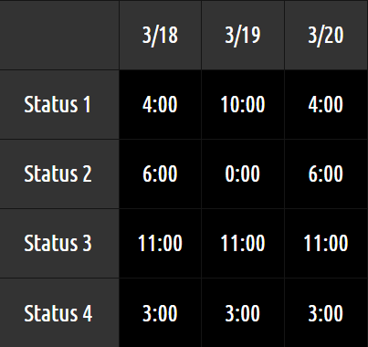
I have a table in my application that shows dates along its x-axis, and different statuses along its y-axis. The table keeps track of how much time an employee spent in a given work status (on duty, off duty, etc) for the given day in hours:minutes. I've included a rough sketch below:

enter image description here

My worry is that some users may get confused and think that this time represents something different, such as the time at which this state occurred (i.e. went on duty at 6:00, went off-duty at 18:00). Is there a better way to represent this time to be more clear of what it is representing, or is this just something that users will have to learn on their own using my software over time?

7
  • 18
    What is the resolution of your durations? "4.5h" would be hard to mistake for half past four, but the numbers are awkward if you need more precision than 15 minutes. Commented Mar 25, 2015 at 18:41
  • 8
    @UlrichSchwarz There are users who cannot comprehend decimal numbers used for this purpose. Some users when presented with a number of hours written as 4.25 will persistently claim it says 4 hours and 25 minutes, regardless of how many times they have been told it is a decimal number and not hours and minutes.
    – kasperd
    Commented Mar 27, 2015 at 14:49
  • 3
    Simple: Just never display a duration shorter than 24 hours. :)
    – reirab
    Commented Mar 27, 2015 at 19:57
  • 1
    @reirab Employees might get a little depressed (and confused) if they see they've been on duty for 25 hours in one day. Actually... could happen with daylight savings!
    – Alex
    Commented Mar 28, 2015 at 19:05
  • 1
    @RhinoFeeder It can also happen when you're crossing time zones, especially if you're traveling from Asia or Oceania to the Americas. I've had 38 hour days before while traveling.
    – reirab
    Commented Mar 28, 2015 at 20:36

11 Answers 11

157

You are right to ask this question. It really depends on who your users are.

In labor-intensive environments, users are often very familiar with the HH:MM notation for duration, so it's OK to use that format. But, I agree that even for those environments easy to get it confused with time.

Is there a better way?

Let's start with the existing solution. The benefits of HH:MM are:

  • It's universally recognized as a time format
  • It's scannable, i.e. when you have lots of data in a grid, the HH:MM aligns nicely so it's easy to scan.

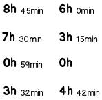
With this in mind, here are two approaches. You could label the existing table to remind users that it's showing duration rather than time. Or you could adopt a different notation to indicate that it's duration:

enter image description here

The notation on the left is popular these days, and preserves some (but not all) the scannability while denoting duration more clearly. The approach on the right keeps the cleanliness of the HH:MM notation, and sets user context elegantly by utilizing the top-left corner (which is the visual entry-point to the table anyway).

14
  • 117
    +1 for the LEFT EXAMPLE. The right one will still cause issues, since people need to figure out there is a label in the upper left hand corner. Users just don't look for content labels there. Commented Mar 25, 2015 at 17:59
  • 15
    Left example, not the one on the right. Commented Mar 25, 2015 at 18:13
  • 30
    An advantage of the left approach is that it makes clear that the duration is in fact hours and minutes; saying that the duration of a video presentation is 1:45 may be less clear than saying that it's 1h30m or 1m30s.
    – supercat
    Commented Mar 25, 2015 at 21:57
  • 6
    I like the left example a ton, and actually can see that being used generally for "duration" throughout the application. This will train the user well to recognize "hh:mm" as a clock-based time (went on-duty at 3:45), and "xxh xxm" as a duration of time.
    – Alex
    Commented Mar 26, 2015 at 2:37
  • 6
    I like the left solution, however, it has some internationalization issues in languages that occasionally write times in a format like 8h00. Commented Mar 26, 2015 at 12:42
26

A plus sign is sometimes prefixed to the time format indicate offset. It can also imply duration. For example:

 +4:00  +10:00  +4:00
 +6:00   +0:00  +6:00
2
  • 12
    I think that could also be misinterpreted as time zones (e.g. UTC+4), though it is a bit of a stretch.
    – Kevin
    Commented Mar 26, 2015 at 18:03
  • @Kevin I agree; Even if it may be impossible to actually misinterpret is as time zones without related time - it can easily confuse and unsettle the user, thinking "ok, seems to work like this - but what about the time zones??". To me, looking at it is confusing even now, knowing what it means. Commented Mar 27, 2015 at 1:06
25

Another possibility would be to add a "prime" mark at the end, as is sometimes (often in race times) used. Minutes and seconds would look like 4′33″, so a single prime is minutes, so use 1:30′ for an hour and a half.

8
  • 6
    I've never seen this used anywhere before. Commented Mar 26, 2015 at 2:11
  • 3
    @ArturoTorresSánchez this is usually used in races, I believe. Commented Mar 26, 2015 at 8:25
  • 11
    @Derek朕會功夫 Yes, but while 4′33″ looks somewhat familiar, 1:30′ does not.
    – Crissov
    Commented Mar 26, 2015 at 13:51
  • 13
    @Crissov I agree with you that 1:30' is quite weird. Instead of using a colon, a degree symbol should be used 1°30'25". Commented Mar 26, 2015 at 19:31
  • 1
    There is a very famous track by composer John Cage named 4'33", which refers to its length (4 minutes 33 seconds).
    – sleblanc
    Commented Mar 28, 2015 at 19:11
20

You can also show the minutes with a smaller font.
On stopwatches, this is done for the seconds or milliseconds.

enter image description here

mockup

download bmml source – Wireframes created with Balsamiq Mockups

2
  • 4
    I like this answer because it's respectful of the original design intent (to show duration without adding extra digits). It also provides nice visual hierarchy between hours and minutes, which works for many applications. And finally, it elegantly deals with the different heights of the 'h' and 'm' which irks me about my own answer :-)
    – tohster
    Commented Mar 28, 2015 at 17:16
  • 1
    I agree! This seems to be a good comprimise, and I was surprised at how changing the size of the minutes caused me to recognize the numbers as a duration. I do wonder about readability on a small screen (eg. mobile), but I'm sure that concern could be quashed with testing or more information about how it will be shown.
    – Jake Liff
    Commented Apr 2, 2015 at 15:16
16

The international standard ISO 8601 would suggest P04:00 or P4H. Its part on periods, durations or time spans and repetitions, though, is hardly ever followed – and you aren’t using its date format in the first place. JFTR

Please note that 4h00 is not unambiguous, since some people tend to write clock times that way. 4h00m or 4h00min would be better.

There‘s also icons: a stop watch ⏱ (with big buttons) often designates durations (less often an hour glass ⏳) where a clock face 🕒 (with big hands) shows times.

7
  • 2
    What encoding do those stop watch and clock face glyphs use? they are not displaying correctly in my browser.
    – Vality
    Commented Mar 26, 2015 at 23:06
  • I believe they are from Unicode’s Emoji code block which is outside the BMP, but – unlike many real writing systems – font support should not be that bad nowadays. Anyhow, the stop watch is not showing on every of my current devices either. I think I did not include variation selectors, but have not checked the page source.
    – Crissov
    Commented Mar 27, 2015 at 11:28
  • Its probably Chrome. They have lagged behind in emoji support for years. Its finally almost implemented. For me if I select the square and right click the font used in the context menu shows the emoji.
    – rtpHarry
    Commented Mar 27, 2015 at 14:07
  • 1
    @Vality Not an encoding problem. If you see no character at all, or an empty square or some such missing character symbol, that means your computer or device has no font containing a glyph for that code point. Usually means the code point is new, a recent addition to Unicode, as is the case for the emoji. Commented Mar 28, 2015 at 17:01
  • None of them are working in FF on ubuntu here either -- so can we agree that they're unlikely to be a good idea unless you have 100% control of the user's system? But U+23F1 isn't the emoji block, it's in the Miscellaneous technical block, of which most is supported on my system.
    – Chris H
    Commented Mar 29, 2015 at 13:47
14

You could use decimals. So for example:

90 minutes would be 1.5 hours instead of 1:30

3 hours and 45 minutes would be 3.75 instead of 3:45

This format is highly scannable and makes it easier to sum the values in your head.

3
  • 22
    I absolutely don't agree with this approach! This just confuses the hell ouf of users! Compare 1:55 and 1.916666, what is more readable? I once had to use such a notation, and many people just didn't get it and wrote e.g. 1.40 when they meant 1:40
    – Misch
    Commented Mar 26, 2015 at 8:21
  • 5
    @Misch - I think it depends on time increments. I've worked at places that only cared about 15 minute increments. If reporting goes down to the minute then the decimal notation x.xxxx would not be a good solution.
    – Mayo
    Commented Mar 26, 2015 at 11:57
  • @Mayo I agree, but in that case I would prefer <big>1</big> 1/2 h and <big>3</big> 3/4 h.
    – yo'
    Commented Mar 30, 2015 at 13:48
8

ISO 8601 Duration

As mentioned in the answer by Crissov, the ISO 8601 standard defines a textual representation of a span of time in this format: PnYnMnDTnHnMnS, called Durations.

In this format, the P marks the beginning. The T separates the days portion from the time (fractional day) portion, and is omitted for whole days.

Examples:

  • P1D = One whole day.
  • PT5M = 5 minutes.
  • PT4H30M means "four and a half hours".
  • P3Y6M4DT12H30M5S represents a duration of "three years, six months, four days, twelve hours, thirty minutes, and five seconds".

Even Briefer: 4H 30M

You could truncate the PT for presentation to the user. So four and a half hours would be: 4H30M.

Perhaps add a space for readability: 4H 30M.
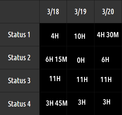
example chart using ISO 8601 style presentation of time spans

Pros

The upside is that this format is unambiguous, and won't be confused for some other meaning. Another benefit is the fact it is a standard. And the values are somewhat intuitive and easy to read and understand.

Cons

One downside is that users may not be familiar. So a moment of explanation or training may be needed.

Programming

Some programming libraries can parse and generate such strings. For Java, the Joda-Time library does so handily with its Period class. Similarly, the new java.time package built into Java 8 also offers a Period class.

Example using Joda-Time 2.7.

DateTime now = DateTime.now();
Period period = new Period( now , now.plusHours( 7 ) );
System.out.println( "period: " + period.toString() );

Output:

period: PT7H
5
  • 7
    You need more than a moment of explanation or training: you need to persuade your users that you're not crazy. And that's not always easy. Commented Mar 29, 2015 at 3:19
  • 1
    No, no and no! ISO hyper-super-best-in-the-world-standards may be (not are) a good choice for technical reports, regulations etc. But they are the worst choice for communicating things to normal people. The only case when they are a good choice in such case is when they coincide with the notation you chose for another reason.
    – yo'
    Commented Mar 30, 2015 at 13:47
  • 2
    @yo' The question asked for ways to display a span-of-time unambiguously. That is the express purpose of ISO 8601, unambiguous textual representations of date-time information. We are not talking about obtuse binary formats. Plain digits and common English letters are used in the suggested format. If you wish to be even more "normal", truncate the PT to use 4H30M. Is explaining "H means hours, M means minutes" really a giant leap of learning? Commented Mar 30, 2015 at 18:24
  • @BasilBourque But we're on UX.SE and not engineering.SE.
    – yo'
    Commented Mar 31, 2015 at 17:25
  • 4
    @yo' I suggest you re-read the Question. The Question is about situations where being unambiguous is more important than familiarity. Other Answers suggest inventing a similar notation. My point is simply that there is not need to invent yet another notation. ISO 8601 was invented to solve this very problem. I added a screen mockup example. As for "engineering.SE", perhaps such a calmer more rational attitude might be more productive than the thinking that leads to language like "crazy", "No, no, and no!", "hyper-super-best", "worst", "normal". Commented Mar 31, 2015 at 20:53
8

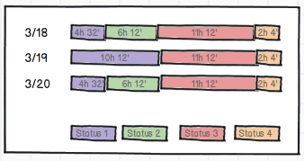
maybe is out of scope, but scanning a table to detect patrons is not very user-friendly. If resources are available, i would go with an horizontal stacked chart:

enter image description here

It offers a better perspective of the percentage of time on each status, and is more easy to scan for out-of-patterns days.

1
  • As both a user and a UX developer, I would go with this one Commented Apr 1, 2015 at 11:32
1

JIRA uses the '3h 15m' style notation which works for me.

Oh the other hand, I used a timesheet system in which time was entered in 15 minute blocks. I found having to enter times as a decimal values like 3.25 was non-intutive way of expressing a duration of 3h 15m.

On the example given, couple of things are not clear:

What is the granularity? Minutes?, 5 minutes or 30 minutes? If showing something like 24 hour days split into several states, I would be thinking along the lines of percentages or segmented bar graphs rather than hours/minutes which might be too precise for a view. Also remember that twice a year you get 23 or 25 hours.

0

One other solution could be to show the seconds as well. Since seconds will be changing quickly it will be clear that the times are continually changing. I don't recommend this solution but from the perspective of clarity, it works.

1
  • It does not work to show durations that are no longer changing. (“The machine was used 6:45:21 yesterday.”) Commented Mar 30, 2015 at 11:20
0

It seems to me that confusion occurs because there are 2 low-order places with both methods. You could take all the data to fixed 3 decimal places (or 1 decimal place) of an hour, using a decimal point, and rounded before display. Remember to keep the data accurate by doing the maths in integer minutes internally, so minor floating-point errors can't occur when totalling. Another idea is to report everything in minutes.

If you test some alternatives on some users you might be able to get to the best solution, possibly something that hasn't come up yet. Some might think it's your job to resolve the ambiguity.

Not the answer you're looking for? Browse other questions tagged or ask your own question.