3

We're building an app in which the user is able to upload or create a file and we're currently trying to optimize the experience of file creation. Currently our interface looks like the following: enter image description here
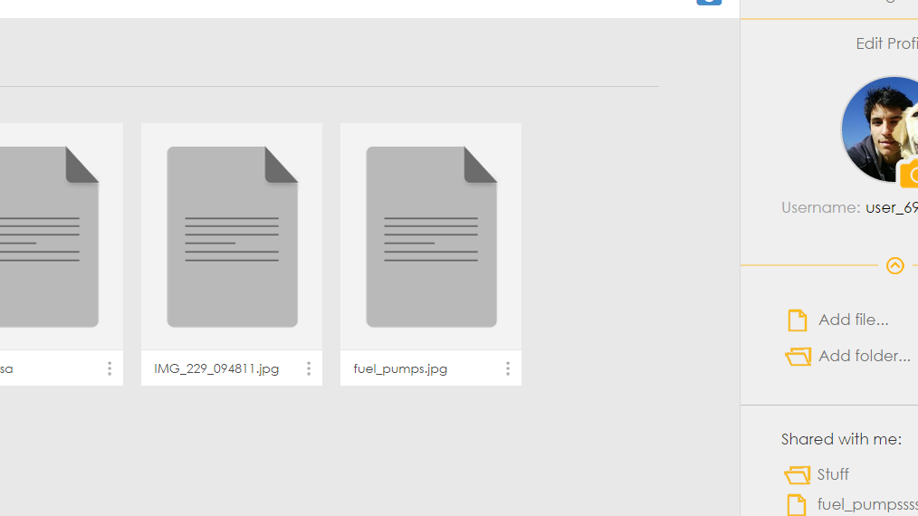
The user panel is hideable via the arrow and users can create files via the menu below it. So in order to make it more intuitive we redesigned it to the following:
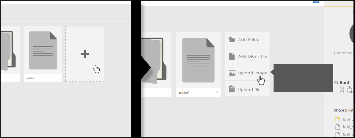
enter image description here

So my question is what is the more intuitive way to create files. Should we keep the buttons in the right menu(it has fixed position) or we should put the "add" button at the end of the items. Thanks.

2 Answers 2

1

Predictable placement is important for common tasks

If creating files is important (as it is for most sites of this nature), then it's important that users know instantly where to navigate to create a file.

  • If you add the create widget to the end of a list, you are forcing the users to hunt around for it, which can be very frustrating. For frequently used or desirable functions, you want the entry point to be predictable and easy to reach.

  • The only time it makes sense to place the create widget at the end of the list is if the list is relevant to the creation of a new item.

    • For example, if you are adding an item to a to-do list, it can be good to add the create at the end of the list because it forces the user to scan the list to make sure she hasn't already added the item.
    • Similarly, if a user is adding a photo to a gallery then it can be good to put create at the end of the gallery so that users consider the context before adding the new item.

In your case, unless the existing files are very relevant to the new file, I would place the create button in a fixed location. Where that is and how prominent depends on how important creation is relative to other fixed actions on your site.

1
  • Keep in mind internationalization. The position of the beginning or end of the list depends on whether the audience for a product is using a left-to-right language or a right-to-left language.
    – David
    Commented Mar 23, 2015 at 21:13
2

The first option will fail when the user has enough files to put the "+" button below the fold.

The second option doesn't suffer from this flaw, although it could benefit from a call-to-action heading, e.g. "Add a new item"

Your Answer

By clicking “Post Your Answer”, you agree to our terms of service and acknowledge you have read our privacy policy.

Not the answer you're looking for? Browse other questions tagged or ask your own question.