4

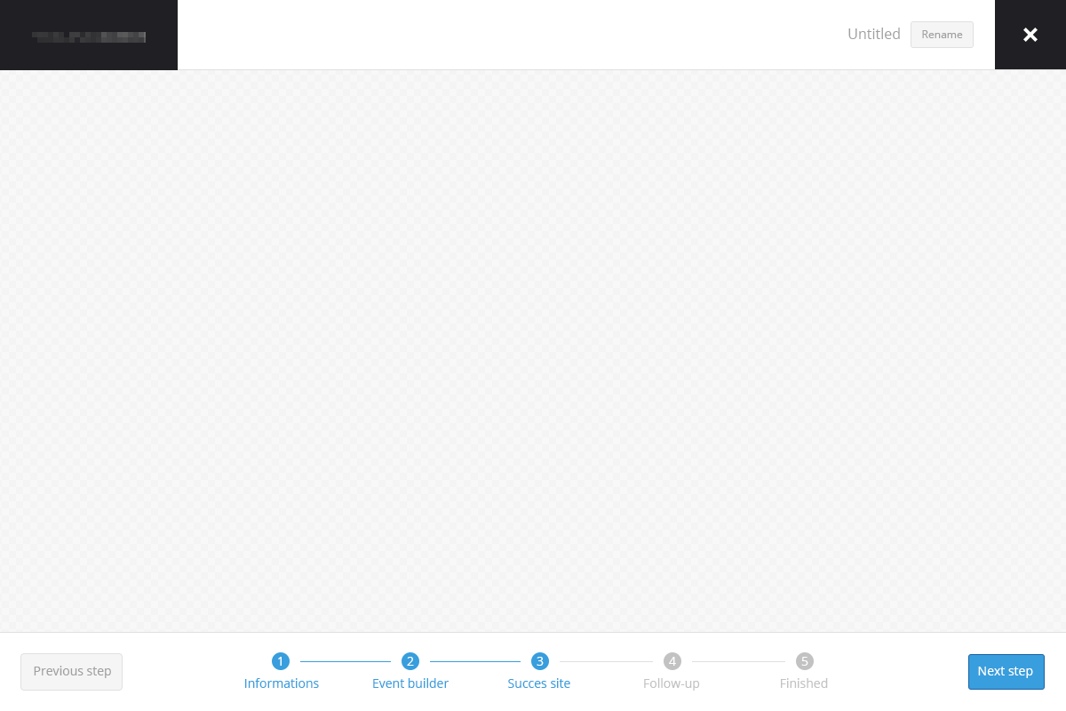
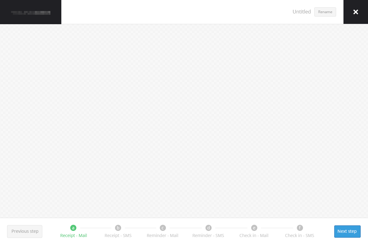
I'm looking for a better solution to visualize the steps shown on the images below.

With ~5 steps it works just fine, although when I use more they start breaking the grid. I really want to keep the height of the bottom bar they're in to the current 90 px.

At one point I also need sub-steps, that means e.g. step 4 has 1-5 more steps under it. How would I show sub-steps? I did a temporary solution as shown in Example 2 below. However I don't think it's a good user experience, since you cant really go back without using the Previous step button.

Any ideas?

Right-click and open image in a new tab to view it in large format.

Example Example 2

1
  • Doesn't it sort of defeat the purpose of a step-tracker if you start introducing sub-steps part way through that the user doesn't know about until they reach them?
    – JonW
    Commented Mar 5, 2015 at 13:29

2 Answers 2

1

Some questions you should ask... Is this a highly complex process that requires so many steps? Sometimes it is... e.g. I'm signing up for a new mobile plan and number. Most of the time it's not. Either way, always ask if you can simplify the flow. Are there info that don't need to be collected at this point in time? Or you can handle it with a set of default settings? The longer the process, the more likely users are to drop out half way.

Once you've strip the process down to the essentials, and you still have numerous steps. Ask, what's a logical way to grouping actions together. In your example, you have multiple receipts, reminders and check-ins. Are they distinct enough actions that warrant their own steps? Or can they be combined? Optional functionality should not be an independent step.

e.g. I can choose to receive reminders (or not) via email, sms etc. I can do the same with check-ins. In fact, aren't reminders and check-ins just notifications? Why not combine them as a single Setup Notifications step? In a way, you can almost consider how the user get receipts as the same thing. Do you really need separate options? Why not have the user choose a type of notification method they'd prefer for everything?

About substeps, best way is to think of them as subsections within a step. It's easy enough to have a scrolling page with one section after another. Keeping with your design, you can sticky your control bars on the top and bottom and have the middle section scroll if you have lots of content.
0

First, in English the word information is plural, and doesn't need the "s" at the end.

Is there a good reason to force the user into this sequence of tasks? Can these things be done asynchronously?

If you are constrained by this complex sequence, I think displaying the steps as rectangles that expand when you are inside a task with sub-steps might be a better way to visualize this.

enter image description here

The rectangles can be resized to accomodate more sub-steps, and you can make indications in the rectangles that are inactive to indicate that there are sub-steps in that step. This also provides a method to jump from arbitrary substeps/steps if the process allows for it.

Your Answer

By clicking “Post Your Answer”, you agree to our terms of service and acknowledge you have read our privacy policy.

Not the answer you're looking for? Browse other questions tagged or ask your own question.