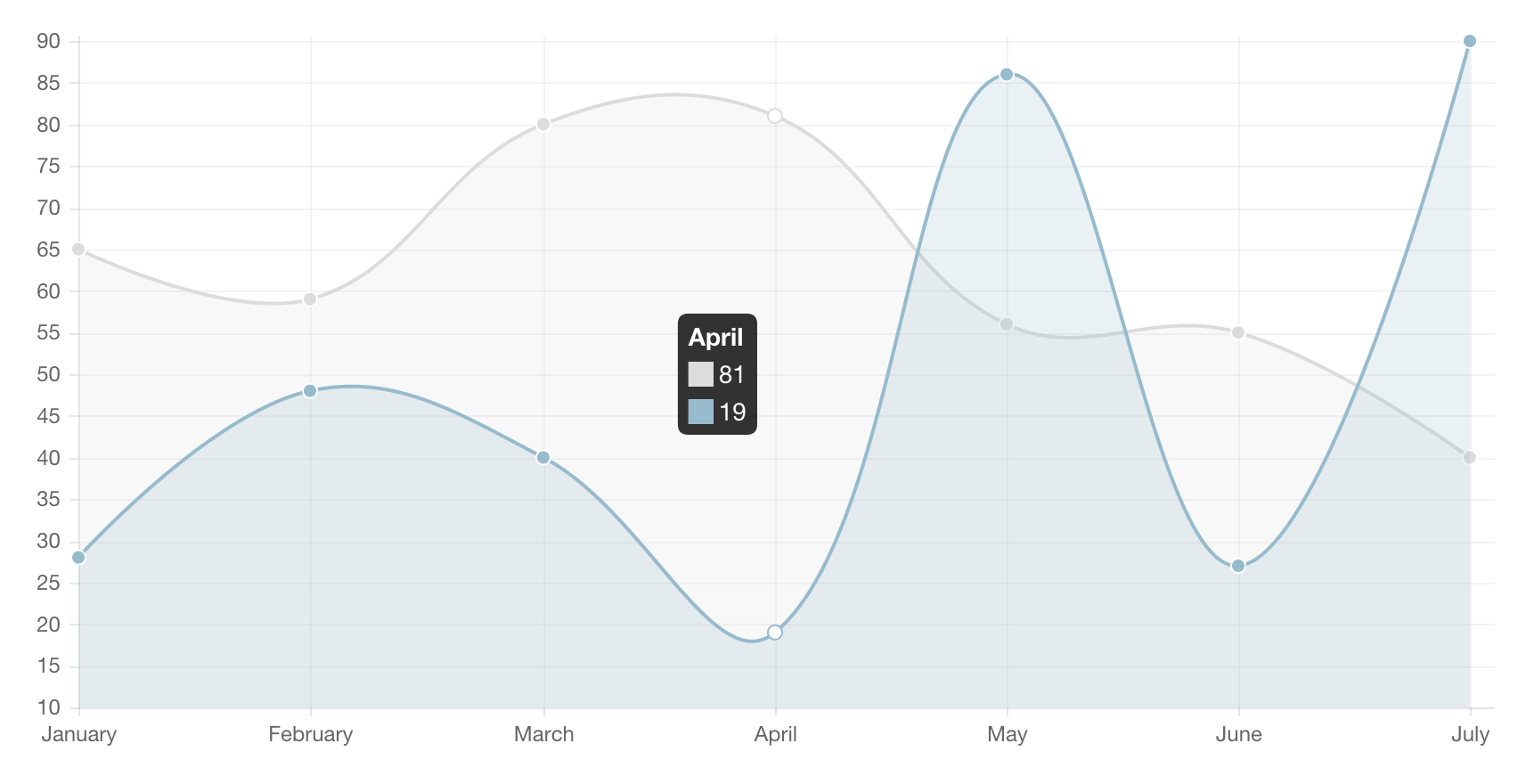
I created a chart using wijmo5. (Click here to see the actual chart in action)

The client wants and I quote,
mouse-over / finger-press will show the exact data for that datapoint
on the mobile phone.
I have my concerns because due to the restriction of the screen space, it is hard to select the right datapoint on a chart.
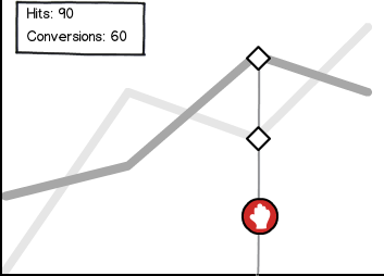
I did consider adding ball-like markers to indicate which datapoint the user is looking at. Not sure if this is the best UX decision.
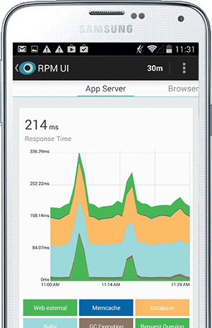
An example of ball markers is this:

On top of that, if there are any good UX suggestions for charts on the mobile phone would be great as well.
I found a good suggestion at reddit about pinning the top and left part of the chart. I think they mean the axes.
In summary, what UX should I add/modify on my current chart so that user can select/view details about specific data points on the chart via the mobile phone? And if there are additional good UX tips for displaying charts on mobile phone that will be great as well.


