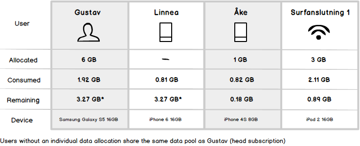
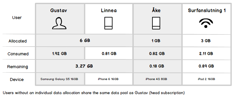
I have an issue visualizing individual data usage in a table where the usage is directly connected to a shared data pool.
The data users can have individual data boundaries, where the data is earmarked to be used by that user. Then it's easy, user A has a boundary of 1 GB and has used up 0,6 GB of that amount. The problem occurs when users don't have individual boundaries, then they all use up a shared data pool.
How do I visually convey this relation between users, their usage and the total remaining data amount?
I have a table designed for it now, but I really suspect that it's easy to misunderstand or possibly not understand at all. Like how do I explain that the "Remaining" value is depending on how much the other users consume?
In this scenario, Gustav and Linnea share the same unallocated data pool (6 GB), and Åke and Surfanslutning 1 have individual allocated data boundaries.

I've had an idea of letting certain cells spread over multiple columns to convey relation, but I feel that this makes it look way too messy and complicated:

Do you have a bright idea of how to clearly visualize this relationship? Or have you seen a similar setup being visualized in a table but maybe in a different context?
