4

My app has a page that contains a table with about 10 columns.

Should I limit the width of the table to some maximum to prevent too much whitespace inside the table rows, or is it a bad practice? If so - what will be a good maximum?

My concern here that when limiting the table width it looks strange compared to other elements on the page (for example the header) that have 100% width.
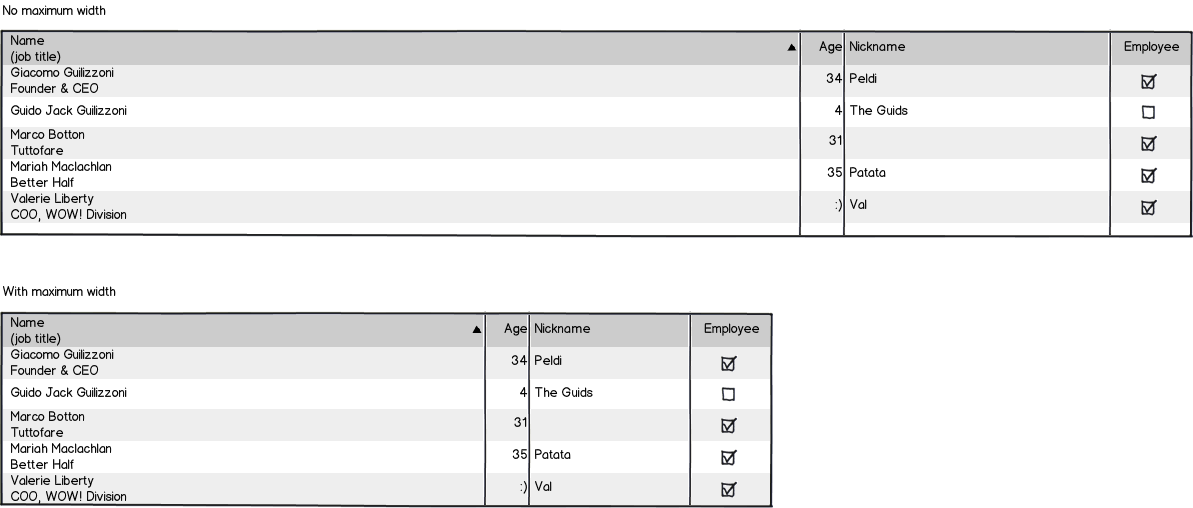
mockup

download bmml source – Wireframes created with Balsamiq Mockups

Edit: My app is a desktop-only app (tablets are ok, but no phones). Screen sizes are range from tablet / laptop size to big screens.

There is also a minimum screen width, so laptops with smaller screen get a horizontal scroller.

1
  • One important consideration is which unit to use for the maximum width. rem or em might be the best choice. Jan 15, 2015 at 11:57

3 Answers 3

3

Yes, you should. The reasons are simple:

  • Readability + Scannability: All that white spaces just makes a "data oasis" that makes no sense inside an information structure like a table. It would be difficult to visually match data between columns unless the table provides some design like the alternating color rows. The colors of the table shouldn't be necessary for good readability.
  • More consistent UI between different devices and resolutions.
  • Usability. For example: What if I want to copy some rows? I would not want to drag my mouse eternally!

For setting the "ideal" max width, you should take into account the resolution of your users to figure out what's the best size that fits everyone. Also a way to start is measure the max length of the text of every column and then add some padding just to avoid the "visual suffocation"

2

I am forever faced with this problem as I design back office applications. To support readability, I would recommend making tables as wide as they need to be and no bigger. The second table in your example is easier to read.

0

You can limit the whitespace on individual columns. You can also center the table so that it doesn't appear "strange."

You are correct in identifying that this table doesn't work visually. There are a lot of solutions to this problem.

To answer your question would require more information. What screen sizes do people use to look at your app? You could do a responsive site that shows 100% on say a phone but centers the table on a desktop.

EDIT:

Too much white space often dramatically reduces the ability to scan through the data. Line-width standards (57-70 characters) do not apply in the same way to tables but the principle of helping the reader focus on the correct characters does.

If you cannot reduce the column width and center the table then how about reducing the table size to what you think is appropriate and place something to the right of the table to help balance the page.

1
  • Thanks! Centering the table does not work for me (it looks even more strange). Limiting whitespace on columns is hard to implement because the table content is versatile and changes from user to user. I edited the question and added screen sizes.
    – Tzach
    Jan 13, 2015 at 14:37

Your Answer

By clicking “Post Your Answer”, you agree to our terms of service and acknowledge that you have read and understand our privacy policy and code of conduct.

Not the answer you're looking for? Browse other questions tagged or ask your own question.