0

My client wants to build an e-commerce website where he wants to display his products(clothing items) on carousels.He is asking me to add three carousels side by side as shown in the drawing in the image below. drawing
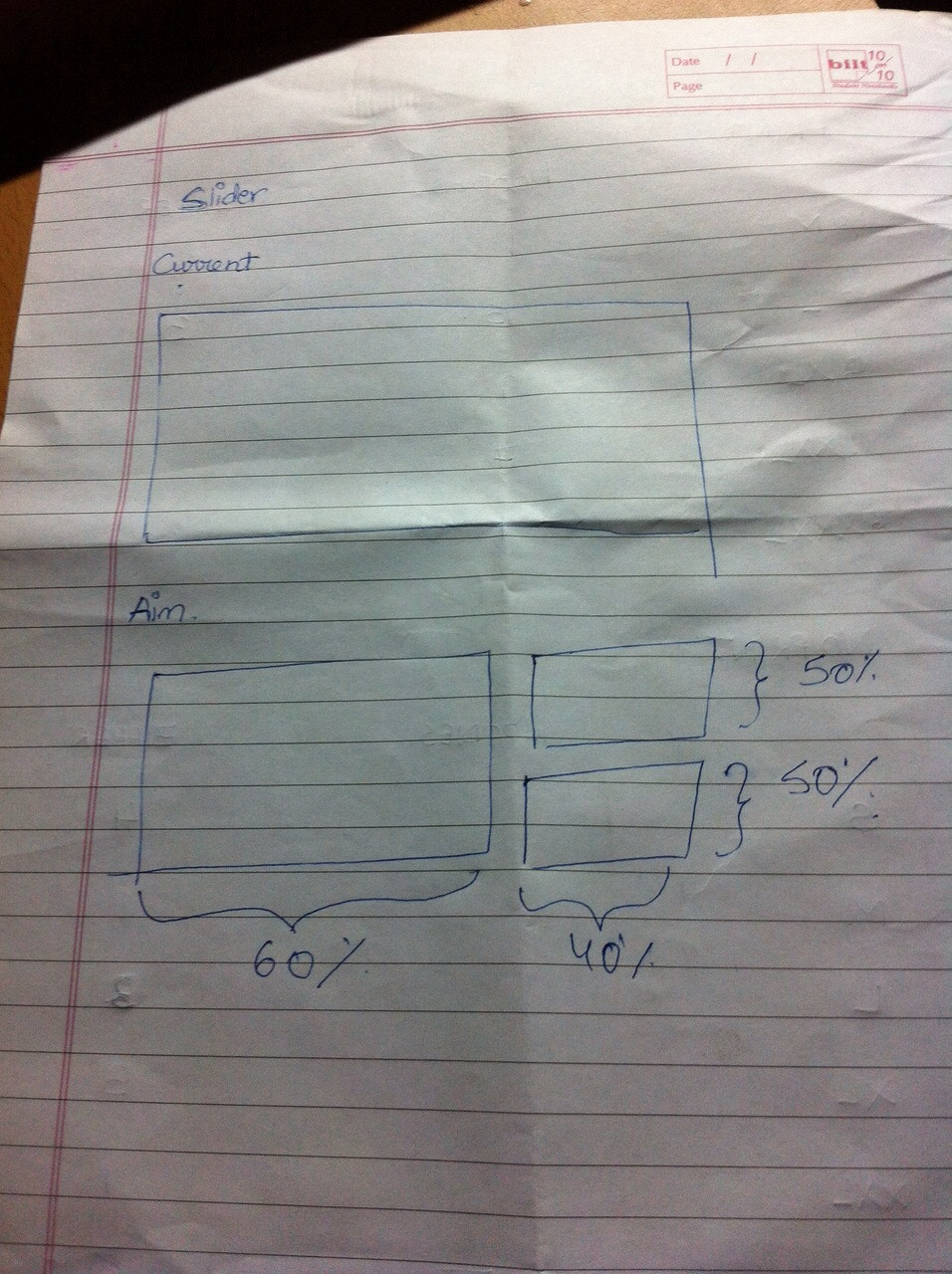
He says it will be easier for him to design three smaller images than a larger image for the current big carousel. He wants each carousel to represent a category(like t-shirts,sweatshirts,etc.)I think it's a bad idea because, firstly, the users can get frustrated with three separate carousels and never even use that part of the site. Secondly, making three separate carousels sticking together as a responsive design would be a nightmare. Thirdly, according to me(and I can be wrong) it kind of defeats the purpose of a carousel, which would be to showcase the important products and events of the website while promoting them. How do I convince my client that three sliders side by side is a bad idea? Or am I wrong?

9
  • 1
    Can we get some more context here? What are the sliders used for? Why does the client want them grouped this way? Why do you think it is a bad idea?
    – JonW
    Commented Jan 11, 2015 at 20:45
  • As JonW said it is contextual, here is Yahoo carousel that I feel can be a good fit for your case: prntscr.com/5rdxhw
    – Pj_
    Commented Jan 11, 2015 at 23:55
  • Well, it's an ecommerce website so he wants to display his products on the slider. He wants it this way because he says it will be difficult to design the images for a larger carousel but easier for three smaller ones, so he wants to keep three carousels for thres different categories. I think it's a bad idea because, firstly, this way the users can get frustrated with the three sliders and never even use that part of the site. Secondly, making that responsive would be a nightmare. Thirdly, according to me(and I can be wrong) it kind of defeats the purpose of a slider, Commented Jan 12, 2015 at 1:41
  • Which would be to showcase the important products and events of the website while promoting them. Commented Jan 12, 2015 at 1:42
  • 1
    Well, you are correct. Let me replace that with carousel to make the question more clear. Commented Jan 12, 2015 at 23:59

3 Answers 3

1

Having 3 sliders is not a bad idea here. Having a single big slider is! Whenever someone comes to your website to purchase anything, he/she would have a product in mind to buy, the three distinct sliders will nicely categorize items. So when, I for example am visiting your website to find discounted deals for t-shirts on your website a single carousel will give me general deals of clothing( eh!), my extra clicks would be frustrating in that case. Since I won't have any idea of what's next in the slider.

Having 3 categories will help me finding deals nicely on t-shirst, not a very good ux but still better than a single Carousel. Whenever the slider changes, I can expect something relevant to appear.

This already existing question will further give more information on carousels: Are carousels effective?

You can discuss with your client on the possibility not using carousel, but if he insists to go with it then I guess you need to provide good controls for the sliders to the users.

6
  • 2
    If the beef is 'extra clicks' than the answer should be 'zero' carousels. Scrolling is much quicker than having to deal with a carousel.
    – DA01
    Commented Jan 13, 2015 at 1:32
  • @DA01 Yes! That's what I have mentioned in my last line. ;-)
    – Pj_
    Commented Jan 13, 2015 at 5:49
  • What about new users that visit the website, not knowing what the company is all about, just to get to know the products and the company. Would three carousels be effective for them? Commented Jan 13, 2015 at 12:52
  • @DA01 I will try to convince him about not putting up any carousel at all but I just want to know the better alternative in case he is adamant about having a carousel. Commented Jan 13, 2015 at 12:54
  • 1
    Yes, then it will be far more helpful than a single carousel. Do you have case where a single carousel will be of any help?
    – Pj_
    Commented Jan 13, 2015 at 12:58
3

Show him this website: http://shouldiuseacarousel.com/

There are a couple of reasons why he shouldn´t do that.

  • 1% clicked a feature. Of those, 89% were the first position. 1% of clicks for the most significant object on the home page? nd.edu stats by @erunyon

  • “We have tested rotating offers many times and have found it to be a poor way of presenting home page content.” wider funnel

  • The target was the biggest item on the homepage - the first carousel item. “Nonetheless, the user failed the task.” nielsen norman Group

  • “Almost all of the testing I’ve managed has proven content delivered via carousels to be missed by users. Few interact with them.” adam fellowes

  • “Carousels are effective at being able to tell people in Marketing/Senior Management that their latest idea is on the Home Page. Use them to put content that users will ignore on your Home Page. Or, if you prefer, don’t use them. Ever.” lee duddell

  • “Carousels pose accessibility issues for keyboard and screen reader users that simply cannot be adequately addressed by markup or hacks. Carousels are this decade's <blink> tag.” jared smith

1
  • Well, I don't think so it's going to help me convince him. I will try though but thank you for this information I'll keep this in mind and try to avoid using carousels Commented Jan 12, 2015 at 1:45
1

"Carousels exist to keep people from beating the $*&# out of each other in meetings." -- Brad Frost

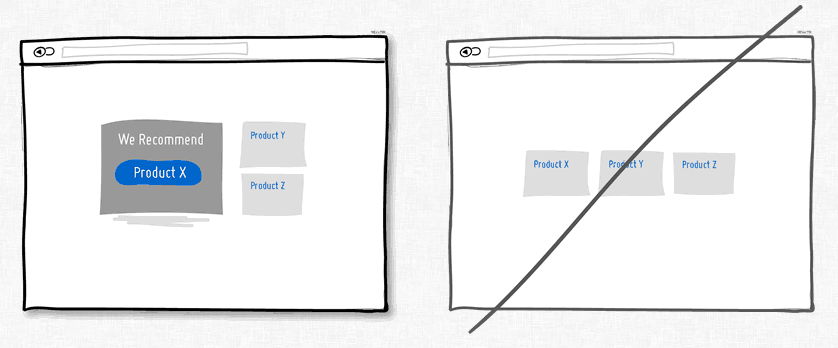
Problem: The home page isn't big enough to show all the stuff for sale.

Solution: Recommend the top selling item with easy access to the full list.

recommend

1
  • I'm sorry I didn't quite catch the point you're trying to make. Commented Jan 13, 2015 at 12:55

Your Answer

By clicking “Post Your Answer”, you agree to our terms of service and acknowledge you have read our privacy policy.

Not the answer you're looking for? Browse other questions tagged or ask your own question.