2

INTRODUCTION:

I am asking for advice to properly redesign the GUI so user can have the best possible user experience.

Although I am generally satisfied how things turned out for entering data into database, I am displeased with the part of the UI responsible for reading from database/edit existing data.

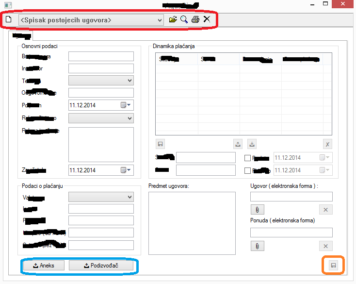
Below is the reference image:
enter image description here

RELEVANT INFORMATION:

First of all, user must not be able to simultaneously enter new, and edit existing, data in the database.

To achieve that, I have added toolbar at the top ( controls in the red circle in the image above ). If user clicks on New page icon, form is reset and looks like in the page above. This means that if the user was editing existing records, and then clicks New page, all the edits will be discarded.

The same goes with editing and reading data: if user was entering new data, and then clicks on Open folder icon, form is reset and record from combobox ( dropdown list ) will be loaded into the form.

In both cases changes/new entry is entered in the database by clicking on Save button ( the one in the orange circle ).

The last thing, form can have many tabs which have 99% similar content as he main tab page ( that is why I have omitted them, to preserve space and clarity ).

Adding new tab pages is done by clicking on the one of the buttons in the blue circle.

/For now, my employers haven't decided just how will the app behave when user clicks on Delete or Print button in the toolbar. Still, these options will exist 100%./

MY EFFORTS TO SOLVE THIS:

I have asked questions here earlier, and on other sites, and have browsed through MSDN documentation on available controls. I have came to the conclusion, with the help of others of course, that tab control is ideal solution since I lack space a lot. I have also decided to use UNICODE images instead of icons, to keep my application faster and smaller.

Above image is all I have at the moment.

QUESTIONS:

  • Can the above layout be redesigned so user can have better UX when reading/editing data without too much tampering with the GUI for entering new record?

  • If you believe I have done a terrible job, please suggest an improvement, since I really want to do this right.

Thank you.

7
  • Can you tell me for which platform is this form going to be used? Also, who would be the potential users?
    – DarkLord
    Commented Dec 11, 2014 at 15:09
  • Also, which files are required and which ones are optional?
    – DarkLord
    Commented Dec 11, 2014 at 15:09
  • @DarkLord: Platform -> Windows XP onwards; User -> someone with no programming experience, someone who uses computers in daily life "the standard way" ( for music, writing reports in MS Word or Excel, playing video games and so on... ) Commented Dec 11, 2014 at 15:11
  • @DarkLord: Controls in top left group box, and the ones in bottom left groupbox are mandatory. Top and bottom right groupbox contains controls that are not mandatory from a "theoretical point of view, but in practice they will be 90% entered. If required, I can update my post with further info, since not all can fit in this comment. Thank you for giving my post a look. Best regards. Commented Dec 11, 2014 at 15:14
  • Which fields are required and which are optional? You must always throw a warning message if the user has entered something in the form and clicks on new page. Also, what is the order the user needs to enter the form.
    – DarkLord
    Commented Dec 11, 2014 at 15:14

3 Answers 3

2

Having built a few apps in a similar space many years ago, the underlying UI/app framework is unhelpful.

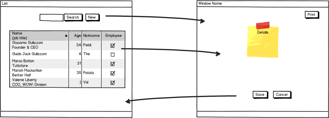
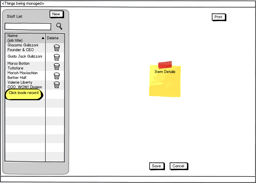
Essentially what you have is both a "List UI" and "Item details" on the same screen. Two basic options:

1. Have two separate screens - List & Item

Simplest to implement. Arguably could be less efficient.

mockup

download bmml source – Wireframes created with Balsamiq Mockups

2. Strongly separate the UI's

Note however with this UI you need to do precise state management. Building a Finite State Machine model is the way to go here.

mockup

download bmml source

Obviously there are variations of the above. e.g. You can add "Read-Only" and"Edit" modes and have button for Edit.

2
  • I like option #2 here. It is easy to find the "Add New Record" action and intuitive that I can edit/delete existing records.
    – DaveAlger
    Commented Dec 16, 2014 at 14:07
  • At quick look must more strongly separate the functionality of the LIST and DETAIL UI's from each other, and make LIST the master UI.
    – Jason A.
    Commented Dec 26, 2014 at 19:21
2

Tabs usually contain different data. For example different sections of a form, like @staccato said.

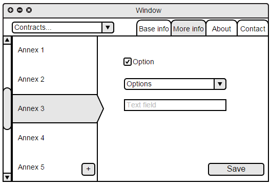
Now each tab is a new annex which the user add. When adding a lot of annexes it will be difficult to distinct different tabs. Instead of tabs you could have a list of annexes and a plus button below it. (For creating a new annex) You can have a list of annexes on the left and the form on the right.

You can now use tabs to organize your form in separate steps if needed. Mockup


A user can now go between viewing and editing a annex by clicking a different row in the list. However never throw away the users changes without consent. You can either store the changes locally for when the user comes back or prompt the user asking to clear the form. I suggest the latter.

Same applies for changing between contracts. Never throw away the users changes.

1
  • I have upvoted your answer. Thank you for your help, it really meant a lot. I gave bounty to the other answer because that answer solved some of my other problems indirectly thus saving me time from typing new questions here or searching online. As for accepting the other solution officially, it seems simpler for me to implement... Best regards. Commented Dec 18, 2014 at 11:58
1
+50

I understand that this is a data entry form for inserting and updating system entities into a database. Seems like a tool that people would need to work with on a daily basis and it's therefore imperative that the UI they use doesn't cause too much cognitive load, which results in unhappy users.

The form you're presenting is over 20 fields long. I first thing I would do is split the form into tabbed sections so that a smaller portion of the form is visible at any given time. I'm not sure what the purpose of the existing tab at the top is, but if it's required, you can always use nested tabs or vertical tabs to accomplish this.

Another change I'd consider is adding textual labels into the action buttons rather than just icons, since many believe that having too many different icon buttons causes the UI to become less comprehensible.

It's fine to use the same screen for both insert and update actions, and you can differentiate which mode you're currently using by showing a title with the relevant text.

1
  • I awarded the bounty because those links solved some other problems I had. I just could not accept it officially because I can not figure out a solution without a "sketch". Best regards. Commented Dec 18, 2014 at 12:01

Your Answer

By clicking “Post Your Answer”, you agree to our terms of service and acknowledge you have read our privacy policy.

Not the answer you're looking for? Browse other questions tagged or ask your own question.